
A bathroom’s paint color noticeably affects how spacious the room feels more than almost any other single choice, since color and light reflection interact directly with a bathroom’s typically smaller dimensions and often more limited natural light.
Below are 11 paint color directions worth considering, with practical notes for each.
1. Soft White With Warm Undertones
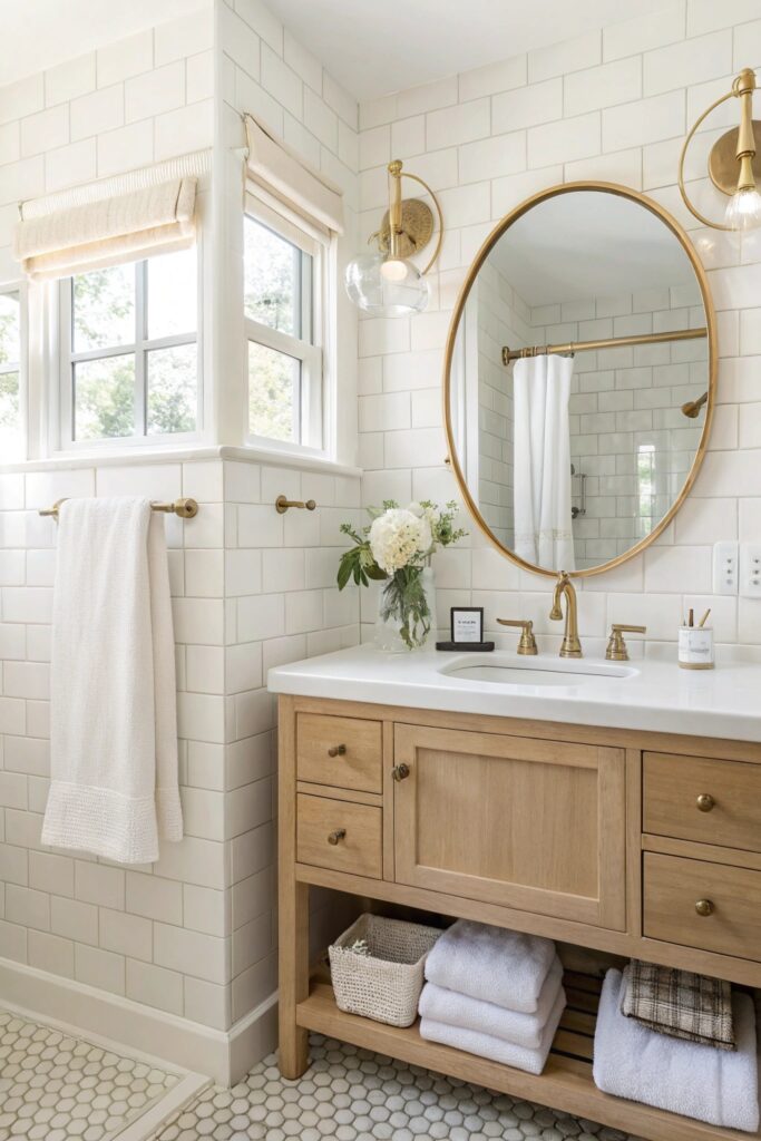
A warm white (rather than a stark, cool white) reflects light effectively while avoiding the clinical feel a pure white can bring to a bathroom specifically.
Choose a warm white with genuine yellow or cream undertones specifically, rather than one with a subtle gray or blue base, since even slight undertone differences can shift how welcoming the final result feels.
2. Pale Sky Blue
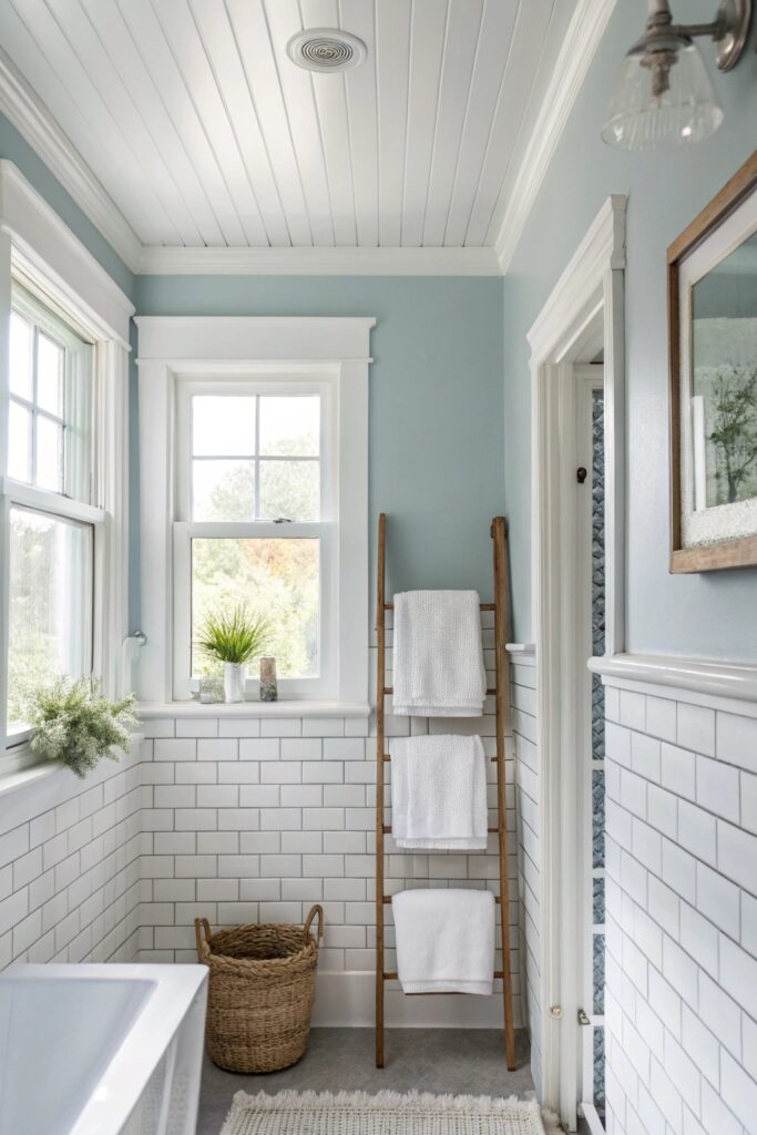
A soft, pale blue creates a truly calming, spa-like atmosphere while still reflecting enough light to keep a smaller bathroom from feeling closed in.
Pair this shade with white or cream trim rather than a stark white specifically, which keeps the overall palette feeling cohesive rather than creating jarring contrast.
3. Soft Sage Green
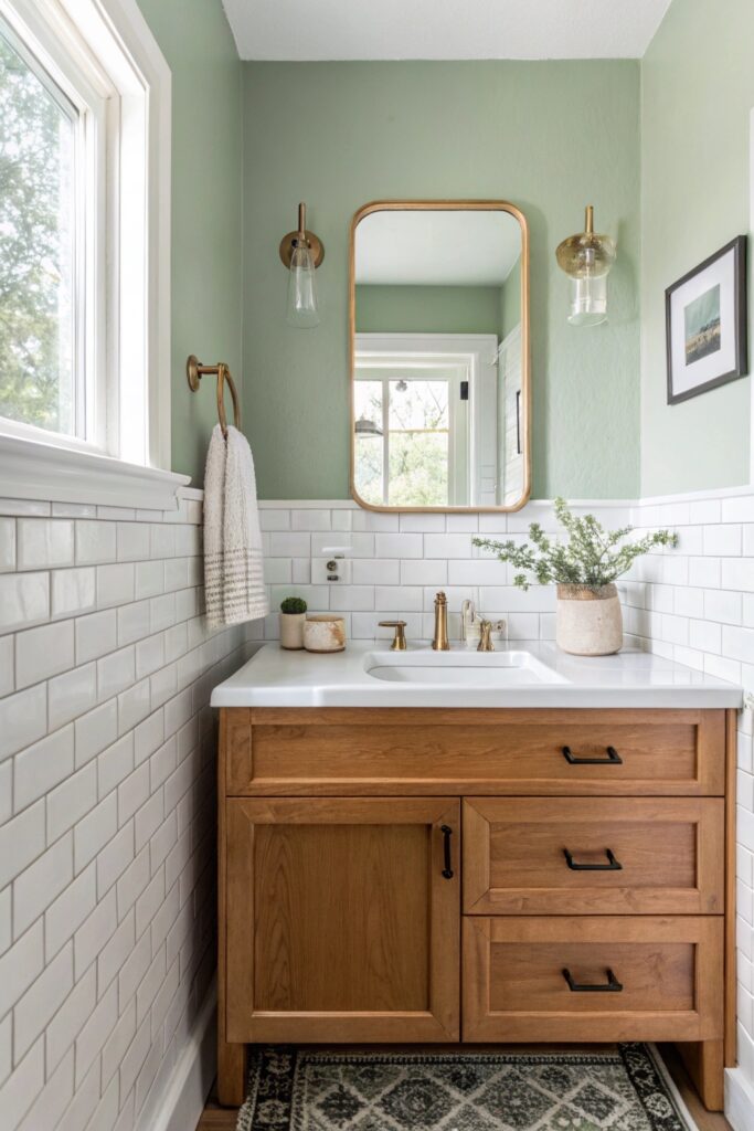
Sage green brings a truly grounded, natural quality to a bathroom, working especially well paired with white fixtures and natural wood accents.
This shade pairs particularly well with brass or gold fixtures, which pick up on sage’s warmer undertones better than cooler metal finishes would.
4. Crisp Greige

A greige (gray-beige blend) offers genuine versatility, reading warmer than a true gray while staying more neutral than a full beige, which pairs well with most fixture finishes.
Test this shade against your specific bathroom’s existing tile or fixture colors before committing, since greige can shift warmer or cooler depending on what surrounds it.
5. Pale Lavender
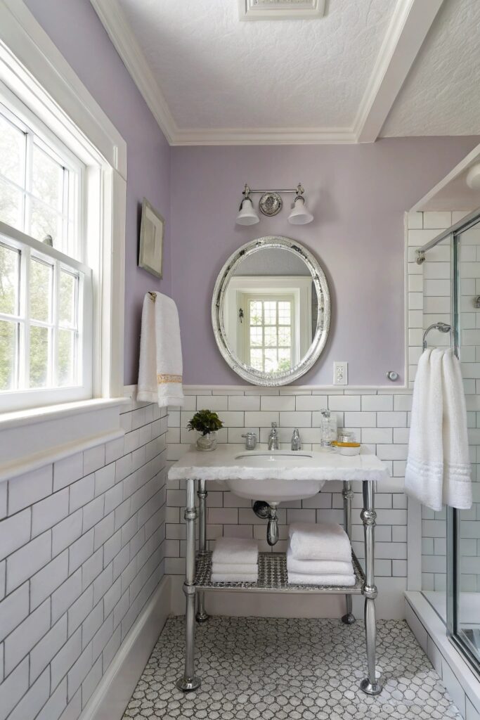
A truly soft, desaturated lavender adds gentle color without overwhelming a smaller space, working particularly well in a bathroom that gets good natural light.
Balance this shade with plenty of white trim and fixtures, since lavender in particular can read as overly saturated if it’s not given enough visual breathing room.
6. Warm Putty or Linen
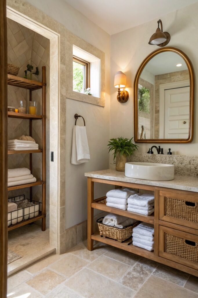
A warm, muted neutral in this family brings genuine coziness that a cooler gray or white doesn’t provide, suiting a bathroom aiming for a more relaxed, lived-in feel.
This palette pairs especially well with black or dark bronze hardware, which adds contrast without competing with the wall color’s inherent warmth.
7. Pale Peach or Blush
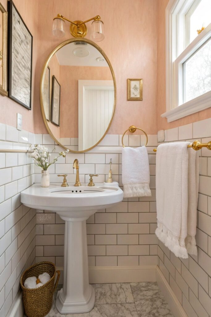
A soft peach or blush tone adds genuine warmth and a flattering quality to skin tones under bathroom lighting specifically, which is worth considering for a vanity area.
Pair this shade with white fixtures specifically rather than colored ones, which lets the wall color remain the room’s primary source of color without competing elements.
8. Light Aqua or Seafoam
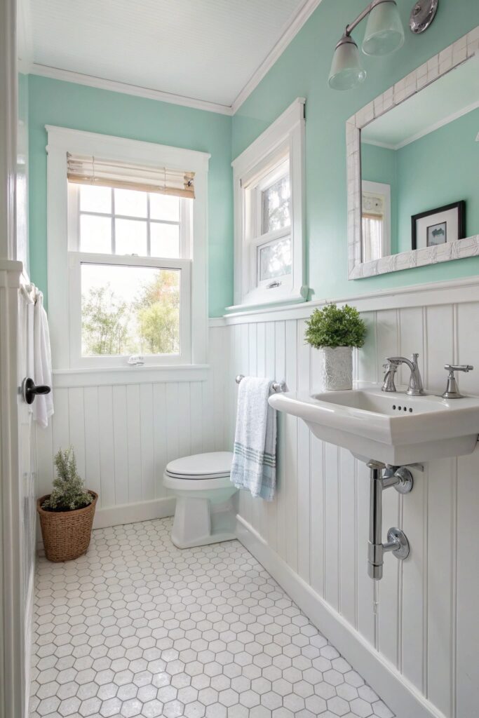
A pale aqua brings genuine coastal, fresh energy to a bathroom, working especially well combined with white tile and natural light.
This shade works particularly well in a bathroom with abundant natural light, since aqua and seafoam tones can read as slightly cold under purely artificial lighting.
9. Soft Charcoal on a Single Accent Wall
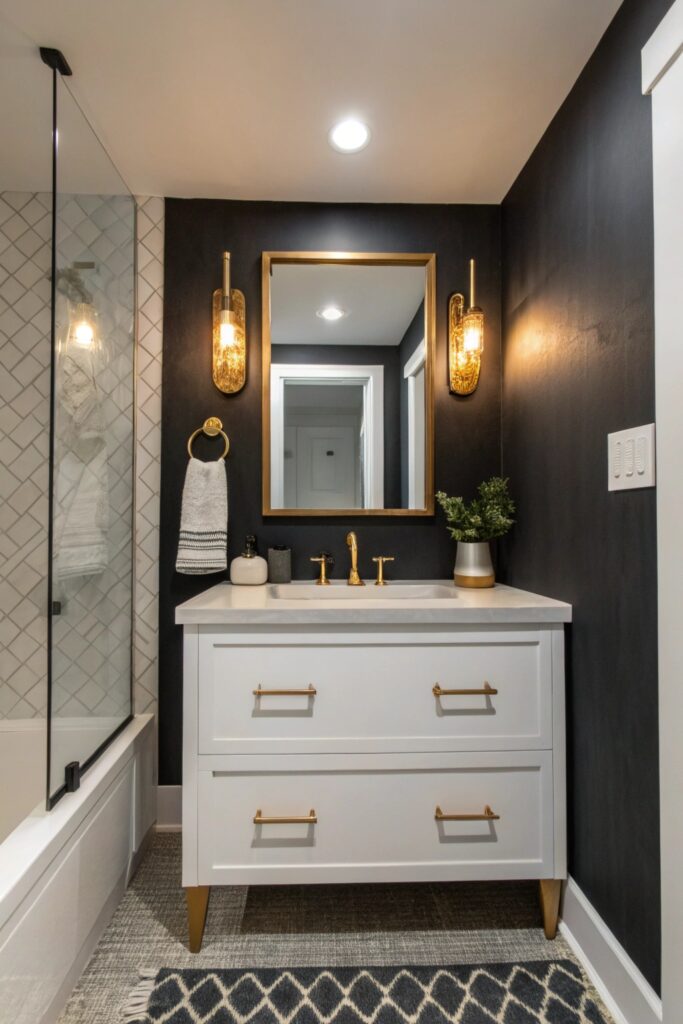
A darker charcoal used specifically on one wall (rather than throughout) adds genuine depth and drama while keeping the room’s other surfaces light enough to maintain an open feel.
Choose the accent wall specifically behind a freestanding tub or a vanity mirror, where the darker color can serve as a genuine backdrop rather than dominating the entire room.
10. Pale Yellow
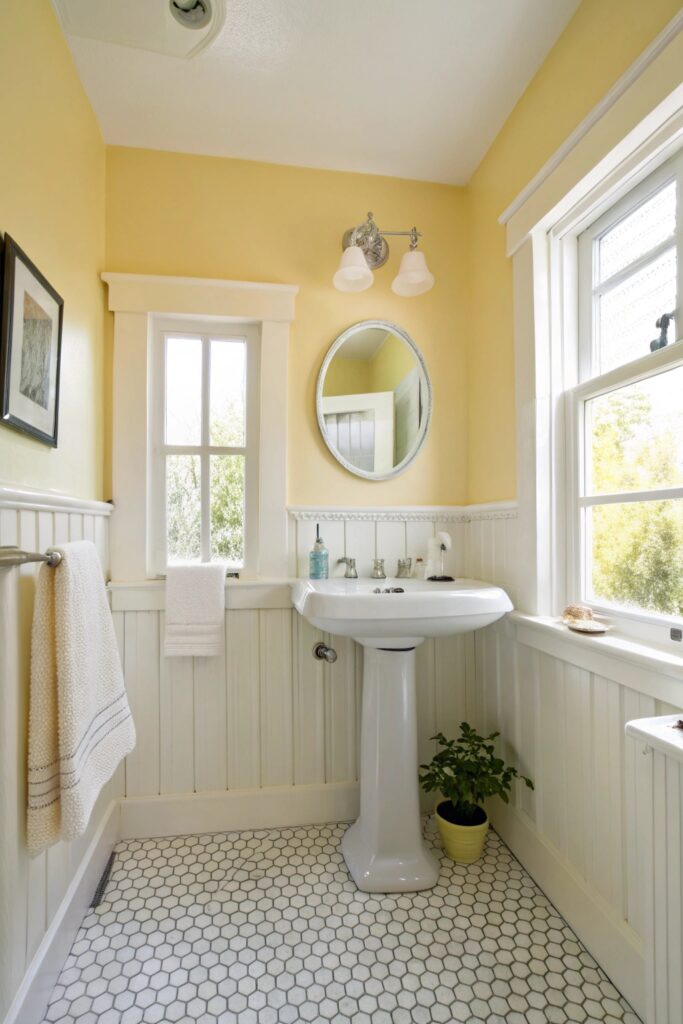
A soft, muted yellow brings genuine warmth and cheerfulness, working particularly well in a bathroom that lacks abundant natural light and could use a brightening color choice.
This shade pairs well with white subway tile specifically, letting the tile’s classic look ground the wall color’s warmth.
11. Tonal Monochrome in One Color Family
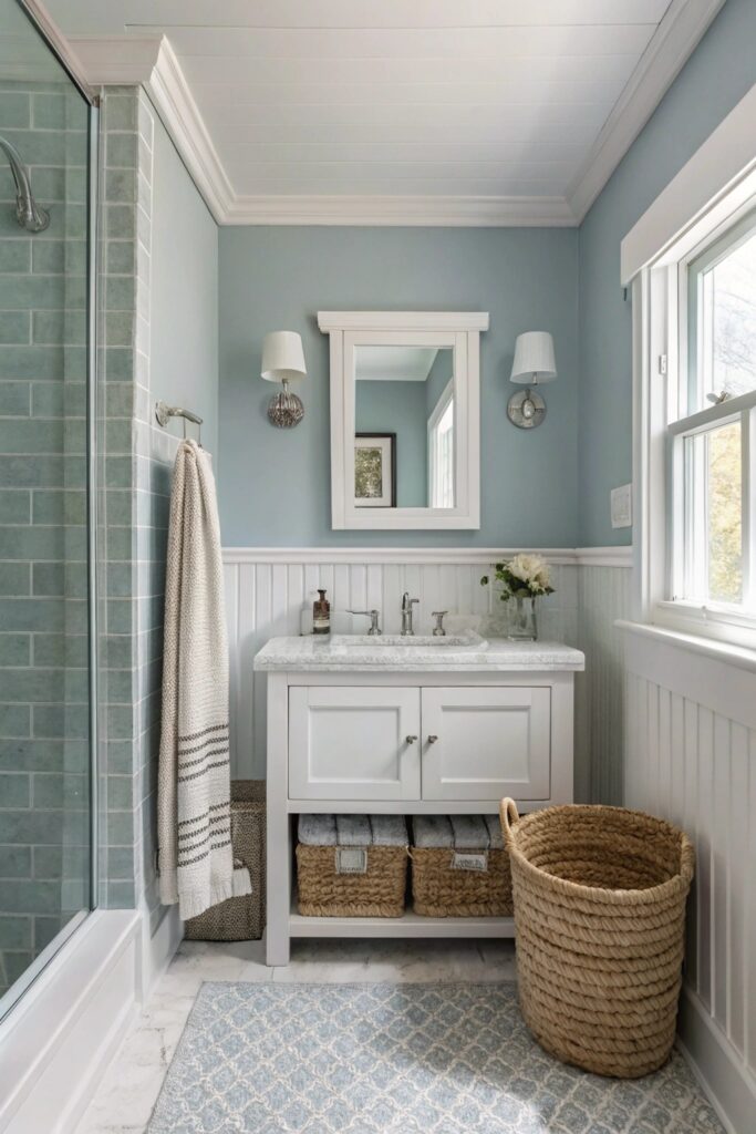
Using varying shades of a single color (walls, trim, and even tile) creates genuine visual cohesion and depth without needing to introduce a second color family at all.
This approach requires more careful color selection than a single-shade room, since even subtle tonal shifts need genuine coordination to avoid looking mismatched rather than intentionally layered.
Choosing the Right Paint Finish
Beyond color, finish matters noticeably more in a bathroom than in almost any other room, since this space deals with consistent moisture and humidity that flat or matte paint doesn’t handle well over time.
A satin or semi-gloss finish specifically resists moisture and wipes clean more easily than a flatter finish, making it the practical choice for bathroom walls regardless of which specific color you land on — reserve fully matte finishes for ceilings or truly low-moisture areas of the room only.
Paint samples in a truly large enough size — at least a two-foot square patch rather than a small swatch — give a considerably more accurate sense of how a color will read across the full wall, since small samples can be misleading once scaled up to an entire room’s surfaces.
View any sample at multiple times of day before finalizing a choice, since a bathroom’s mix of natural daylight and artificial lighting can make a color read noticeably differently in the morning versus evening.
Testing Colors in Bathroom Lighting Specifically
Bathroom lighting is often a mix of harsh overhead fixtures and vanity bulbs with a different color temperature than the rest of the house, which can make a paint color read very differently than it did on the sample card in daylight.
Painting a large swatch directly on the wall and checking it morning, midday, and with the vanity lights on at night catches most surprises before committing to a full room.
Coordinating Paint With Existing Fixtures
If the tile, tub, or countertop can’t be changed, pulling an undertone from those existing materials into the wall color creates a more cohesive look than picking a paint color in isolation.
Warm-toned tile pairs more naturally with the warm whites, putty, and peach options on this list, while cooler gray or white tile tends to suit the pale blue, sage, or greige choices better.
A small sample pot goes a long way toward avoiding an expensive repaint if the color doesn’t turn out the way you pictured it.
Pick Your Color and Start Painting
Drawn to the sage green option? See our dedicated guide to green bathroom ideas for more ways to build out that palette.
Warmer undertones matter more than the specific hue chosen, since a warm white, sage, or greige tends to feel more inviting in a bathroom than a cooler-toned equivalent. Test any color as a genuine sample on the actual wall before committing, since bathroom lighting (often a mix of natural and artificial sources) can shift how a color reads compared to how it looked on a paint chip.