
Danish pastel style works through genuine restraint — muted, desaturated colors and soft textures — rather than the brighter, more saturated pastels typically associated with a pastel-themed room, which is the key distinction that gives this aesthetic its calm, dreamy quality.
Below are 10 elements that build this look, with practical notes for each.
1. Start With a Muted Pastel Color Palette
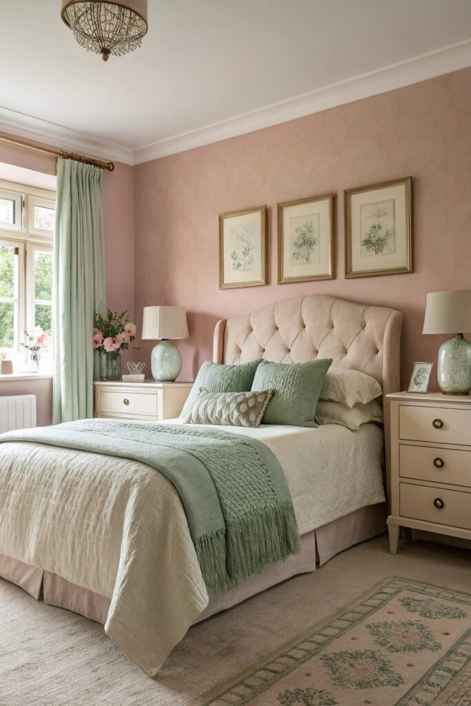
Danish pastel style specifically uses desaturated, dusty versions of pastel colors — muted sage, dusty pink, soft butter yellow — rather than bright, saturated pastels, which is the key detail separating it from a typical pastel room.
Test paint or fabric swatches in your room’s actual lighting before committing, since a color that reads as muted in a store display can look considerably brighter or more saturated under different lighting conditions.
2. Layer Textured Neutral Bedding
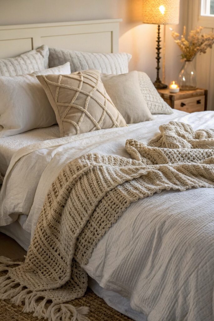
Bedding in cream, oatmeal, or soft white with genuine textural variety (waffle weave, linen, knit) provides the neutral base Danish pastel style builds its muted color accents on top of.
A textured neutral base also makes it easier to introduce a new muted accent color later without needing to replace the bedding itself, since neutral tones pair with nearly any pastel accent.
3. Add Curved, Soft-Edged Furniture
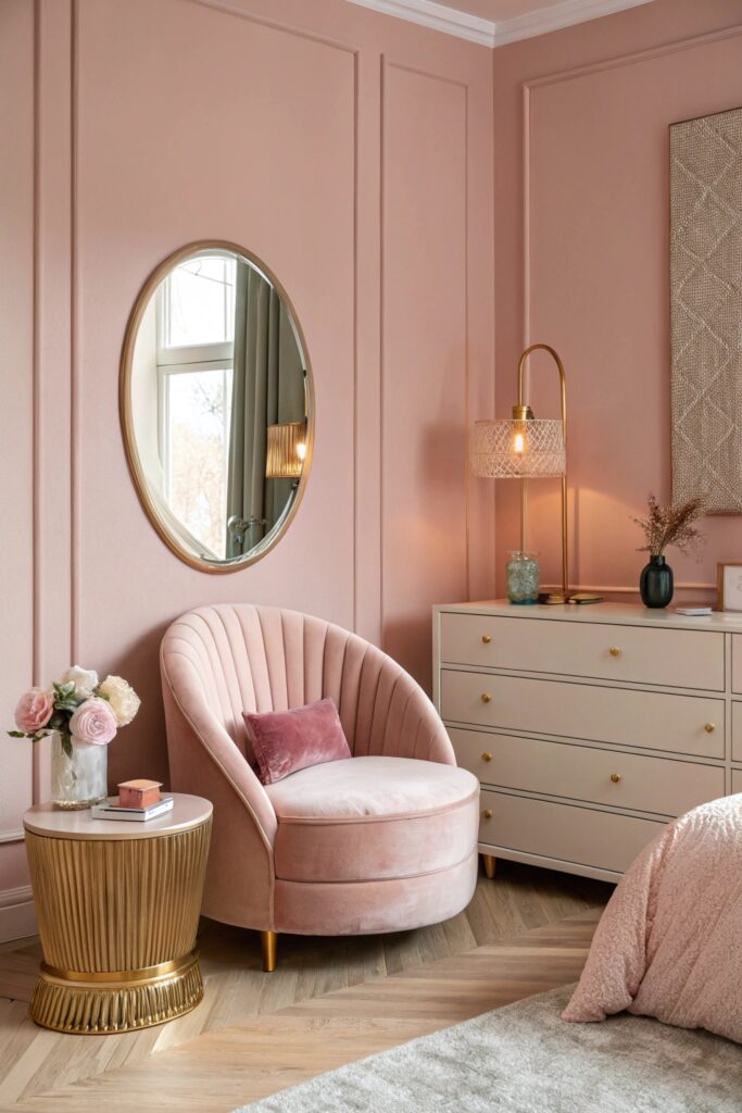
Furniture with rounded corners and soft silhouettes reinforces the gentle, calming quality central to Danish pastel style, contrasting with the sharper lines more common in minimalist or modern styling.
This furniture style is worth prioritizing specifically for larger pieces (a chair, a bed frame) where the shape has the most visual impact, rather than smaller accessories where the effect is less noticeable.
4. Incorporate Dried and Preserved Flowers
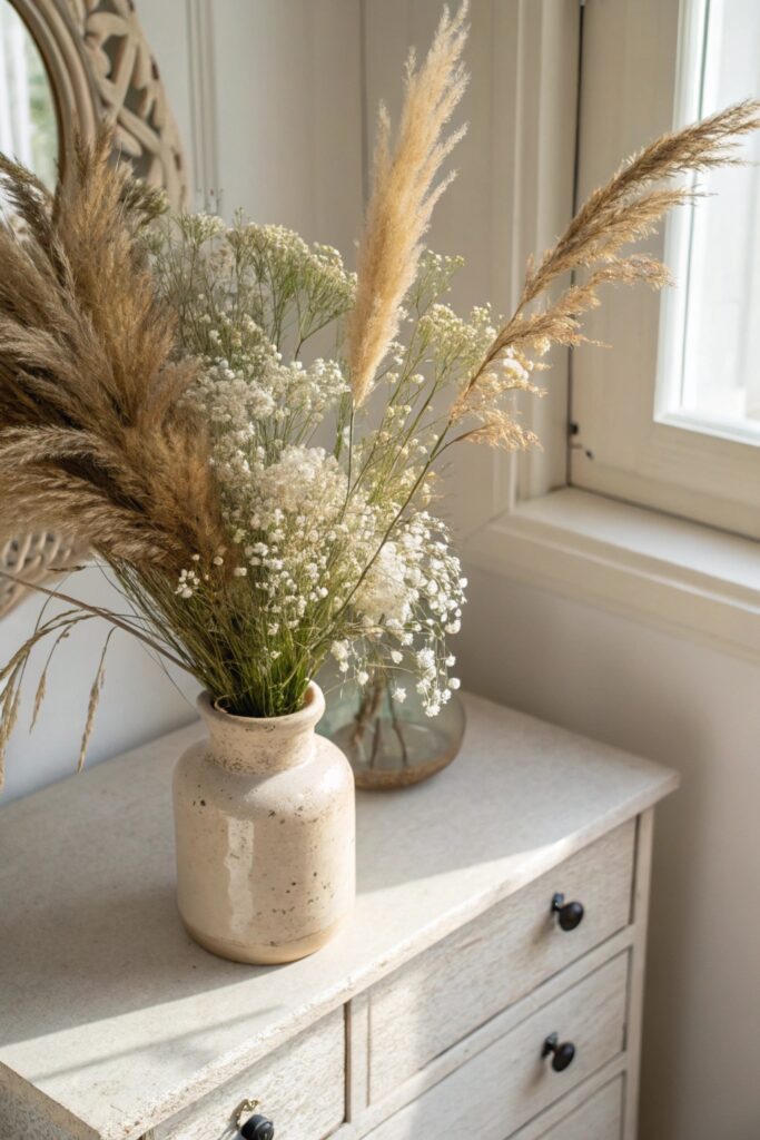
Dried flowers in muted tones (pampas grass, dried baby’s breath, preserved roses) fit the palette naturally while requiring zero ongoing maintenance, which matters for a genuinely low-effort styling approach.
Choose stems in colors that genuinely match your specific palette rather than assuming all dried florals will coordinate automatically, since dried flower colors vary as much as fresh ones do.
5. Use Warm, Ambient Lighting
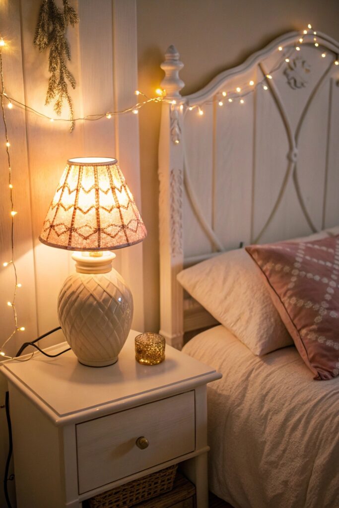
Warm-toned bulbs and layered lighting (a floor lamp, string lights, candles) matter as much to Danish pastel’s dreamy quality as the color palette itself, since harsh overhead lighting undercuts the softness this style depends on.
Battery-powered string lights or small lamps work well for this layered approach without needing additional wall outlets, which matters in a room with limited electrical access.
6. Add a Gallery Wall of Soft, Dreamy Art
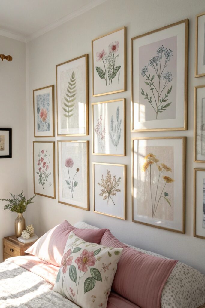
A cluster of art in muted tones and gentle subject matter (soft florals, abstract washes, dreamy photography) extends the palette onto the walls in a genuinely cohesive way.
Choose frames in a consistent muted metal tone (brushed brass, matte black) rather than mixing several bright or glossy finishes, which keeps the gallery wall feeling cohesive with the room’s overall softness.
7. Incorporate Bouclé and Woven Textiles
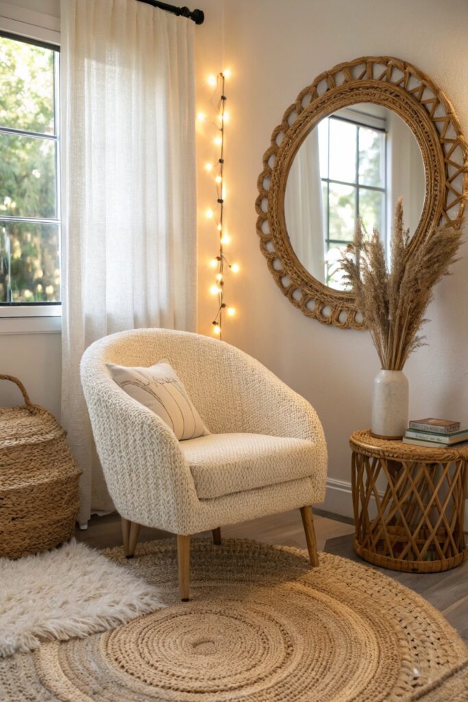
Bouclé fabric and woven textures add genuine tactile softness that’s central to Danish pastel’s overall sensory approach, working well on pillows, a chair, or a throw blanket.
Bouclé specifically holds up well to regular use and doesn’t show wear as visibly as some smoother fabrics, making it a genuinely practical choice beyond its aesthetic fit.
8. Keep Surfaces Minimal and Uncluttered
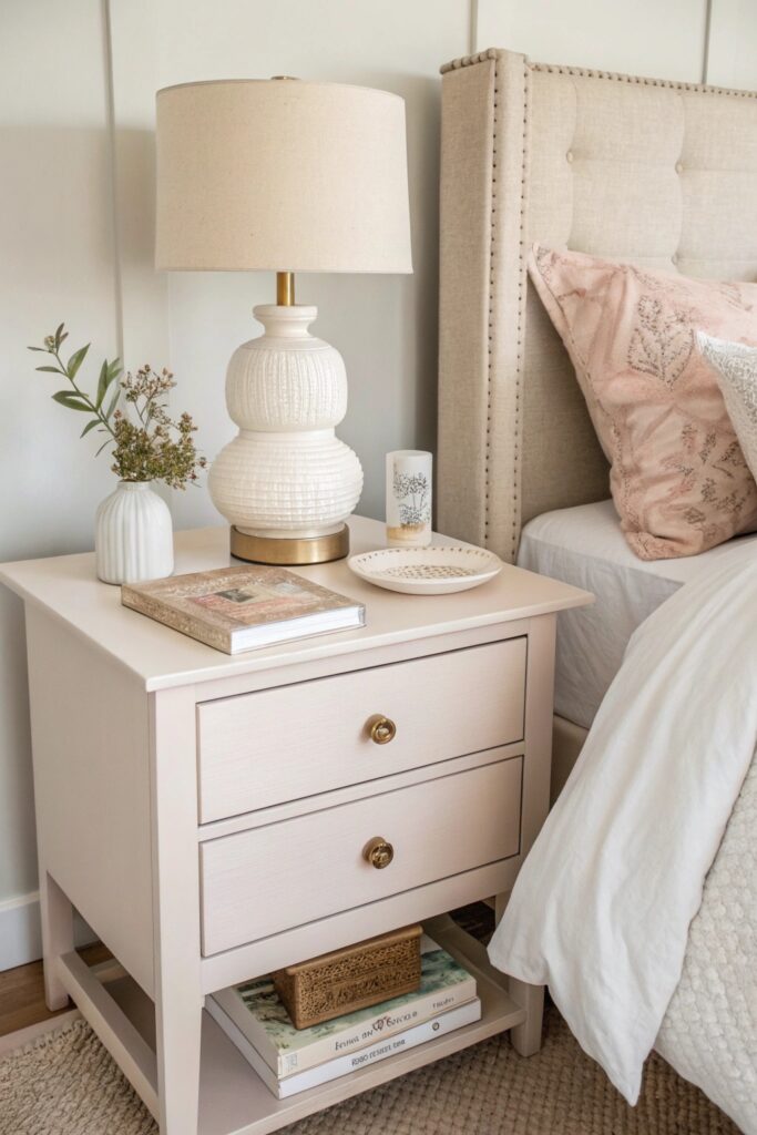
Danish pastel style depends on genuine visual calm, which means keeping surfaces edited to just a few considered objects rather than a fuller, more layered display.
A regular editing habit — reassessing what’s accumulated on visible surfaces every couple of weeks — matters more for maintaining this look than the initial styling effort does.
9. Add a Statement Pastel Rug
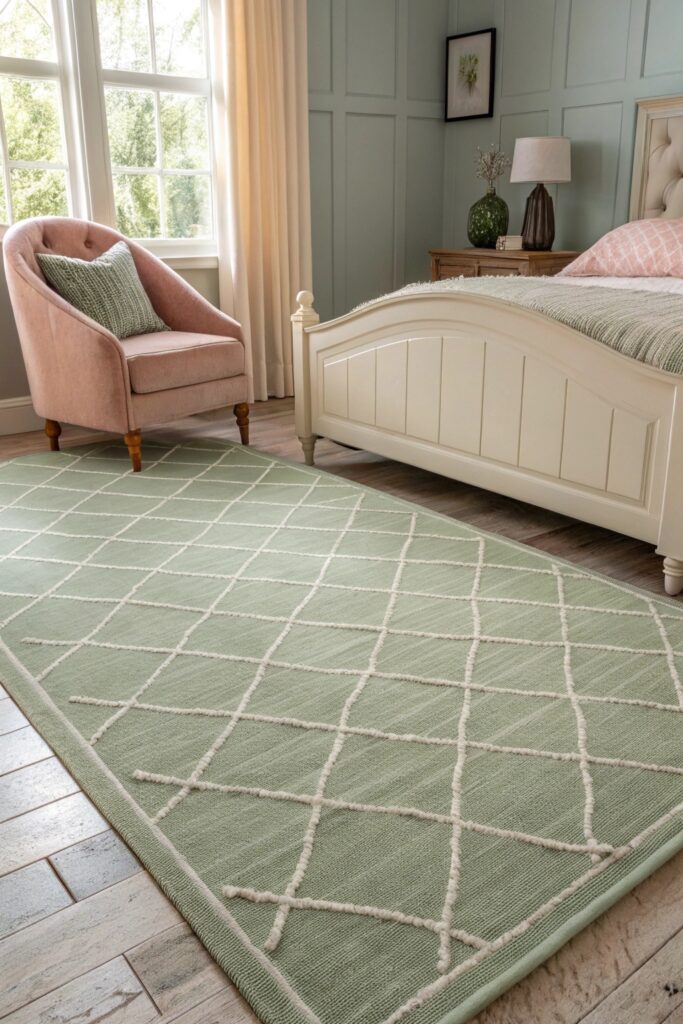
A rug in a muted pastel tone anchors the room’s color palette at floor level, adding genuine softness underfoot that complements the style’s overall gentle quality.
Choose a rug with a subtle texture (a slight pile, a woven pattern) rather than a flat, glossy synthetic material, which reinforces the tactile softness central to the style.
10. Add Greenery in Soft-Toned Planters
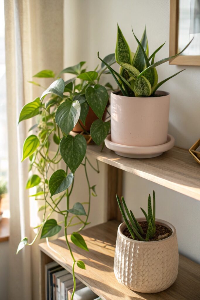
Plants in muted ceramic planters (rather than bright plastic pots) keep greenery consistent with the overall palette, adding organic life without introducing a jarring color.
What Makes This Different From a Regular Pastel Room
The defining feature of Danish pastel style is desaturation specifically — colors that look like they’ve been gently faded or dusted with gray, rather than the fuller, more saturated pastels associated with a traditional pastel palette or nursery-style decorating.
This distinction matters when shopping for specific items, since a product description labeled simply as pastel pink or pastel blue doesn’t guarantee the muted, grayed-down quality this aesthetic depends on — it’s worth examining actual product photos closely, or requesting swatches when possible, rather than assuming any pastel-labeled item will genuinely fit the look.
Building the look gradually rather than all at once tends to produce better results, since the muted, considered quality central to this aesthetic comes partly from restraint — starting with bedding and lighting, then adding a few accent pieces over time, avoids the temptation to over-decorate a style that specifically depends on genuine visual calm.
Wrapping This Up
A muted, desaturated palette and warm ambient lighting matter more than any specific decorative object, since both are what separate Danish pastel from a brighter, more typical pastel room. Keep surfaces genuinely edited throughout, since visual clutter undercuts the calm quality this style depends on more than it would in a busier, more maximalist aesthetic.