
A cohesive color scheme genuinely affects how spacious and put-together a dorm room feels more than almost any other single styling decision, since color consistency across bedding, decor, and accents ties a small space together in a way piecemeal color choices don’t.
Below are 12 color palettes that work well in a dorm setting, with practical notes for each.
1. Soft White and Sage Green
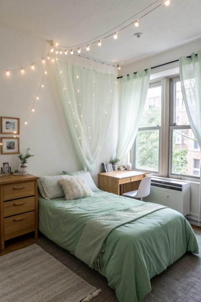
A soft white base with sage green accents (bedding, a rug, a few decor pieces) creates a genuinely calm, nature-inspired palette that reflects light well in a typically smaller dorm room.
This palette works well regardless of your dorm’s existing wall color, since white and sage both layer easily over a standard white or beige base wall without clashing.
2. Blush Pink and Warm Gray
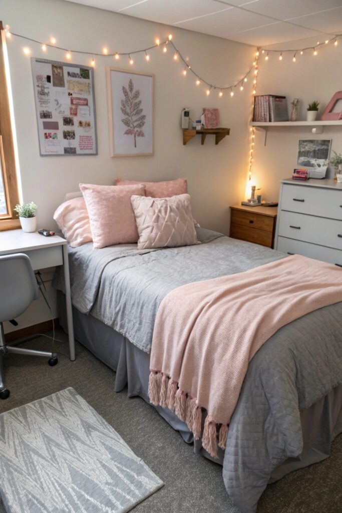
Blush pink paired with a warm gray base reads as considerably more sophisticated than pink alone, avoiding the overly sweet look pink-dominant rooms can sometimes have.
Choose gray as the dominant color and pink as the accent specifically, which keeps the overall room from reading as overly sweet or one-note.
3. Navy and Mustard Yellow
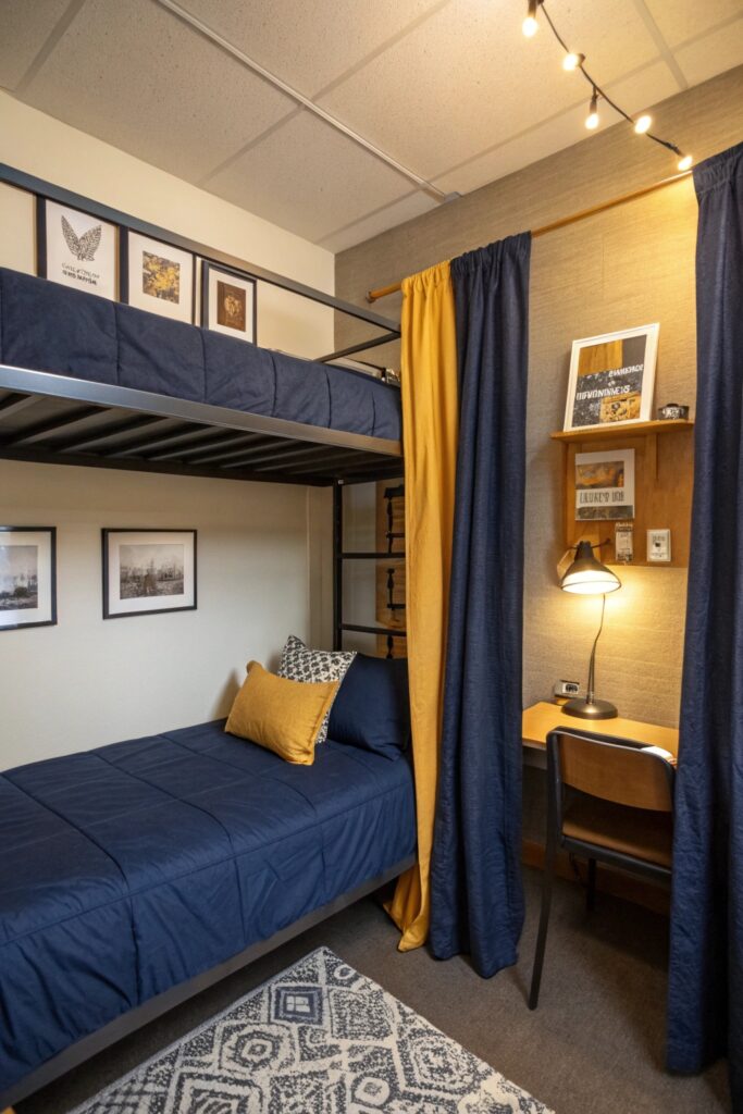
A navy base with mustard yellow accents creates genuine visual richness and contrast, working especially well for anyone wanting a bolder palette than the softer, more muted options on this list.
Balance the darker navy with enough lighter surfaces (a white desk, cream bedding) so the room doesn’t feel visually heavy in a smaller space.
4. All-White with Wood Accents
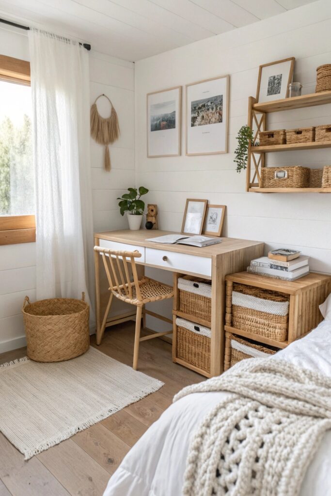
A fully white base paired with natural wood tones creates a genuinely airy, expansive feel that maximizes how open a small dorm room reads, since white reflects available light most effectively.
This scheme relies almost entirely on material variety (different wood tones, textures) to add visual interest, since the color palette itself stays intentionally minimal.
5. Dusty Blue and Cream
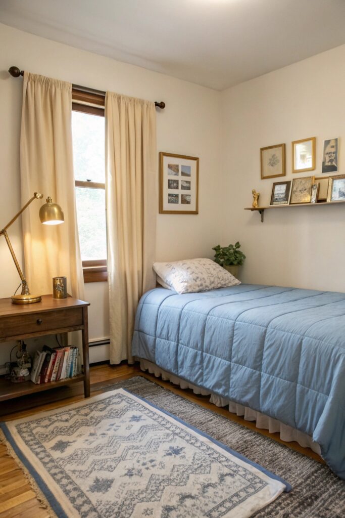
Dusty blue paired with a cream base creates a genuinely calming, cohesive palette that reads as more considered than a single flat color throughout the room.
Add a warmer wood or brass accent to keep this cooler palette from feeling sterile in a room that already tends toward cool white walls.
6. Terracotta and Cream
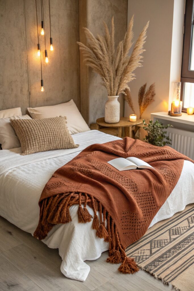
Terracotta accents against a cream base bring genuine warmth, working particularly well combined with natural materials like wood or rattan for a cohesive earthy palette.
A rust or burnt orange throw pillow works well as a slightly deeper accent within this same warm palette, adding depth without introducing an unrelated color.
7. Black, White, and One Bold Accent
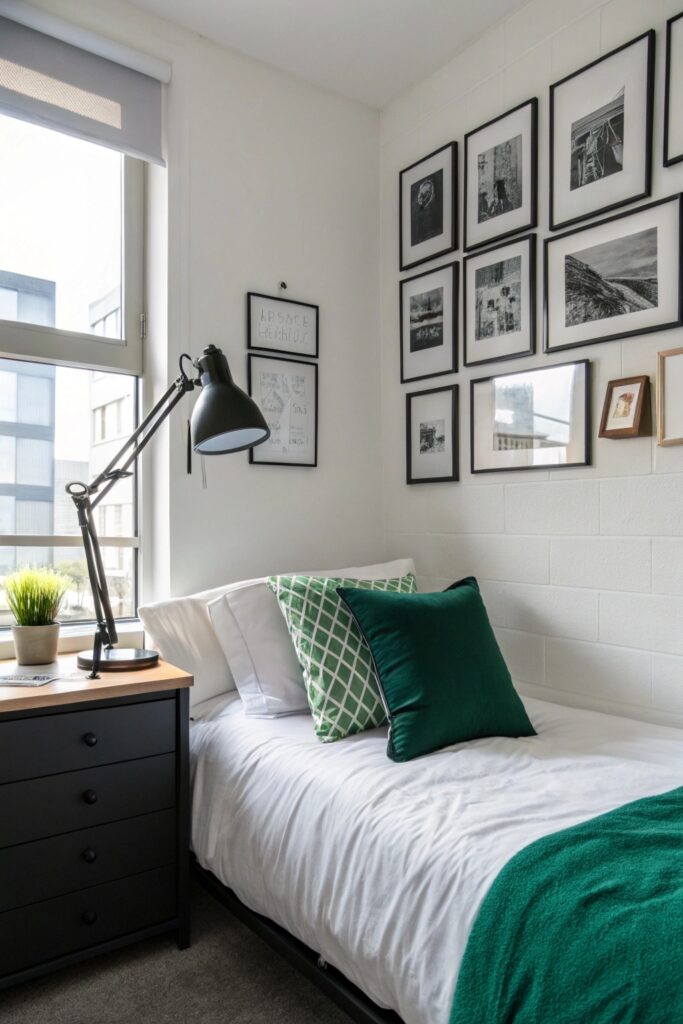
A black-and-white base with a single saturated accent color creates genuine visual punch through restraint rather than a full spectrum of colors competing for attention.
Choose the accent color for something easily swapped (a pillow, a small object) rather than a large piece, which lets you change the accent seasonally without redoing the whole room.
8. Lavender and Soft Gray
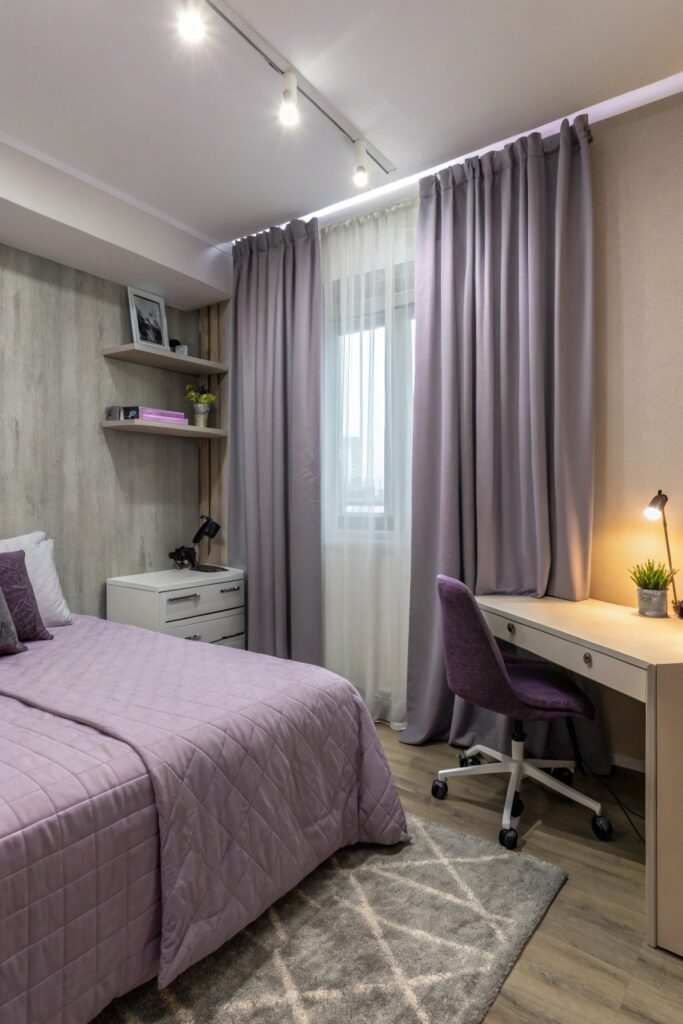
Lavender paired with soft gray creates a genuinely gentle, calming palette without leaning as sweet as a full pastel scheme would.
Keep the gray as a true neutral gray rather than one with a warm or cool undertone that clashes with lavender’s cooler tone.
9. Olive Green and Tan
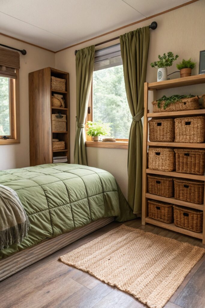
Olive green paired with tan creates a genuinely grounded, earthy palette that works well combined with natural textures like woven baskets or wood furniture.
A rust or burnt orange accent pairs particularly well within this palette, adding a warm contrast note without introducing a fully unrelated color family.
10. Millennial Pink and Charcoal
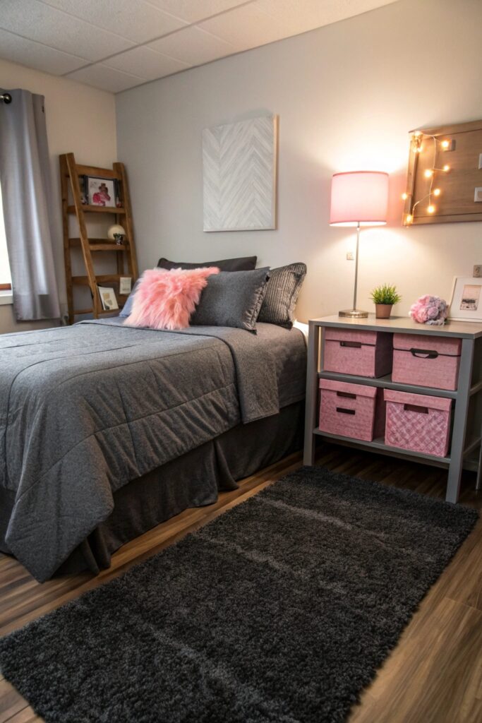
Millennial pink balanced against charcoal gray creates genuine contrast that keeps the palette from reading as overly soft, working well for anyone wanting pink without a fully pastel room.
Balance the pink with enough charcoal so the room doesn’t read as fully pastel, which is the detail that keeps this scheme feeling more grown-up than a lighter pink-dominant room.
11. Ocean Blue and Sandy Beige
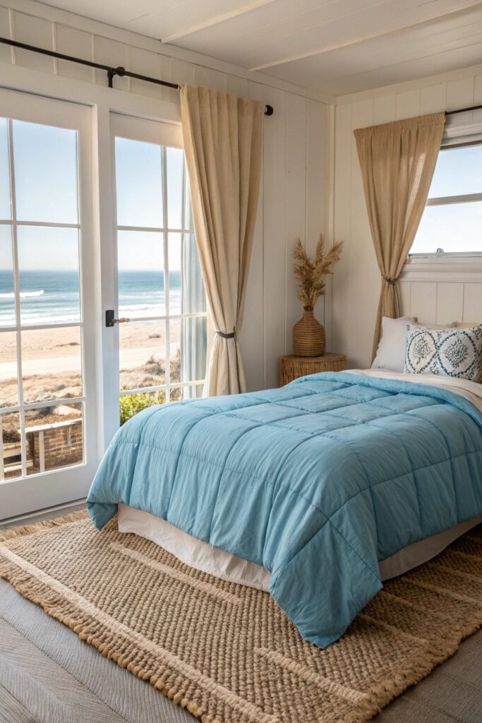
Ocean blue paired with sandy beige creates a genuinely relaxed, coastal-inspired palette that works well combined with natural textures like jute or linen.
Add a rope or woven texture element specifically, which reinforces the coastal feel beyond color alone.
12. Monochrome Blush
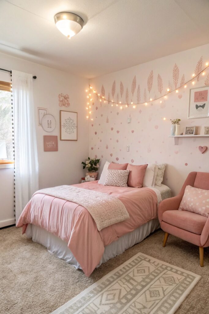
Varying shades of a single blush tone throughout the room creates genuine cohesion and depth without needing to introduce a second color family at all.
Vary the blush shades from pale to slightly deeper tones across different elements (walls, bedding, accents) to avoid the flatness a single uniform shade throughout can create.
This single-tone approach works especially well if you’re not confident mixing colors, since staying within one color family removes the risk of clashing accents while still allowing for genuine visual depth through shade variation.
Quick Tips Before You Commit to a Color Scheme
Test any color choice against your dorm’s actual wall color and lighting before committing to bedding or decor in that palette, since dorm rooms often have fixed white or beige walls that interact differently with color choices than a freshly painted room would.
Limiting the room to 2-3 coordinated colors (rather than the full range shown in any single scheme above) keeps a small dorm room from feeling visually busy, regardless of which specific palette you choose.
Wrapping It Up
Lighter, reflective base colors matter most in a genuinely small dorm room, since they help the space read as more open regardless of which specific accent palette you pair them with. Stick to 2-3 coordinated colors throughout rather than trying to incorporate every accent color shown in a given scheme, which keeps the room feeling cohesive rather than visually scattered.