
The colors that consistently read as calming and well-considered in a bedroom tend to share a few traits — muted rather than highly saturated, warm-leaning undertones in most cases, and a level of depth that reads intentional rather than flat or generic.
Below are 12 colors that work particularly well for bedrooms specifically, with real paint references and reasoning for each.
Looking for specific finish, trim, and hardware pairings for each color? See our companion guide to best bedroom colors that make any space feel designer-made.
1. Soft Sage Green

Sage green has become one of the most consistently recommended bedroom colors in recent years, reading as calming and nature-connected without the starkness of a purer green — Benjamin Moore ‘Saybrook Sage’ and Sherwin-Williams ‘Evergreen Fog’ are common reference points.
This color performs well across most light exposures, though it reads noticeably cooler in a north-facing room, worth testing on the actual wall before committing if your bedroom faces that direction specifically.
2. Warm Greige
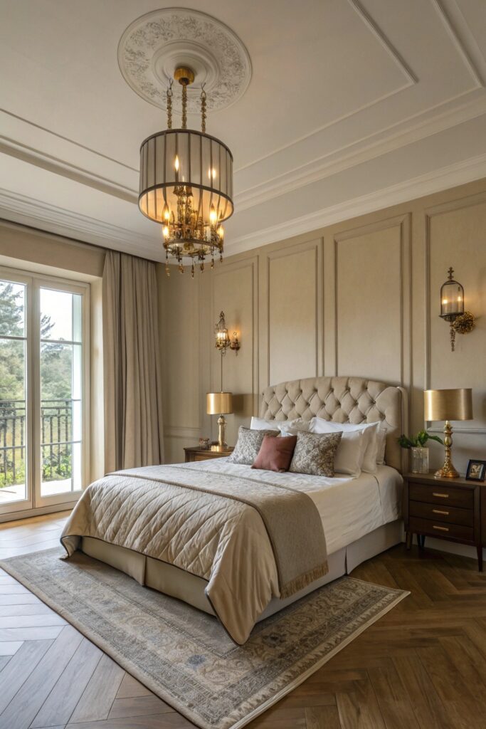
A greige with genuine warmth (rather than a cooler, more gray-leaning greige) works as a highly flexible neutral that reads sophisticated without the starkness of pure white or the commitment of a bolder color choice.
Benjamin Moore ‘Balboa Mist’ is a reliable warm greige reference — check the specific undertone before purchasing, since some greiges marketed as warm still carry enough gray to read cooler than expected once applied at full wall scale.
3. Deep Charcoal
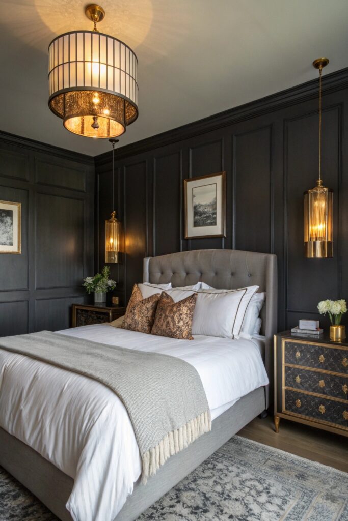
A deep charcoal creates genuine drama and coziness, working particularly well as an accent wall behind the headboard if committing to a full room feels like too much, and it pairs naturally with warm wood tones and brass accents.
For a related but bolder direction than charcoal, our guide to black bedroom ideas covers the fully committed version of this same dark, moody approach in more depth.
4. Blush Pink (The Grown-Up Version)
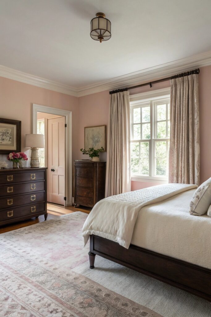
A dusty, muted blush rather than a bright or overly sweet pink reads as sophisticated and calming rather than juvenile, working especially well paired with warm metals and natural wood tones to keep the palette feeling mature.
Farrow & Ball ‘Setting Plaster’ is a commonly referenced example of this more grown-up blush tone, distinct from brighter, more saturated pink options that can feel less suited to an adult bedroom.
5. Muted Navy Blue
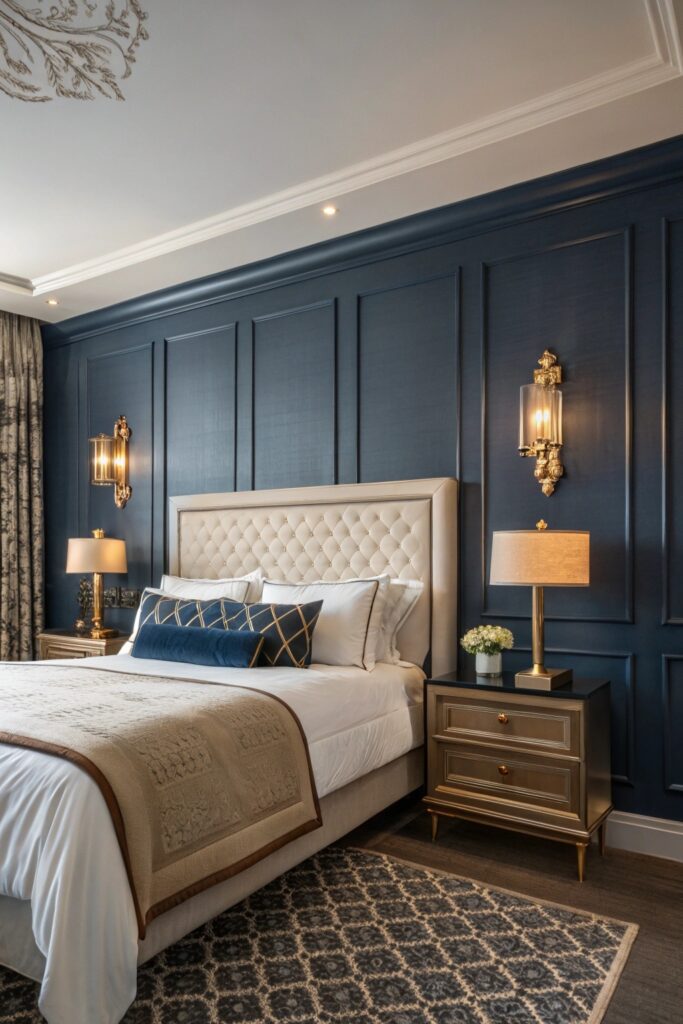
A softer, more muted navy (rather than a bright or highly saturated blue) creates a genuinely restful, enveloping feel that’s become a consistently popular bedroom choice, working well with both warm and cool accent colors depending on the rest of the room’s palette.
Deep blues generally photograph and read best with adequate natural light or well-planned artificial lighting, since insufficient light can make a dark navy room feel more cave-like than intentionally cozy.
6. Warm Terracotta
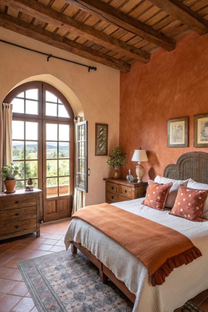
Terracotta and warm clay tones bring an inherently cozy, grounded feeling that works particularly well in bedrooms lacking abundant natural light, since the color’s warmth compensates for what cooler light exposure would otherwise wash out.
This color pairs naturally with warm wood furniture and brass or copper accents, extending the same warm-material logic that makes terracotta work well in other rooms throughout a home.
7. Classic Cream
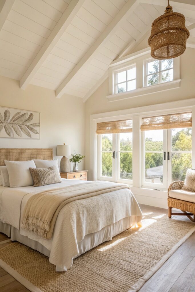
A warm cream (distinct from a stark, cooler white) remains one of the most broadly flattering and flexible bedroom color choices, working well across nearly any light exposure and serving as a neutral backdrop that doesn’t compete with bedding, art, or furniture choices.
This is also one of the safest choices for anyone uncertain about committing to a bolder color, or for a room that needs to appeal broadly, such as a guest bedroom or a home being prepared for resale.
8. Soft Lavender
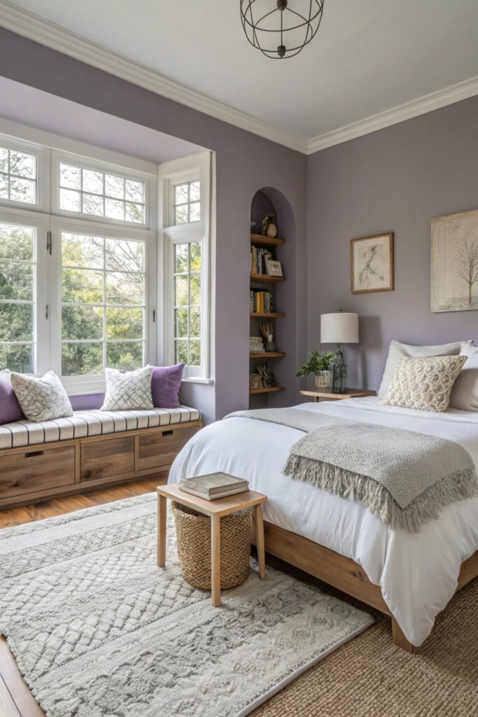
A muted, grayed-down lavender (rather than a brighter, more saturated purple) has documented associations with relaxation and improved sleep quality in some research on color and rest, making it a genuinely function-driven choice beyond pure aesthetic preference.
Keep the lavender muted and grey-leaning rather than bright or saturated — a more vivid purple can read as playful or juvenile in a way that undermines the calming effect a softer version achieves.
9. Rich Forest Green
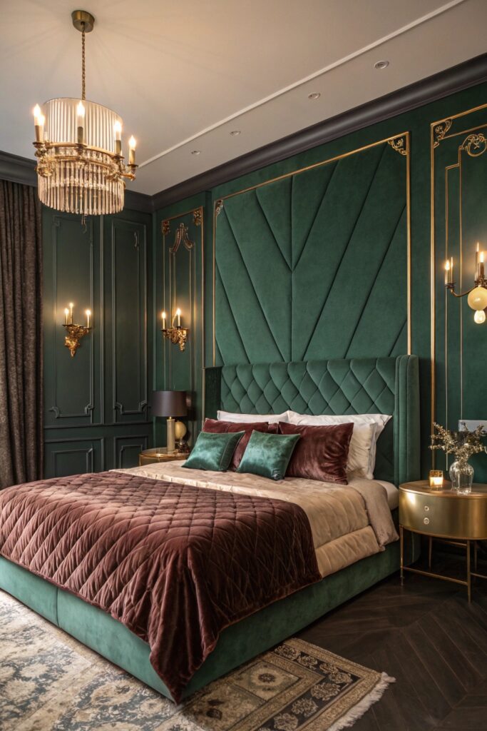
A deeply saturated forest green creates a genuinely enveloping, nature-connected feeling distinct from the lighter, softer quality of sage green, working especially well in bedrooms with good natural light to prevent the deeper tone from reading as overly dark.
This color pairs naturally with warm wood tones, brass fixtures, and cream or white bedding, following the same warm-cool balancing principle that makes most successful deep-color rooms work.
10. Warm Taupe
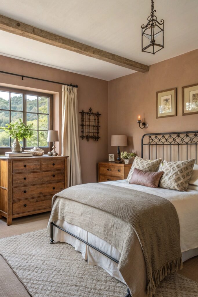
True warm taupe (balanced between brown and gray without leaning too far toward pink or purple) offers a reliable, sophisticated neutral that holds its intended tone across most lighting conditions better than some other neutral options.
For bedrooms with challenging north-facing light specifically, our guide to paint colors for northern light covers additional undertone considerations that apply directly to choosing a taupe or similar neutral in that exposure.
11. Soft Powder Blue
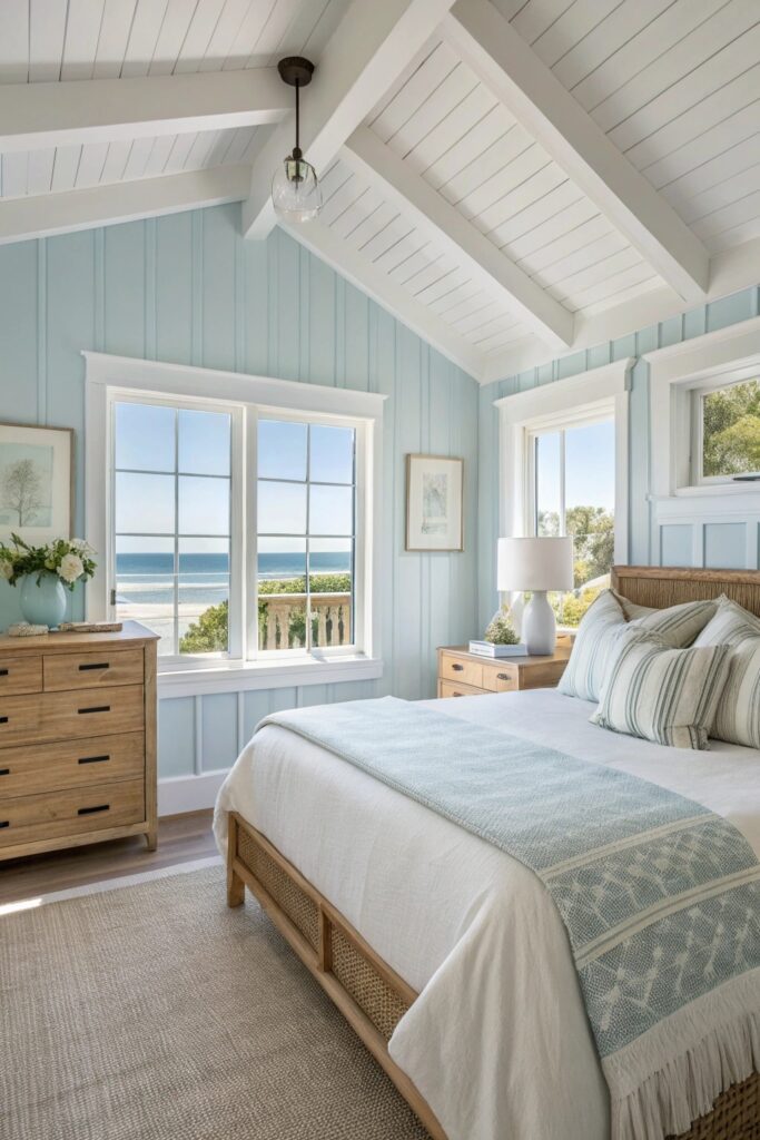
A muted, dusty powder blue reads as calming and airy without the potential coldness of a brighter or more saturated blue, working particularly well in bedrooms that already receive good natural light throughout the day.
This color pairs well with white or cream trim and natural wood furniture, keeping the overall palette light and restful rather than introducing additional contrast or visual weight.
12. Deep Plum
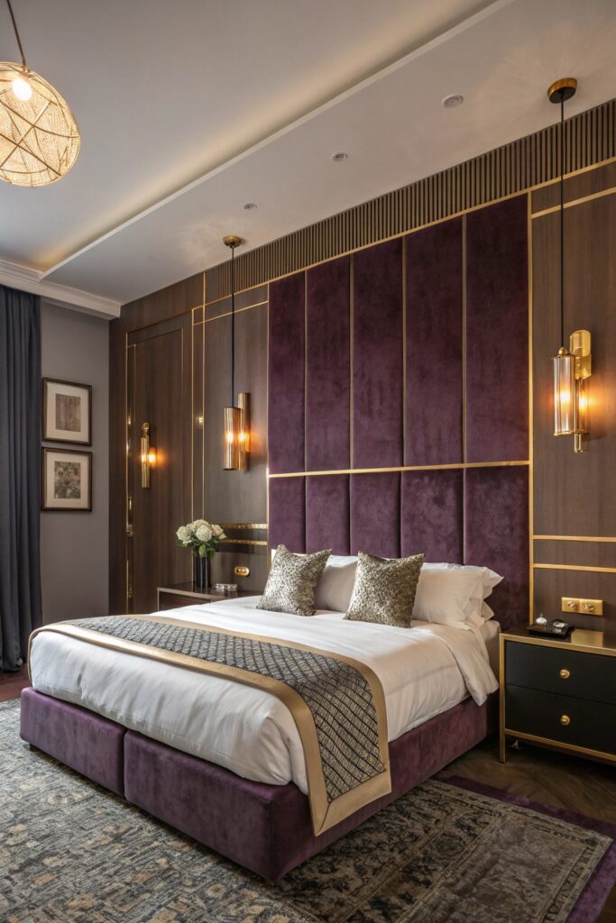
A rich, deep plum brings genuine luxury and warmth that’s distinct from both navy’s coolness and charcoal’s neutrality, working as a genuinely striking choice for anyone wanting a bedroom color that reads as considered and distinctive rather than safely neutral.
This deeper color benefits from the same warm lighting consideration that applies to other dark bedroom colors — 2700K bulbs and layered lighting sources prevent the room from feeling underlit or overly somber.
How to Choose the Right Color for Your Bedroom
Consider your room’s natural light exposure before anything else — north-facing rooms benefit from warmer undertones to counteract cooler ambient light, while south-facing rooms with abundant light can handle cooler tones without them reading as cold. Test any color as an actual painted swatch on the wall itself rather than relying on a paint chip alone, since color perception shifts meaningfully once applied at full wall scale under your room’s specific lighting.
Wrapping It Up
Sage green and warm greige are worth starting with if you’re unsure which direction to take, since both are broadly flattering across different light exposures and pair easily with most existing furniture and bedding. Reserve the deeper, more dramatic colors (charcoal, forest green, plum) for once you’re confident about committing to a bolder overall bedroom aesthetic.