
A bedroom color scheme’s success depends as much on light reflectance value and undertone as it does on the color itself, since the same shade can read completely differently depending on the room’s actual lighting and existing finishes. The details below cover the specifics worth checking before committing to paint.
Below are 14 palettes worth considering, with the practical details for each.
1. Soft Beige and Warm White
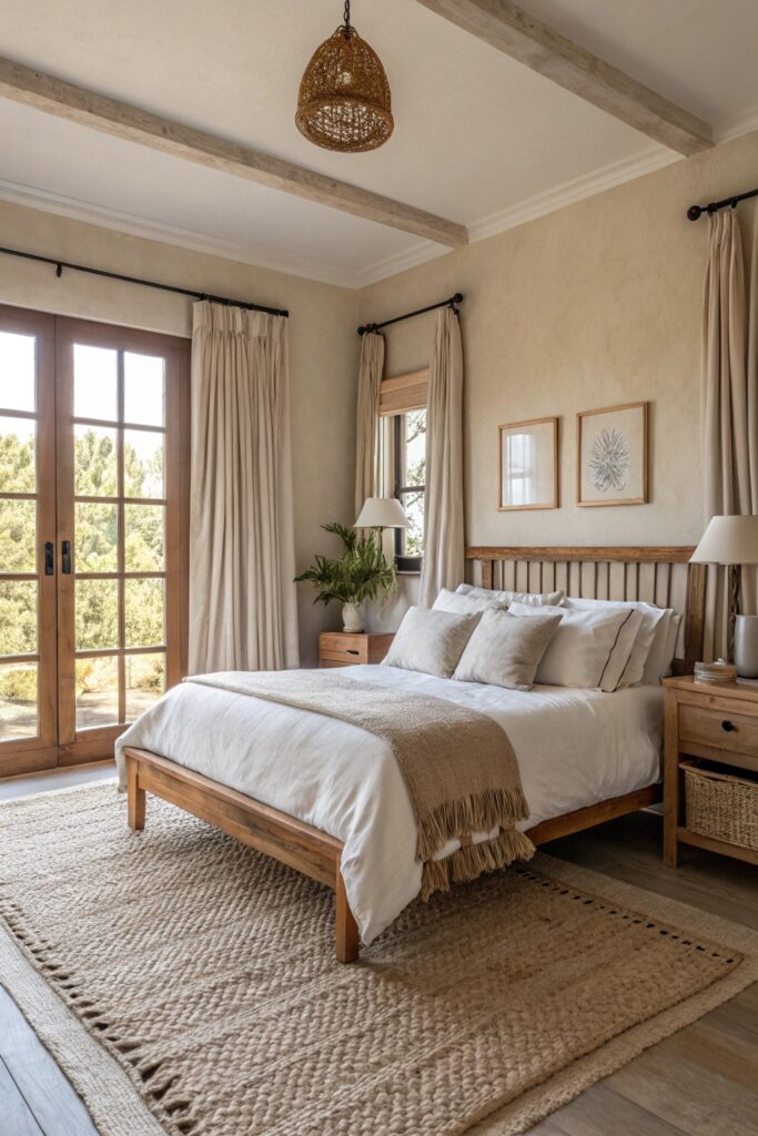
Both colors in the LRV 60 to 75 range keep the room bright while still feeling warmer than a stark white. Check the beige’s undertone — pink, yellow, or green — against your existing flooring before committing, since a mismatched undertone is one of the more common paint regrets.
2. Deep Navy and Crisp White
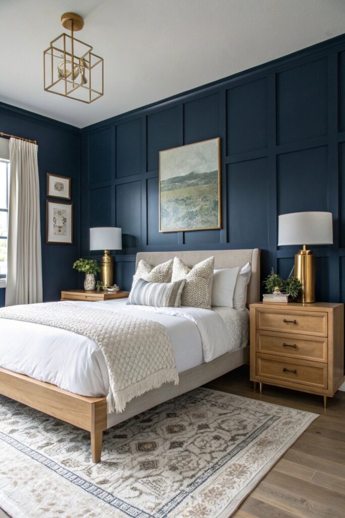
Navy typically has an LRV under 10, which means it usually needs two to three coats to cover evenly and can show roller marks more than lighter colors. Using it on a single accent wall rather than all four walls keeps a smaller bedroom from feeling closed in.
3. Sage Green and Cream
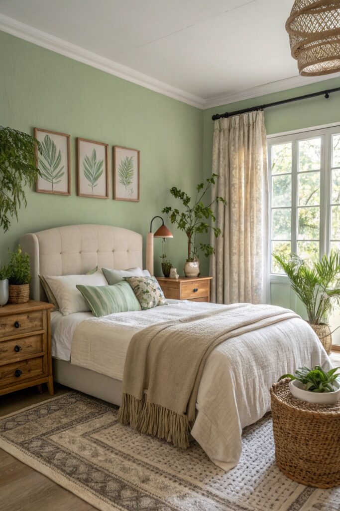
Sage is a desaturated green with an undertone that can lean gray or yellow depending on the specific formula — test it in the room’s actual light rather than under store lighting, since green shifts more noticeably between warm and cool light sources than most colors.
4. Charcoal Gray and Soft Blush
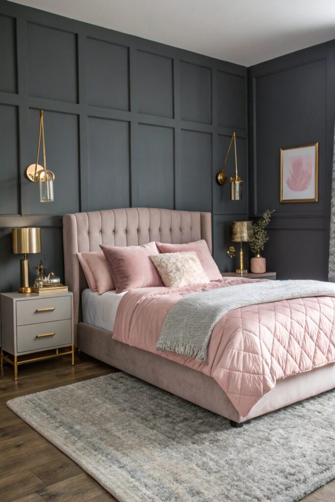
Charcoal absorbs a significant amount of light, with an LRV often under 15, so the room typically needs more artificial lighting to compensate. Keeping blush to roughly 20 to 30 percent of the room — bedding and accents rather than walls — avoids an overly saccharine result.
5. Warm Terracotta and Sand
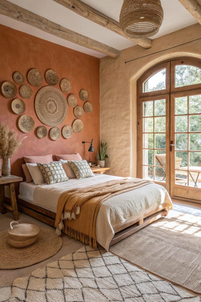
Terracotta’s orange-red undertone pairs naturally with warm wood tones but can clash with cool-toned grays, so it’s worth checking against any existing furniture with a gray or silver finish before committing to this palette.
6. Dusty Blue and Light Gray
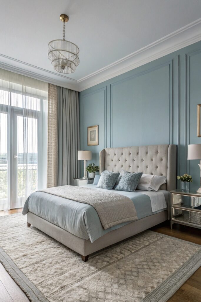
Both colors sitting in a moderate LRV range, roughly 40 to 55, creates a calming effect without going as dark as navy or charcoal, which is part of why this pairing shows up often in bedroom-specific palettes.
7. Olive Green and Warm Wood
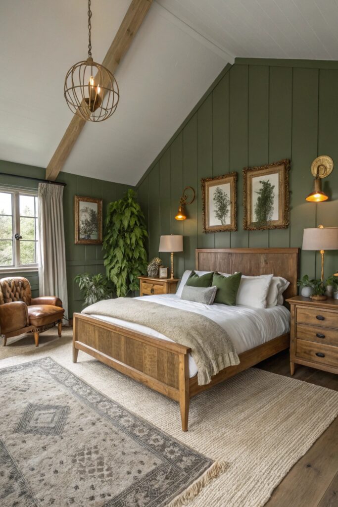
Olive’s muted, warm undertone pairs better with brass or warm wood hardware than with chrome or silver finishes, which tend to look slightly cold against this specific green.
8. Cream and Gold Accents
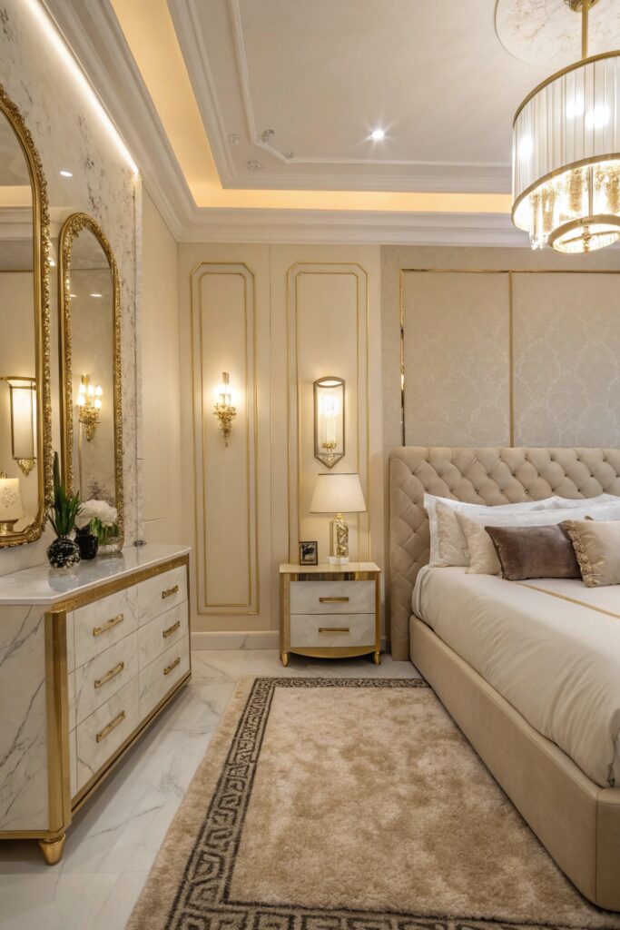
Keeping metallic gold accents to roughly 10 percent of the room’s visual elements — a mirror frame, a lamp base — prevents the space from tipping into feeling overly ornate. Unlacquered brass develops a natural patina over time, while lacquered gold-tone finishes stay uniformly shiny.
9. Forest Green and Beige
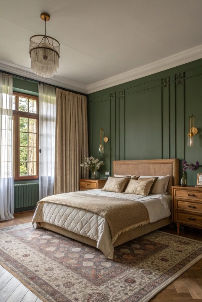
Deep forest green has a low LRV similar to navy, so pairing it with a lighter beige or cream trim helps define the room’s edges and keeps it from reading as a single dark cave-like space.
10. Lavender and Soft White
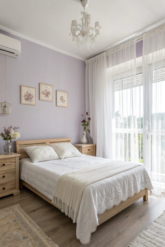
A desaturated, dusty lavender reads as more sophisticated than a brighter purple. Cooler artificial lighting can push lavender toward looking more gray or blue than it does in natural daylight, which is worth checking if the room is used mostly in the evening.
11. Taupe and Warm Ivory
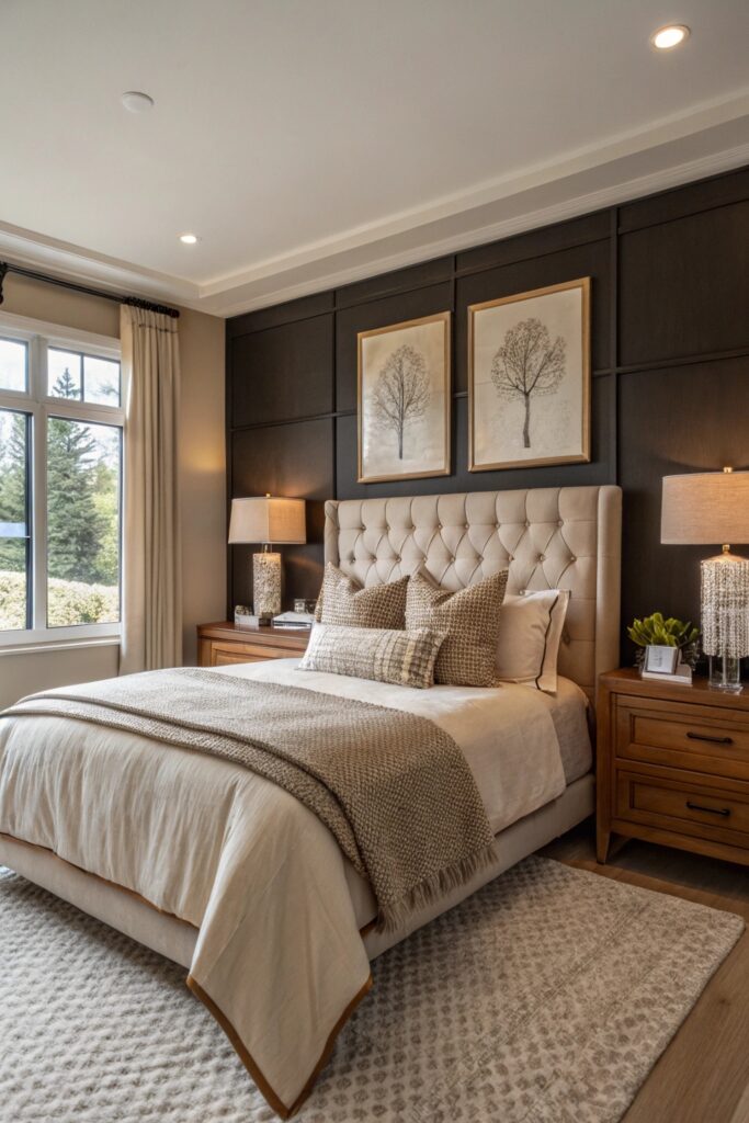
Taupe’s undertone can lean pink, gray, or green depending on the specific formula, and testing a large sample against your actual lighting matters more here than with most other neutrals, since taupe is notorious for reading differently than expected once on the wall.
12. Black and Warm Wood
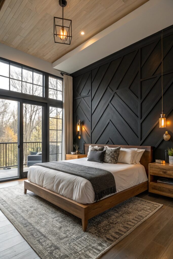
Black has close to a 0 LRV, absorbing nearly all light that hits it, so it works best as a single accent wall rather than full room coverage in most bedrooms. Pairing it with warm wood tones and adequate lighting keeps the room from feeling smaller and darker than intended.
13. Sky Blue and White
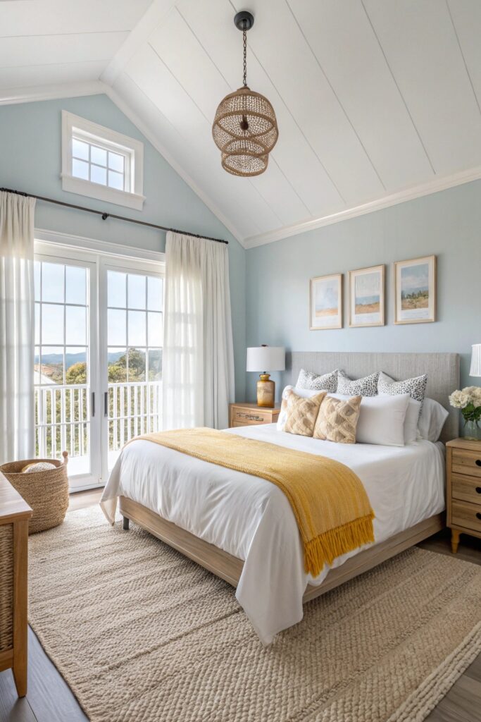
Both colors sitting above LRV 70 creates one of the brightest, airiest combinations on this list, well suited to a room that wants to feel open rather than cozy in the traditional sense.
14. Warm Gray and Mustard Yellow
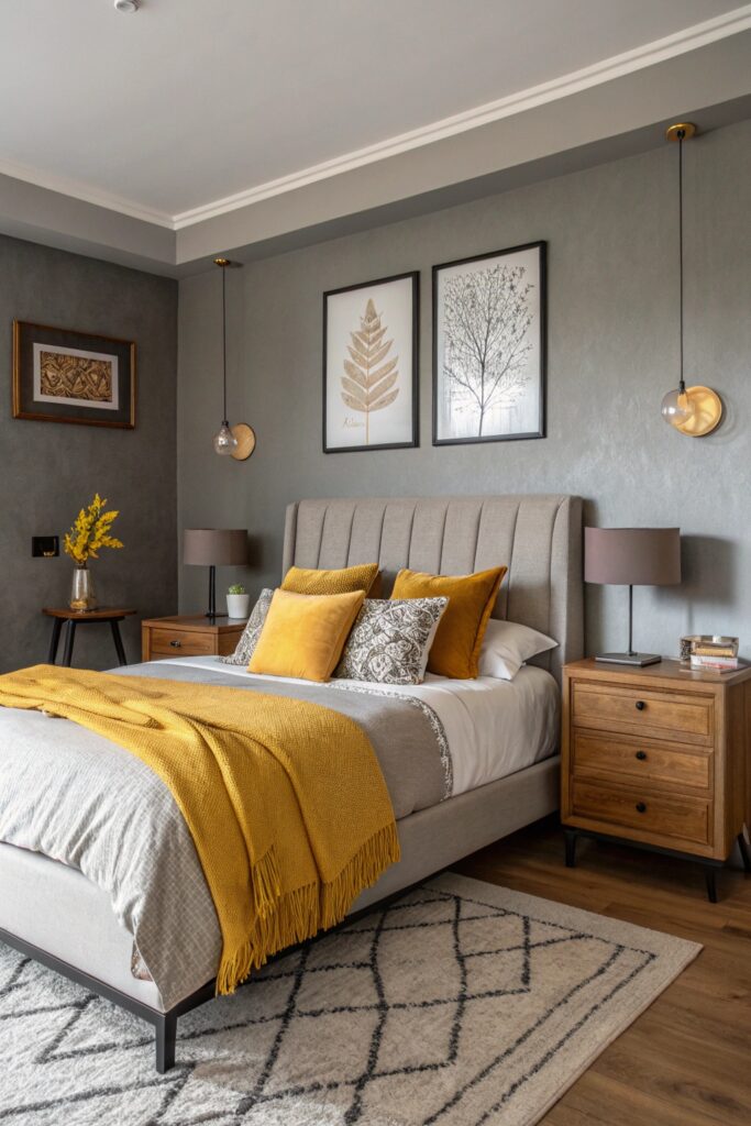
Mustard is saturated enough to work best as an accent — roughly 10 to 20 percent of the room — rather than a dominant wall color. Confirm the gray’s undertone is actually warm rather than cool, since a cool gray fights against mustard’s warmth instead of complementing it.
Choosing a Sheen for Bedroom Walls
Matte and eggshell finishes are the most common choices for bedroom walls, since they hide minor surface imperfections better than satin or semi-gloss. A slightly higher sheen, like satin, holds up better to occasional cleaning if the room sees heavy use, though it will show more of the wall’s underlying texture and any patching work.
What a Repaint Costs
A DIY repaint of a standard bedroom typically costs $100 to $300 in paint and supplies.
Hiring a professional painter runs considerably higher, often $400 to $1,000 depending on room size, ceiling height, and how much prep work — patching, priming over a dark existing color — the walls need first.
Priming matters more than most people expect when switching between very light and very dark colors — going from a pale wall to navy or black without a tinted primer often means three or more topcoats to fully hide the previous color, while a gray-tinted primer designed for dark colors can cut that down to two.
Test Colors Under Your Room’s Actual Light
A north-facing room gets cooler, bluer natural light throughout the day, while a south-facing room gets warmer light — the same paint color can look noticeably different between the two. Painting a large sample swatch and viewing it at different times of day, rather than relying on the paint chip alone, catches these shifts before they become a full-room mistake. This matters more for saturated or dark colors like navy, forest green, or black, where the difference between how a color looks in the store and how it looks on your actual wall tends to be more pronounced.