12 Shelf Decor Ideas for Wall Shelves That Never Look Cluttered
Introduction
Shelf Decor Ideas for Wall Shelves have a sneaky way of starting beautiful and slowly becoming a graveyard for everything you don’t know where else to put. One day it’s a curated display of your favorite things — the next it’s holding a random candle, three unopened pieces of mail, and a phone charger that somehow migrated up there. Sound familiar?
have a sneaky way of starting beautiful and slowly becoming a graveyard for everything you don’t know where else to put. One day it’s a curated display of your favorite things — the next it’s holding a random candle, three unopened pieces of mail, and a phone charger that somehow migrated up there. Sound familiar?
I’ve been styling wall shelves Decor Ideas for years, and the cluttered shelf problem is genuinely one of the most common decorating frustrations people deal with. The good news is that it’s entirely fixable with a few clear principles and some intentional choices.
Here are 12 shelf decor ideas that keep your wall shelves looking clean, styled, and clutter-free — no matter how much personality you want to pack into them.
1. The Rule of Three for Object Grouping
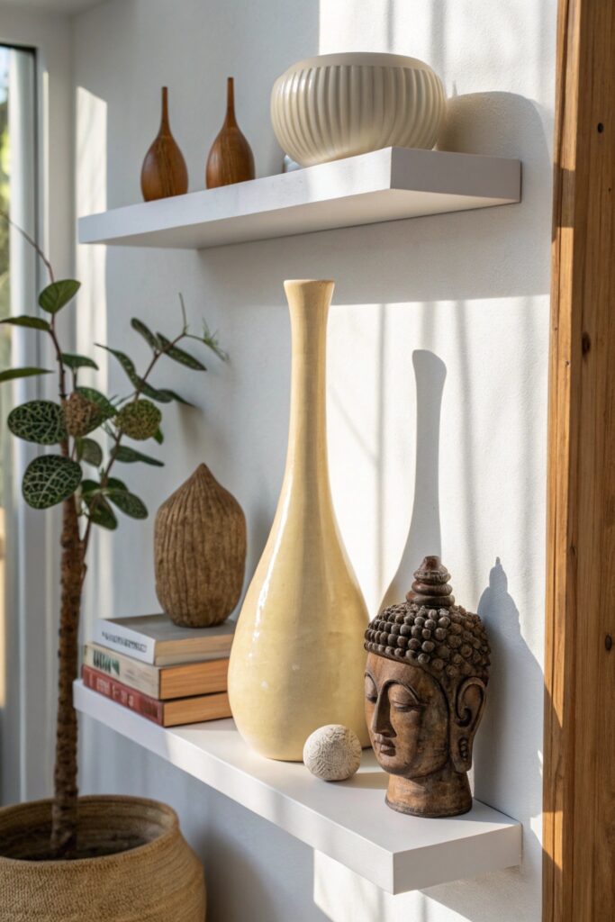
If you take nothing else from this article, take this — the rule of three is the single most powerful tool in shelf styling. Grouping objects in threes creates natural visual balance that feels complete without feeling crowded. Two objects look like a pair waiting for a third. Four objects start to crowd. Three objects hit the sweet spot every single time, and professional stylists use this rule constantly.
The reason three works comes down to how the eye moves. With three objects of varying heights, your eye travels from the tallest point down through the middle height to the shortest, creating a satisfying visual journey that feels resolved rather than arbitrary.
How to apply the rule of three on wall shelves:
- Vary heights dramatically within each group — tall, medium, and short creates the most dynamic trio
- Mix materials within the group — ceramic next to wood next to metal reads as collected rather than matched
- Various shapes — a round object next to a rectangular one next to something organic creates visual interest
- Keep some negative space around each grouping — the space between groups is as important as the objects themselves
Never fill every inch of a wall shelf. The space you leave is not wasted space — it’s active visual breathing room that makes everything on the shelf look more intentional and considered. IMO, removing two objects from an overcrowded shelf does more for its appearance than adding anything new ever could.
2. Books as Both Function and Decoration
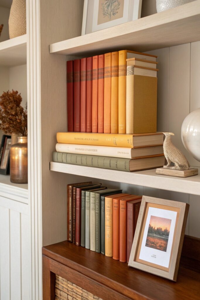
Books on wall shelves pull double duty better than almost any other object — they provide genuine storage value while functioning as incredibly versatile decorating tools. The key is treating your books as visual elements rather than just content containers, which means thinking about how they look on the shelf as much as what’s inside them.
The difference between books that make a shelf look cluttered and books that make a shelf look styled comes down almost entirely to how you arrange them and what you mix them with.
Book arrangement strategies that eliminate shelf clutter:
- Alternate vertical and horizontal stacking — a run of upright books followed by a horizontal stack creates rhythm and variation
- Color coordinate by spine — grouping books by spine color creates a clean, gallery-like effect even on a full shelf
- Remove dust jackets from hardcovers to reveal the often more beautiful cloth binding underneath
- Face select books outward, showing their covers — this works especially well with beautiful coffee table books
- Use horizontal book stacks as risers for small objects placed on top, creating natural height variation
Mixing books with non-book objects is what separates a styled bookshelf from a purely functional one. A small plant, a ceramic sculpture, or a framed photo tucked between book sections breaks the uniformity and creates a shelf that looks curated rather than simply loaded with reading material.
3. Incorporate One Trailing Plant Per Shelf
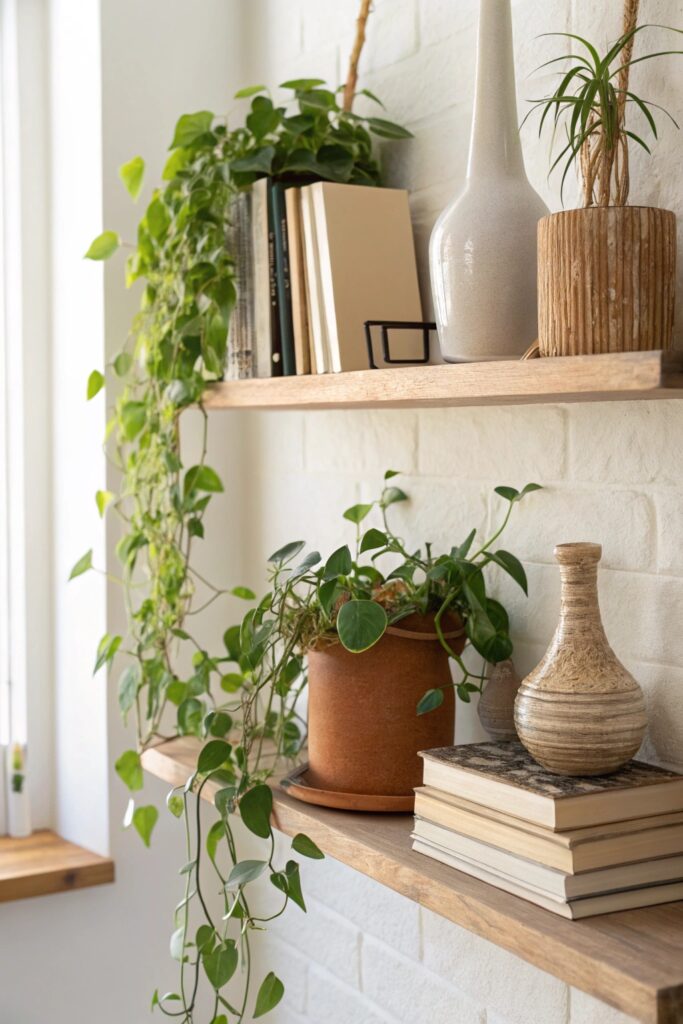
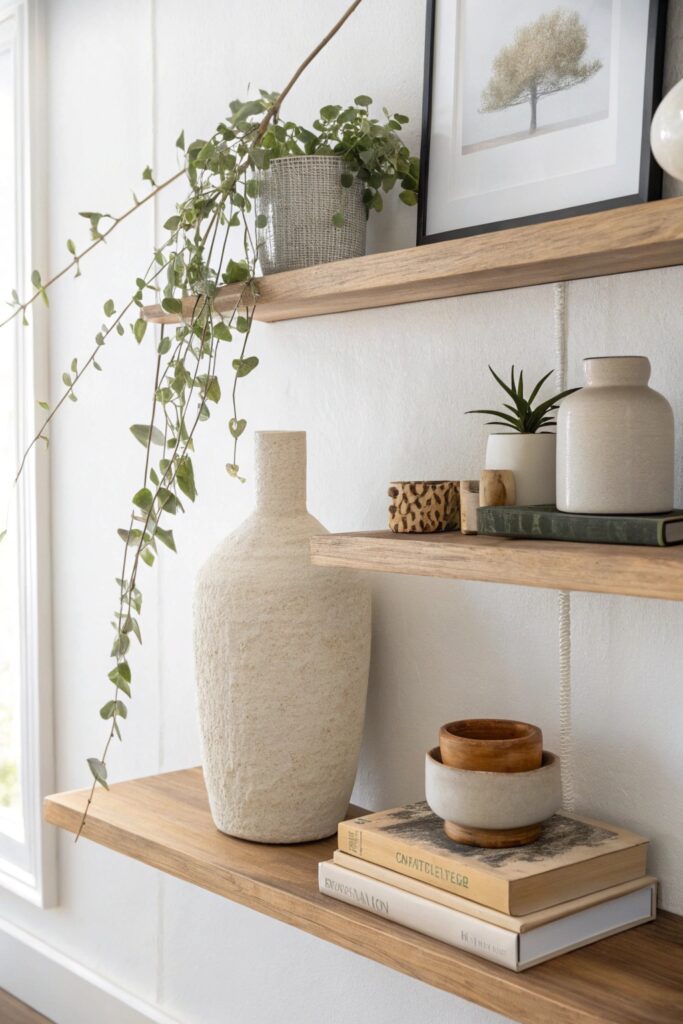
A trailing plant on a wall shelf does something no decorative object can replicate — it softens edges, adds movement, and brings the kind of living organic quality that makes a space feel genuinely inhabited rather than staged. A single trailing plant per shelf is the styling addition that transforms good shelves into great ones, and it works in virtually every aesthetic from minimalist to maximalist.
Pothos, string of hearts, string of pearls, and ivy are the most reliable trailing plants for shelf styling because they grow enthusiastically, tolerate a range of light conditions, and trail in a naturally graceful way that looks intentional rather than scraggly.
Making trailing plants work on wall shelves:
- Position at the outer edge of the shelf so trailing vines fall naturally downward
- Use a beautiful pot that coordinates with your shelf’s color palette — the pot is as visible as the plant
- Choose trailing length intentionally — longer trails create drama, shorter trailing works better on shelves with less vertical clearance below
- Group taller upright objects on the inner side of the shelf, letting the plant trail outward
- Mix one trailing plant with one upright plant on the same shelf for maximum organic variety
The trailing vine that falls below a shelf edge creates a natural visual connection between shelf levels, linking the whole shelving unit into a cohesive display rather than a series of separate horizontal surfaces. This connecting quality is genuinely hard to achieve with any non-plant object 🙂
4. Use a Consistent Color Palette Across All Shelves
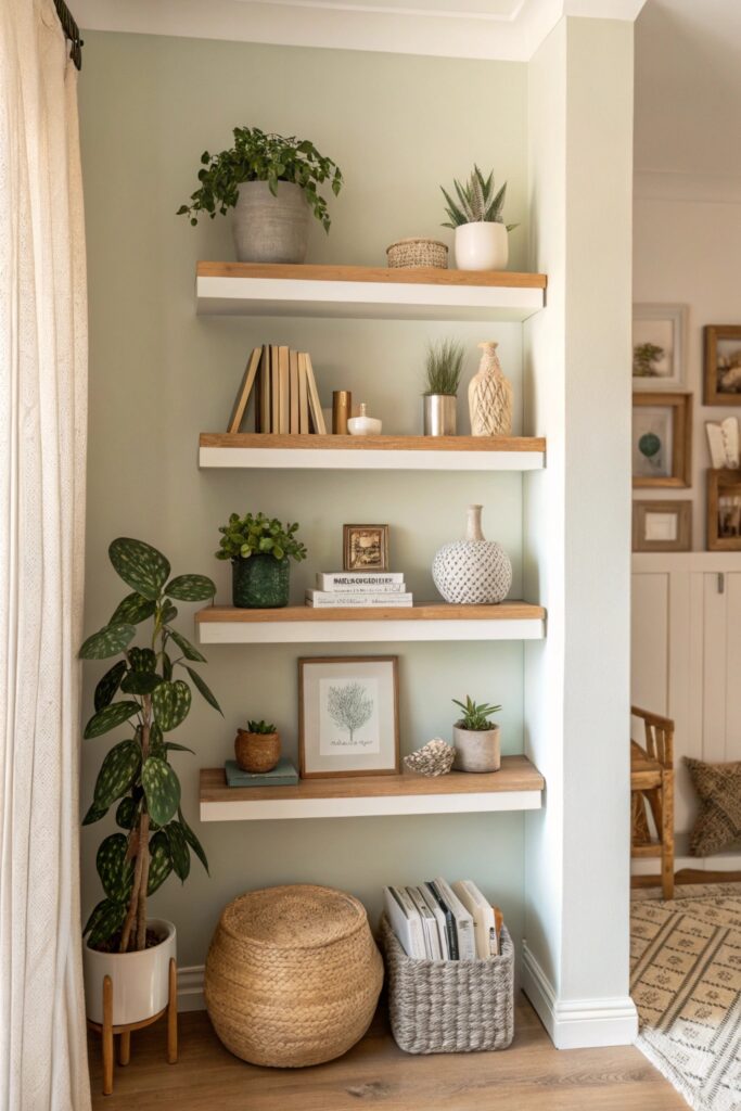
Nothing makes wall shelves look cluttered faster than a completely random color situation — every object a different hue with no relationship to anything else on the shelf. Committing to a consistent color palette across your entire shelving display is the organizational framework that makes everything feel intentional, even when the objects themselves are wildly varied in shape, size, and material.
You don’t need to be rigid about this — a palette of three to four colors with one neutral gives you enormous flexibility while maintaining the visual cohesion that prevents clutter.
Building a shelf color palette that works:
- Choose one dominant neutral — white, cream, natural wood, or black anchors the whole display
- Add two accent colors that appear throughout the shelving in varying proportions
- Allow one wildcard color for a single statement piece per shelf — this creates interest without chaos
- Coordinate book spine colors with your chosen palette where possible — this makes a bigger visual difference than most people expect
- Let your wall color influence your palette — objects that contrast slightly with the wall read more clearly than those that disappear into it
Editing for color is as important as editing for quantity. When you bring a new object onto your shelves, ask whether its color connects to your established palette before committing it to a spot. This one question prevents the gradual color drift that turns a cohesive shelf display into a visual free-for-all over time.
5. Create Visual Triangles with Object Placement
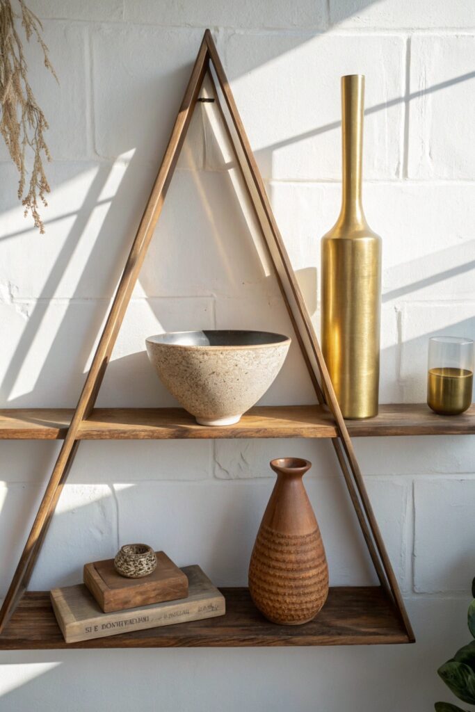
Arranging objects in triangular compositions is the technique professional stylists use to create balance and visual flow on wall shelves — and once you understand it, you’ll see it everywhere in well-styled interiors. A triangle composition places your tallest object at the apex and shorter objects at the two base points, creating an arrangement the eye naturally finds satisfying and complete.
This principle works on individual shelves and across an entire shelving unit — you can create micro-triangles within each shelf and a macro-triangle across all shelves simultaneously.
Applying triangular composition to wall shelf styling:
- Identify your tallest object on each shelf and position it slightly off-center as the triangle’s peak
- Place medium-height objects at the sides and slightly forward from the tall piece
- Position low objects at the outer points of the triangle, completing the base
- Repeat similar triangular rhythms across multiple shelves for a cohesive overall composition
- Use plants as flexible triangle points — their organic shapes fit naturally into compositions without looking forced
The off-center positioning of your tall object is what makes triangular shelf compositions look natural rather than formulaic. Dead-center tall objects create symmetry that feels static; slightly off-center placement creates tension and movement that keeps the eye engaged. Shift your tallest piece one-third of the way from either edge rather than placing it exactly in the middle.
6. Mix Textures Deliberately

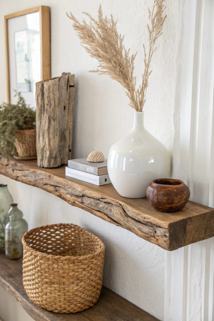
Deliberate texture mixing on wall shelves creates the kind of rich, layered visual experience that makes a display look professionally curated rather than randomly assembled. A shelf that contains only smooth ceramic objects reads as flat and one-dimensional. A shelf that mixes smooth ceramic with rough wood, woven natural fiber, reflective glass, and soft dried botanicals creates depth that rewards a closer look.
Texture is the design element that most amateur shelf stylists overlook because it’s less immediately obvious than color or shape — but it’s what separates truly beautiful shelves from merely tidy ones.
Texture combinations that consistently work well on wall shelves:
- Smooth ceramic + rough natural wood — the contrast between refined and raw is endlessly satisfying
- Woven rattan or grass basket + glossy glass vase — organic softness next to hard reflective surface
- Matte stone object + metallic accent — weight and warmth next to brightness and light reflection
- Dried botanical + smooth ceramic pot — delicate organic texture against clean manufactured form
- Linen-bound book + glazed ceramic sculpture — soft fabric texture next to smooth fired clay
FYI — texture variety is especially important on neutral-palette shelves where color isn’t doing the heavy visual lifting. When your shelf uses primarily whites, creams, and naturals, texture becomes the primary source of visual interest. A shelf of all-white objects with varied textures looks far more sophisticated than a shelf of varied colors with uniform texture.
7. Include One Mirror or Reflective Element
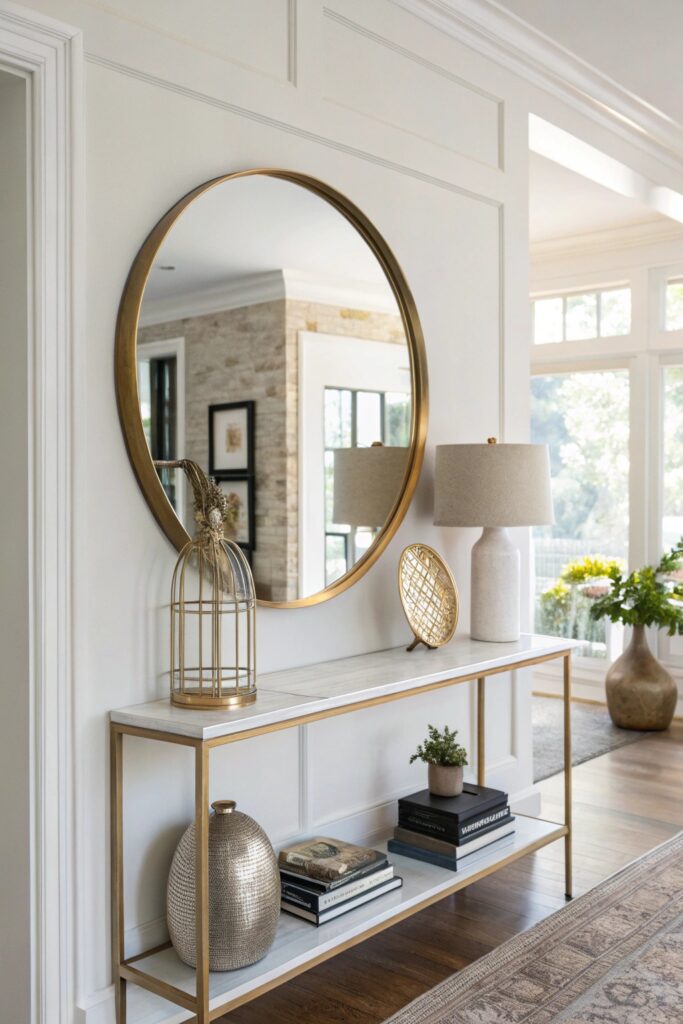
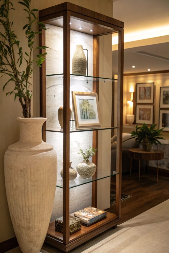
Adding a small mirror or reflective element to your wall shelf display achieves something genuinely clever — it visually expands the shelf space, bounces light around the display, and adds a layer of depth that makes the whole shelf feel larger and more dynamic. A small leaning mirror on a shelf creates the impression that the shelf continues beyond its physical boundaries.
Reflective elements work especially well on darker shelves or in rooms with limited natural light, where they actively improve the brightness and openness of the display.
Reflective elements that work beautifully on wall shelves:
- A small leaned mirror in a simple frame propped against the wall at the back of the shelf
- Mercury glass vase or object — the antique mirrored finish reflects light beautifully
- Metallic sculptural object in gold, silver, or copper catches and bounces light
- Glass dome or cloche over a small object — adds dimension and a subtle reflective quality
- Crystal or glass bookend — functional and reflective simultaneously
The leaned mirror approach works best on deeper shelves where there’s enough room for the mirror to stand without falling forward. For shallower wall shelves, a small metallic object or mercury glass piece delivers the reflective benefit without requiring the depth that a standing mirror needs. Choose your reflective element based on your shelf’s actual dimensions rather than what looks best in theory.
8. Layer Items Front to Back

Layering objects front to back on a wall shelf creates depth that makes a display look significantly more professional than objects lined up in a single flat row. Flat-row shelf styling is the most common mistake people make — everything at the same depth, all visible simultaneously, all competing equally for attention. Layering resolves this instantly.
When you place a larger object at the back of a shelf and smaller objects in front of it, you create a scene with foreground and background — the same compositional principle that makes photographs interesting rather than flat.
Layering techniques for wall shelf depth:
- Large vase or sculpture at the back with smaller objects positioned in front and around it
- Books as a back layer with decorative objects leaned against or positioned in front of the book spines
- Framed art leaned against the back with objects arranged in front — this creates a styled vignette effect
- Tall plant at the back with a trailing plant at the front edge — two plants at different depths and heights
- Tray or board as a back element with objects clustered on and in front of it
The depth of your shelf determines how much layering is possible — deeper shelves allow three distinct layers, while standard floating shelves might only accommodate two. Work with what your shelf actually provides rather than forcing layers that don’t fit comfortably in the available space.
9. Use Negative Space as a Design Tool
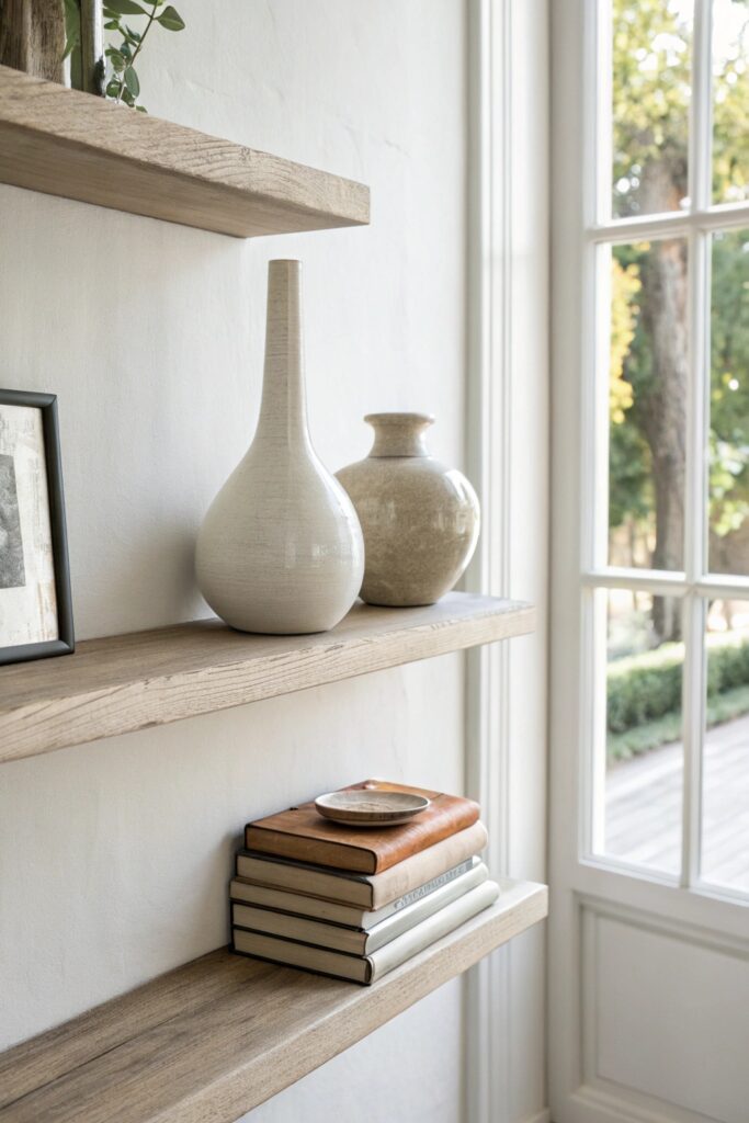
Negative space — the empty areas on your shelves — is not wasted real estate. It’s one of the most powerful tools in shelf styling, and treating it as an active design element rather than a failure to fill space is what separates cluttered shelves from clean ones. Professional stylists consistently leave more space than feels comfortable at first, because they understand that objects look better with room to breathe.
The psychological difficulty of leaving wall shelf space empty is real — it feels unfinished, like something is missing. Push through that feeling. What looks unfinished in person almost always photographs as intentional and sophisticated.
Using negative space strategically on wall shelves:
- Leave the ends of shelves empty rather than pushing objects to the edges — this creates a contained, intentional composition
- Space groupings apart rather than running objects continuously across the shelf
- Dedicate one shelf in a unit to minimal display — one or two objects maximum, rest empty
- Use the wall itself as part of the display — let visible wall space frame your objects
- Resist the urge to fill gaps created by removing objects — live with the space before filling it
The emptiest shelf in any shelving unit often becomes the visual anchor that makes the whole unit feel calm and organized rather than overwhelming. One shelf with a single beautiful object and generous negative space around it gives the eye a place to rest before moving through the more populated shelves above and below.
10. Style with Odd-Numbered Collections
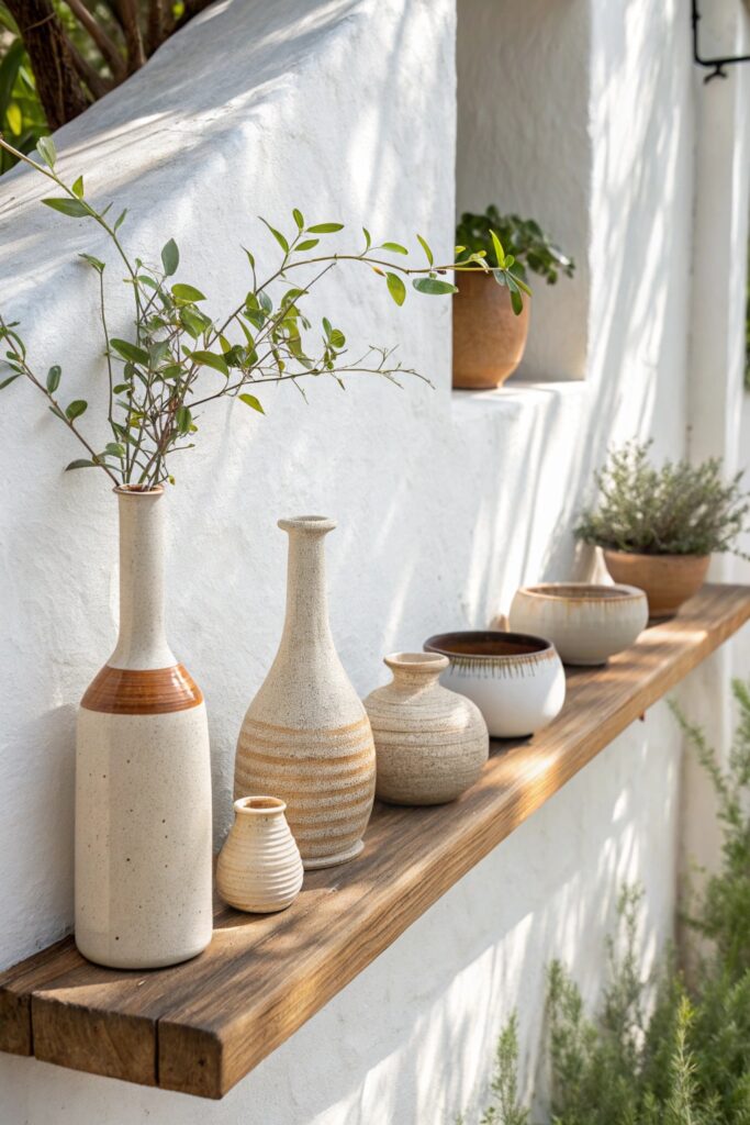
Odd-numbered collections always look more natural and visually interesting than even-numbered ones — and this applies as consistently on wall shelves as anywhere else in interior design. Groups of three, five, or seven objects create asymmetry that feels alive and dynamic, while groups of two, four, or six tend to feel static and overly balanced.
This is rooted in the same visual psychology that makes the rule of three work — the eye finds perfectly even arrangements resolved and slightly boring, while odd groupings create gentle tension that keeps attention engaged.
Applying odd-number styling to wall shelf collections:
- Group small ceramics in threes or fives rather than pairs — the visual rhythm immediately improves
- Display books in odd-numbered horizontal stacks — three books stacked horizontally read more naturally than two or four
- Create five-point arrangements across a longer shelf by treating the whole shelf as one composition with five key objects
- Use single objects as anchors — one dominant piece with a two-piece supporting group creates an odd total of three
- When styling multiple shelves, maintain odd numbers within each shelf independently, rather than trying to count across all shelves
The odd-number principle becomes most obvious when you break it. Style a shelf with two matching vases, then add one object beside them and notice how immediately the arrangement feels more resolved. That moment of recognition is genuinely satisfying — once you feel it, you’ll apply the odd-number principle automatically to every shelf you style from that point forward.
11. Introduce Varying Heights Consistently
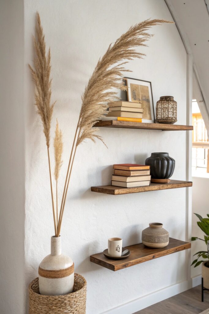
Consistent height variation across your wall shelves is the structural principle that makes shelves look styled rather than stored. When everything on a shelf sits at the same height — which happens naturally when you line up books of similar size or collections of matching objects — the display looks flat and monotonous regardless of how beautiful the individual pieces are.
Height variation creates the visual rhythm and movement that makes a shelf genuinely interesting to look at rather than just tidy.
Creating height variation on wall shelves:
- Combine tall vases with short bowls — the extreme contrast in height creates the most dramatic visual effect
- Use risers and platforms to elevate shorter objects to create artificial height differences
- Mix tall books standing upright with short horizontal stacks on the same shelf
- Include at least one very tall object and one very low object on each shelf for maximum range
- Let a trailing plant provide downward height extension below the shelf surface for added range
The ideal height range on a wall shelf runs from objects at approximately 80% of the shelf height down to objects at roughly 20-30% of the shelf height. That full range of tall to short creates the visual interest that makes a shelf look professionally styled — and it’s achievable with objects you likely already own through strategic rearrangement rather than new purchases.
12. Edit Ruthlessly and Regularly

The most important shelf decor idea on this entire list has nothing to do with what you add — it’s about editing ruthlessly and returning to your shelves regularly to remove what’s accumulated and restore the intentional styling you created. Every shelf drifts toward clutter over time. Things land there that shouldn’t. Dust gathers. Objects that once felt right start to feel tired. Regular editing keeps all of that in check.
Professional stylists don’t set and forget their displays — they revisit them seasonally, swapping pieces in and out and removing anything that no longer serves the overall aesthetic.
Building an editing habit for wall shelves:
- Schedule a quarterly shelf refresh — pull everything off, clean the shelf surface, and only return what genuinely earns its place
- Apply the one-in-one-out rule — adding a new object means removing an existing one to maintain the same visual density
- Photograph your shelves regularly — photos reveal clutter your eye learns to overlook in person
- Question everything that’s been there unchanged for over six months — familiarity breeds blindness to objects that have stopped contributing
- Rotate seasonal objects to keep shelves feeling fresh throughout the year without a complete overhaul
The ruthless edit is genuinely the most powerful shelf styling tool available because it costs nothing and produces immediate, visible results. Most cluttered shelves aren’t cluttered because of bad styling choices — they’re cluttered because of accumulated additions that were never consciously evaluated. Permit yourself to remove things freely, and your shelves will thank you every single time.
Conclusion
Great wall shelf styling comes down to a few consistent principles — vary your heights, group in odd numbers, mix your textures, embrace negative space, and edit regularly. None of these requires expensive objects or professional design training. They just require intentional choices made consistently over time.
Start with one shelf rather than trying to restyle everything at once. Apply the rule of three, introduce one trailing plant, and clear some negative space. Notice how quickly those three changes transform the whole shelf’s appearance.
Your wall shelves should tell your story clearly and beautifully — not archive everything that didn’t find a home elsewhere. Edit with confidence, style with intention, and let your shelves breathe 🙂