A wall collage’s success comes down to a unifying element — consistent framing, a shared color palette, or a common subject — that ties otherwise varied pieces together into something that reads as intentional rather than randomly assembled.
Below are 15 wall collage approaches, with practical notes for each.
1. Classic Grid Gallery Wall
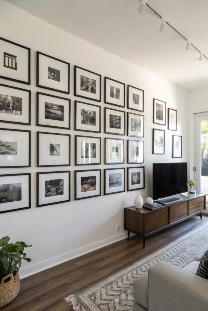
Identical frames arranged in a precise grid pattern creates a clean, orderly look that suits a more modern or minimalist room, relying on the frames’ uniformity rather than variety for its visual impact.
Keep spacing consistent (2-3 inches between frames) throughout the grid, since even small spacing variations become noticeable in a pattern this structured and repetitive.
2. Salon-Style Eclectic Mix
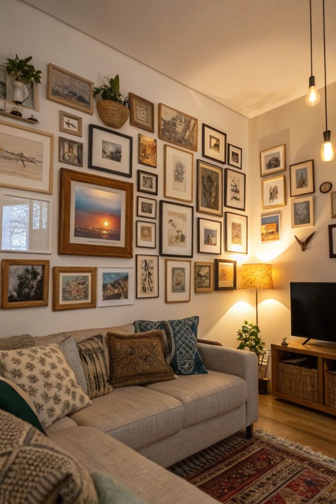
Mixing frame sizes, styles, and finishes in a denser, less structured arrangement creates a collected-over-time look that reads as genuinely personal rather than purchased as a matched set.
Start with the largest piece as an anchor and build outward from there, which is a more reliable approach than trying to place smaller pieces first and fitting the anchor piece around them.
3. Monochrome Photo Collection
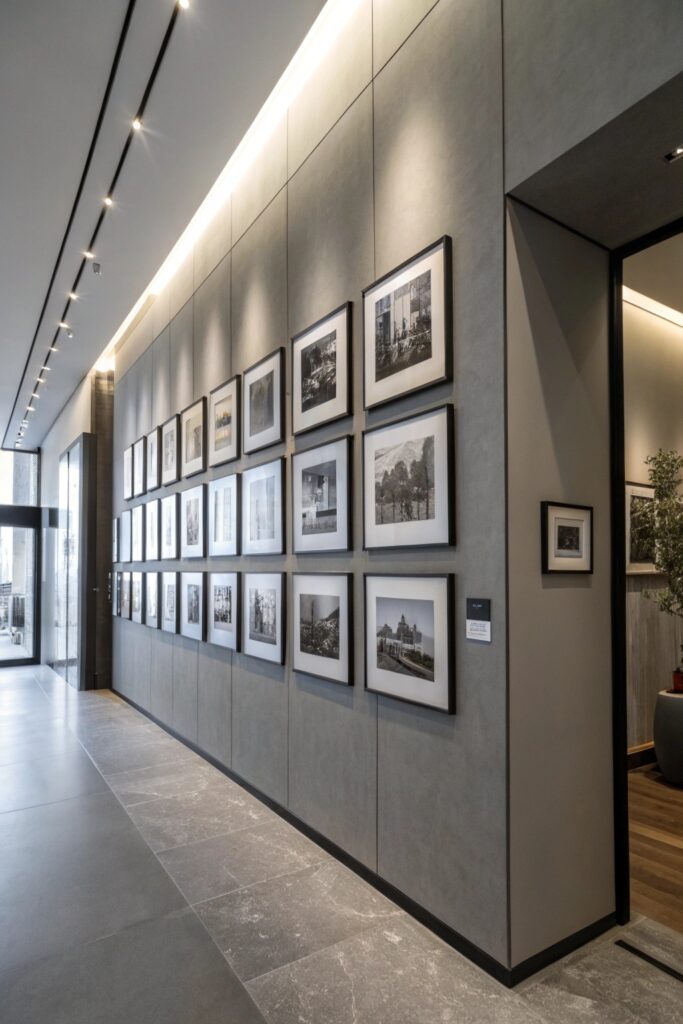
Black and white photos throughout a collage create visual cohesion despite varying subject matter, letting the consistent tone unify what might otherwise be a visually scattered mix of images.
This approach also simplifies frame shopping considerably, since you’re not trying to coordinate colors across a wide range of frame finishes and mat colors.
4. Mixed Media Wall
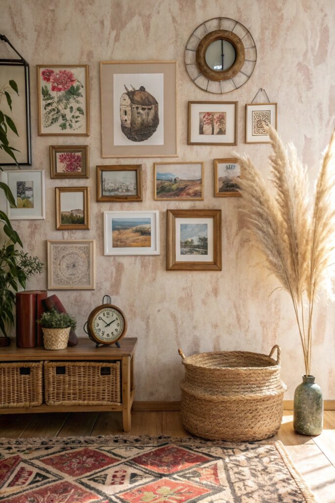
Combining framed prints with three-dimensional elements (a small shelf, a woven piece, a mirror) adds genuine texture and depth beyond what flat framed pieces alone provide.
Choose the shelf’s material and finish to complement rather than match the frames exactly, which keeps the combination feeling intentional rather than accidentally mismatched.
5. Symmetrical Mirror Collage
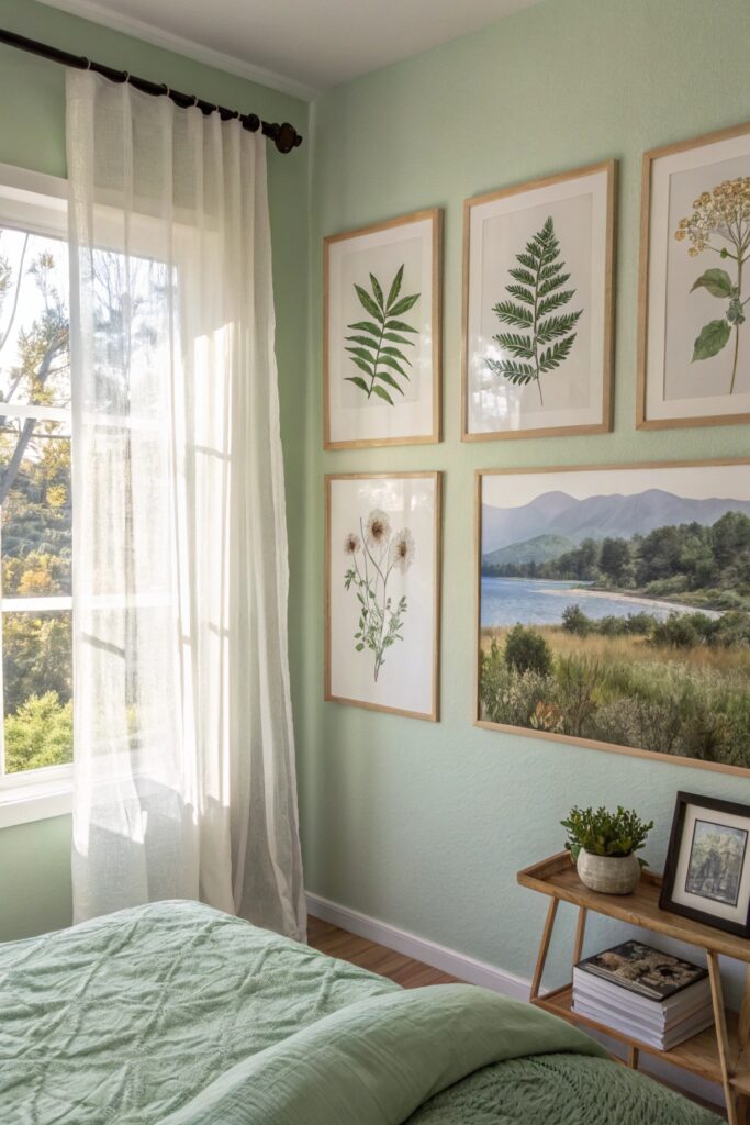
A cluster of small mirrors in matching or coordinated frames adds light-reflecting function to the collage format, working especially well in a room that could use more brightness.
Choose mirrors with a consistent frame finish even if the shapes vary slightly, which maintains cohesion despite the mix of sizes.
6. Family Photo Timeline
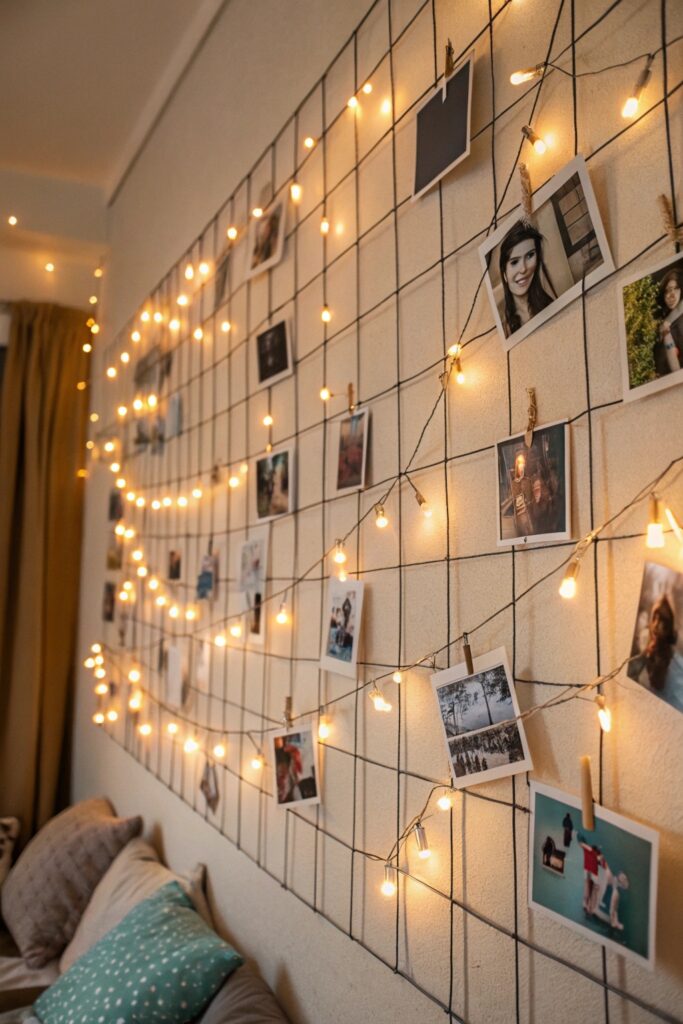
Arranging photos roughly chronologically creates a genuine visual narrative, working well in a hallway or stairwell where the sequential arrangement naturally guides movement through the space.
Leave room to add photos over time in a timeline format specifically, since this style is meant to grow rather than being completed all at once.
7. Botanical Print Collection
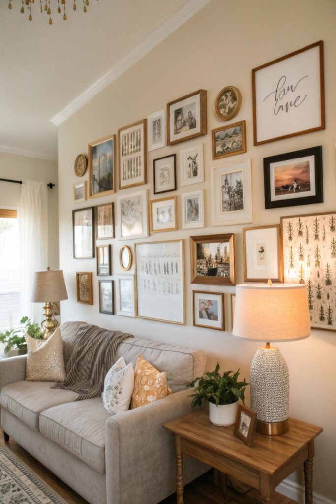
A themed collection of botanical illustrations or pressed-flower-style prints brings cohesive, nature-inspired content that works well in almost any room’s overall color palette.
Look for prints with a consistent illustration style (all botanical line drawings, for instance) rather than mixing illustration styles, which can undercut the collection’s overall cohesion.
8. Typography and Quote Wall
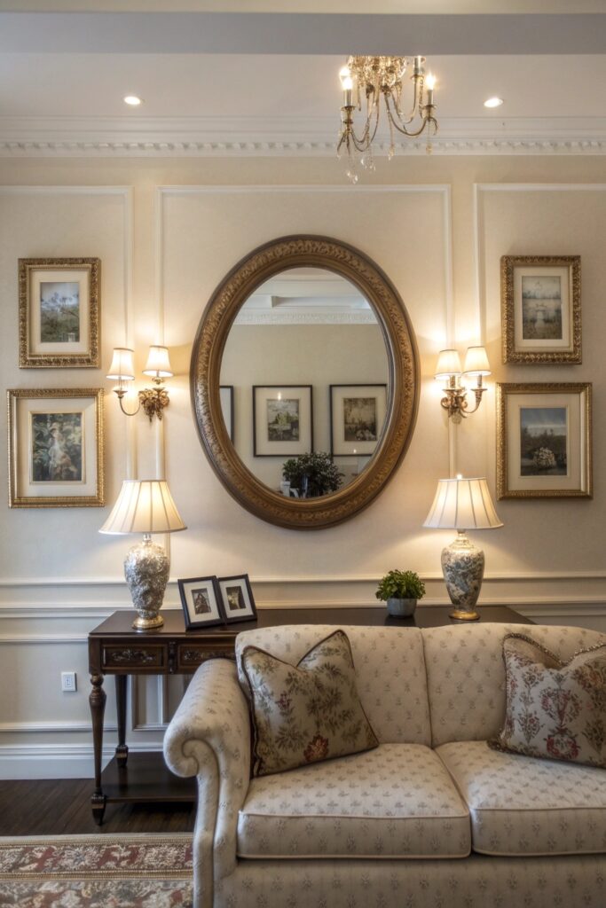
Mixing framed quotes or typography prints with photos or art adds a personal, narrative element that purely visual pieces don’t provide on their own.
Limit typography pieces to no more than a third of the total collage, which keeps the balance leaning toward visual interest rather than becoming primarily text-heavy.
9. Vintage Map Collage
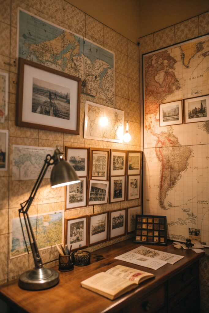
A cluster of vintage or vintage-look maps, particularly of meaningful locations, creates a genuinely personal collage with built-in visual cohesion through the shared map format.
Choose maps in a consistent color treatment (all sepia-toned, or all black and white) if using more than two or three, which prevents the collection from feeling visually scattered.
10. Shelf and Frame Combo
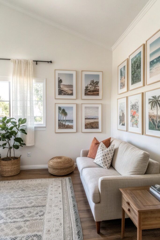
Combining a floating shelf with leaned or hung frames around it adds a functional display surface within the collage itself, letting objects and frames work together rather than frames alone.
This works particularly well in an entryway or home office, where the shelf portion also provides genuinely useful daily storage beyond the visual display.
11. Abstract Art Cluster
A grouping of abstract prints in a coordinated color palette creates visual interest without needing to coordinate specific subject matter, since abstract work reads as cohesive through color and form alone.
Choose prints from a consistent color family (all warm tones, or all cool blues) specifically, since abstract work depends more heavily on color cohesion than representational art does.
12. Postcard and Ticket Stub Wall
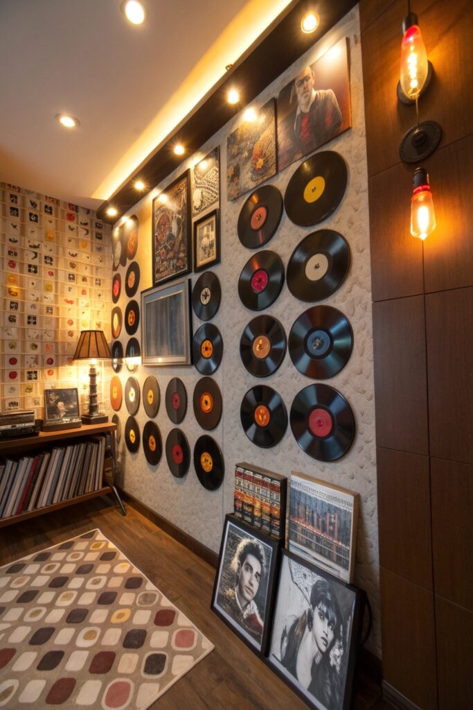
Displaying travel postcards, ticket stubs, and other small memorabilia in simple frames or a grid layout turns genuine keepsakes into a collage that tells a real personal story.
Simple black frames or a uniform grid layout work best for this specific application, letting the memorabilia itself carry the visual interest rather than competing with elaborate framing.
13. Circular Frame Arrangement
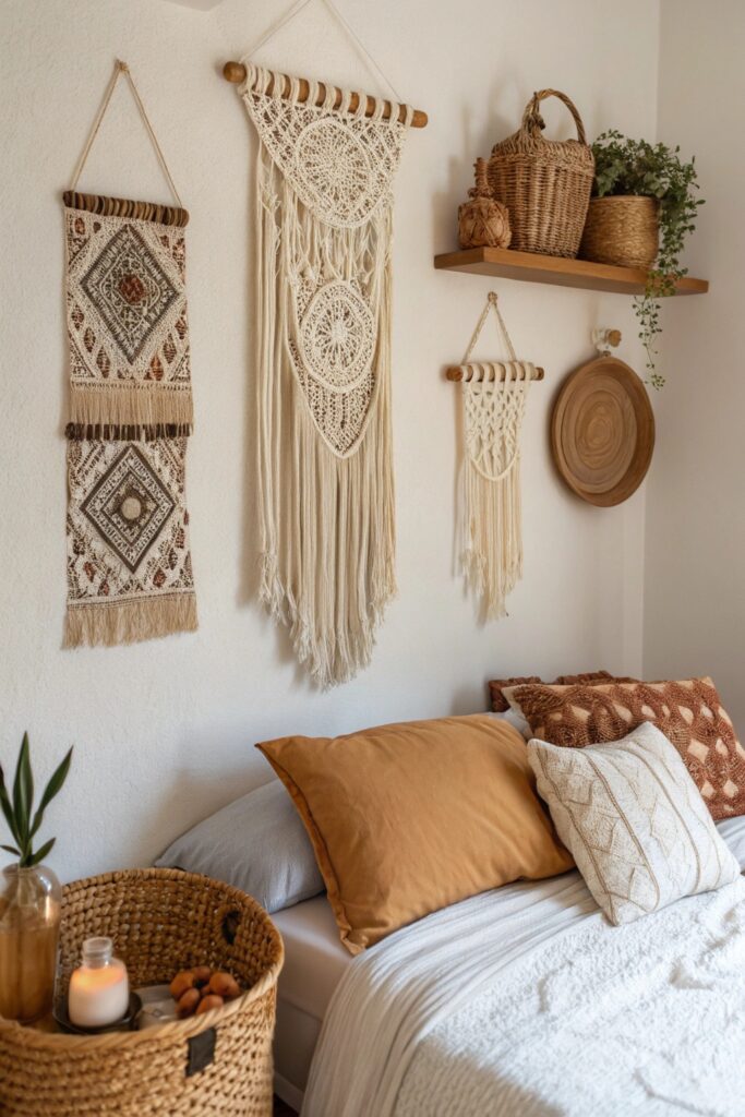
Round frames, either uniform or in varying sizes, add a softer geometric shape that stands out against a room otherwise dominated by rectangular furniture and windows.
Mix frame sizes within the circular shapes for more visual interest than a uniform-size arrangement would provide.
14. Kids’ Artwork Rotation Wall
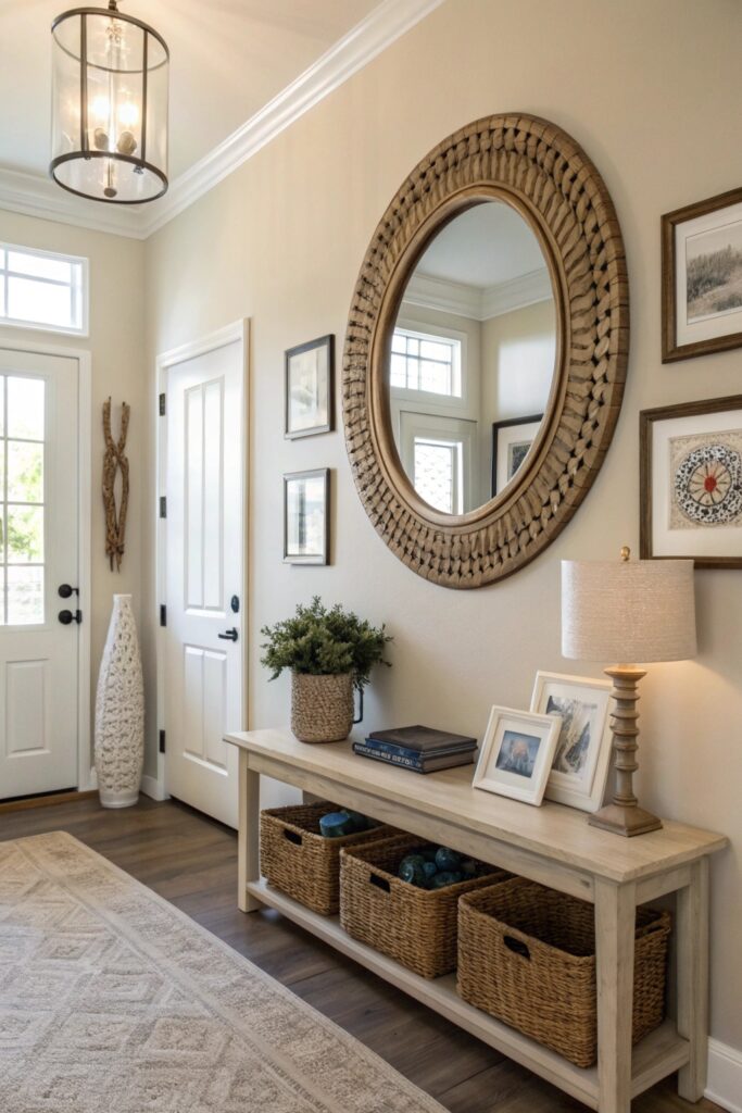
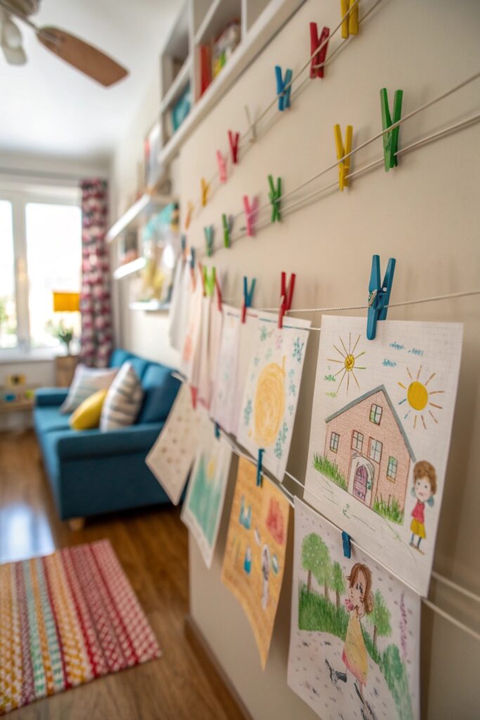
A dedicated collage space with simple clip frames or a wire-and-clip system lets children’s artwork be displayed and easily rotated as new pieces come home, without needing to reframe anything.
A simple wire-and-clip system costs very little and makes swapping artwork a genuinely quick process, which matters for a rotation wall meant to change regularly.
15. Neon and Statement Piece Collage
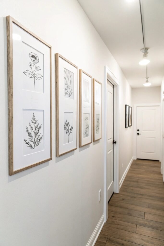
Combining a bold neon or LED sign with framed art creates genuine contrast and a focal point that a fully framed, traditional collage doesn’t achieve on its own.
Keep the neon piece as the clear focal point, with supporting framed pieces noticeably smaller, so the arrangement doesn’t compete for the same visual weight.
How to Actually Plan Your Collage
Lay out the full arrangement on the floor before hanging anything, which lets you adjust spacing and composition without repeatedly patching nail holes in the wall.
Cut paper templates matching each frame’s dimensions and tape them to the wall first, giving you a genuine preview of the final arrangement’s scale and spacing before committing to actual hardware.
Final Thoughts
Planning the layout before hanging anything matters more than any specific style choice, since even a well-conceived collage concept can look disorganized if the spacing and composition weren’t tested first. Choose one unifying element (frame color, photo tone, subject matter) and let that consistency do the work of tying a varied collection together.