
Styled wall shelves depend more on a handful of consistent design principles — grouping, height variation, genuine negative space — than on any specific decorative object, which is why the same techniques work across nearly any room or style.
Below are 12 principles for styling shelves that stay looking intentional, with practical notes for each.
1. The Rule of Three for Object Grouping
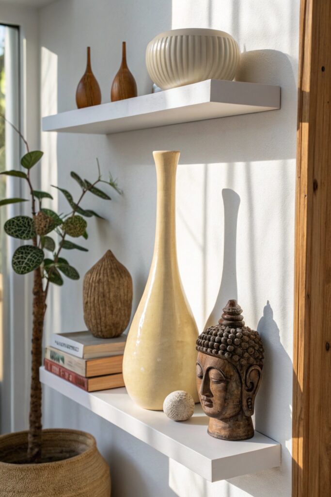
Clusters of three objects read as more intentionally arranged than paired, even-numbered groupings, a principle that applies to wall shelf styling as consistently as any other display surface.
This works whether you’re grouping candles, small vases, or decorative objects — the odd-number principle holds regardless of what specific items are being displayed.
2. Books as Both Function and Decoration
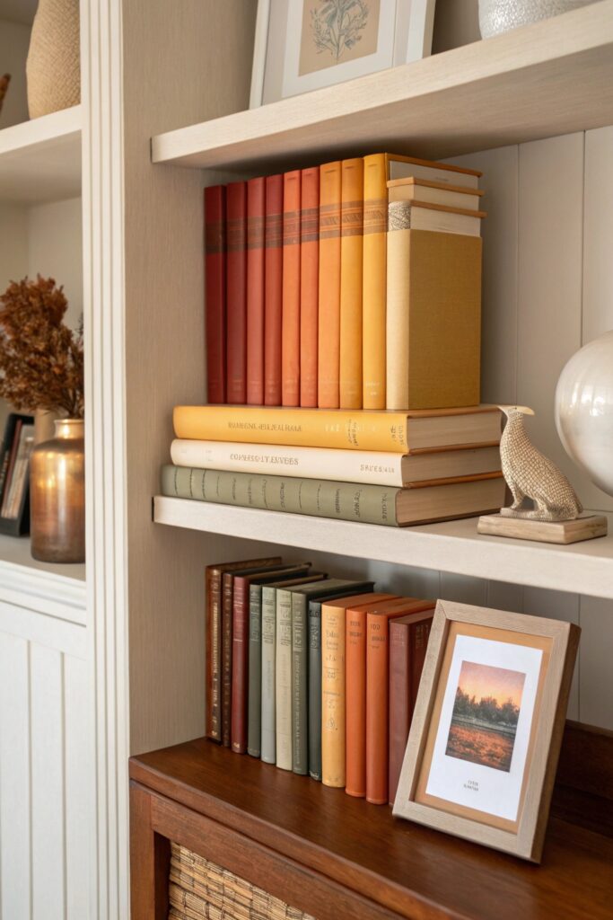
Books arranged both upright and stacked horizontally add genuine height variation and a collected feel that purely decorative objects alone don’t provide.
Mixing book orientations (some stacked flat, one or two standing) adds more visual interest than a uniform row of upright spines.
3. Incorporate One Trailing Plant Per Shelf
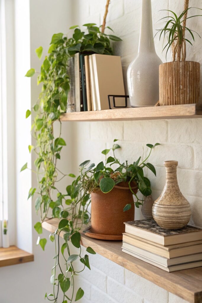
A single trailing plant (real or faux) adds organic movement that breaks up the shelf’s otherwise straight horizontal line, softening the overall display.
Faux trailing plants have become convincing enough at normal viewing distance to be a genuinely reasonable choice for anyone without reliable natural light near the shelf.
4. Use a Consistent Color Palette Across All Shelves
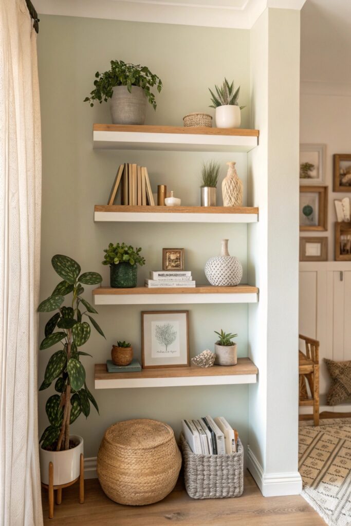
Limiting displayed items to 2-3 coordinated colors across every shelf keeps a multi-shelf display from reading as visually busy, which matters more here than on a single surface.
This doesn’t require replacing existing items — grouping the more visually coordinated pieces toward the front while keeping mismatched items toward the back achieves a similar cohesive effect.
5. Create Visual Triangles with Object Placement
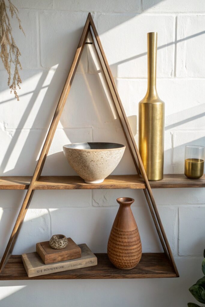
Arranging objects so their heights form a rough triangle (tall, medium, short) creates a more dynamic composition than a flat, uniform-height row.
A taller item (a vase, a small plant) anchoring one end with shorter objects graduating toward the other end is a reliable, easy-to-execute version of this technique.
6. Mix Textures Deliberately
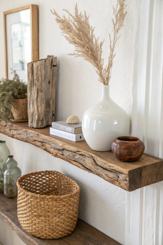
Combining smooth ceramic, woven baskets, and matte wood adds tactile variety that a single-material display can’t achieve, even within a genuinely limited color palette.
Aim for at least two distinct textures within any single grouping, which reads as more considered than a shelf of uniformly smooth or uniformly matte objects.
7. Include One Mirror or Reflective Element
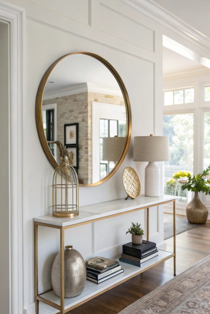
A small mirror or glass object adds genuine light-bouncing benefit to a shelf display, working especially well on a shelf that doesn’t receive direct natural light.
Position the mirror to reflect a window or light source specifically when possible, which maximizes the light-bouncing benefit rather than simply reflecting a wall.
8. Layer Items Front to Back
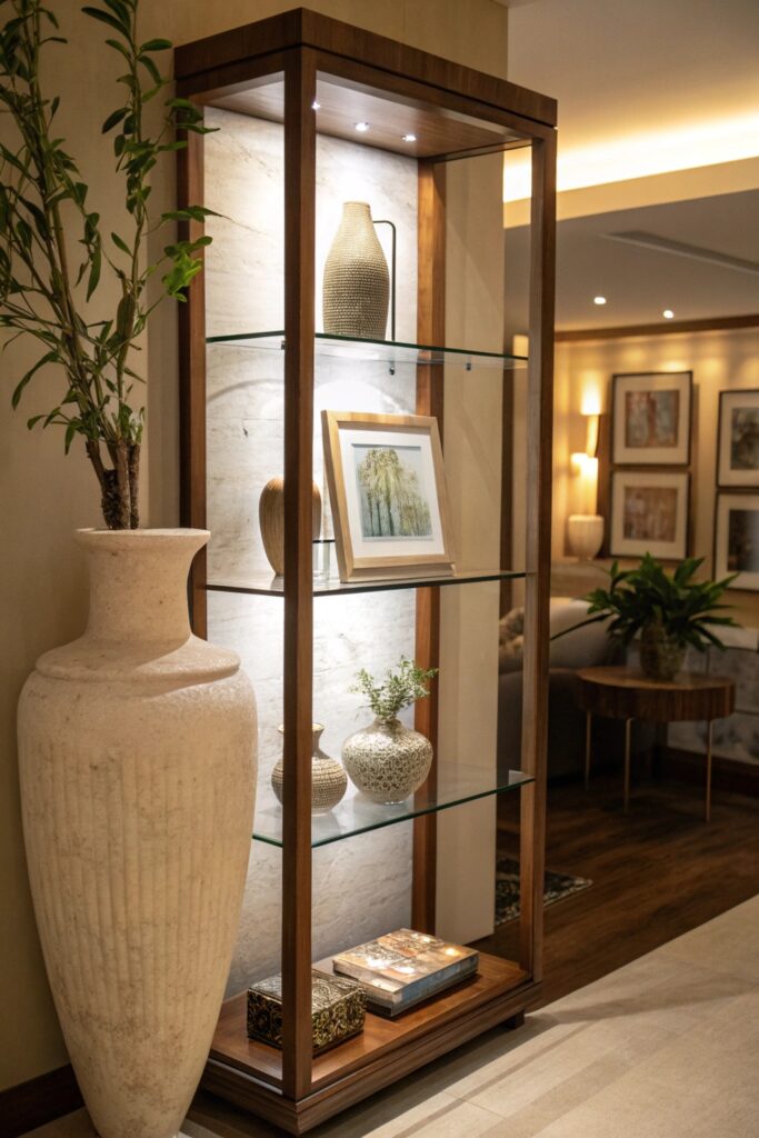
Placing a taller item behind a shorter one, rather than lining everything up in a single row, creates genuine depth that a flat arrangement doesn’t achieve.
This technique works particularly well with objects of varying depths, letting the shelf’s own physical depth do genuine visual work beyond a flat, single-layer arrangement.
9. Use Negative Space as a Design Tool
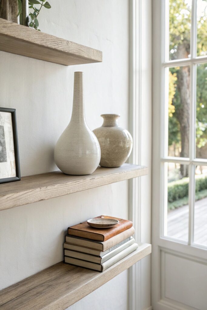
Leaving genuine empty space between grouped items is what separates a styled shelf from one that simply accumulated objects over time, and this restraint matters more than any specific object choice.
Aim for shelving that’s roughly 70% empty rather than fully stocked, which is a useful rule of thumb for keeping open storage from tipping into visual clutter.
10. Style with Odd-Numbered Collections
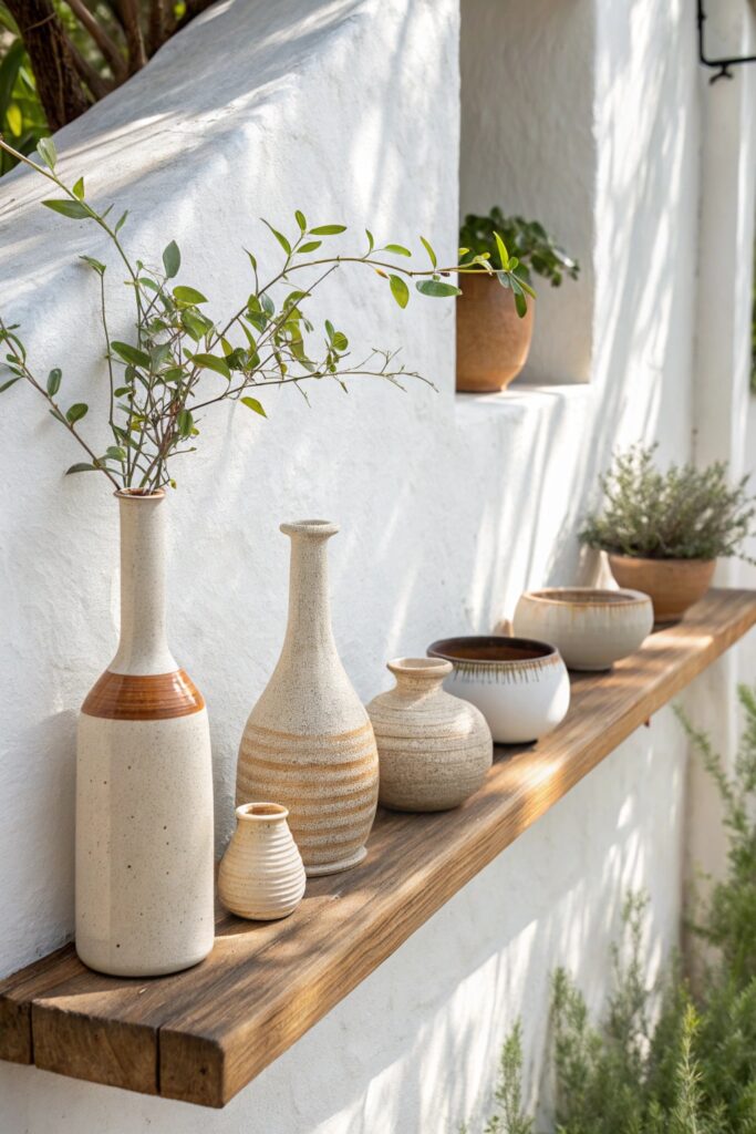
Beyond the basic rule of three, larger odd-numbered groupings (five, seven) continue to read as more naturally arranged than even-numbered clusters as a shelf display grows more complex.
Vary the specific objects within an odd-numbered collection slightly (different heights, slightly different shapes) rather than using fully identical pieces, which reads as more collected than purchased as a set.
11. Introduce Varying Heights Consistently
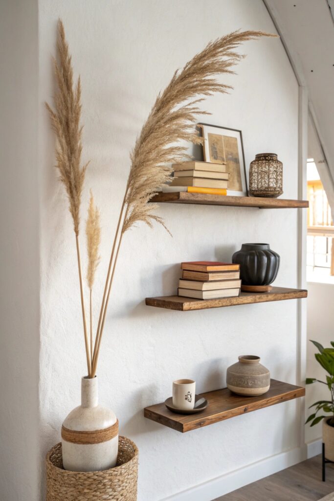
Applying the same height-variation principle across every shelf in a multi-shelf display creates genuine visual rhythm that carries the eye from one shelf to the next.
A taller item on one shelf paired with a taller item on an adjacent shelf, rather than randomly distributed heights, helps the eye move naturally across a multi-shelf display.
12. Edit Ruthlessly and Regularly
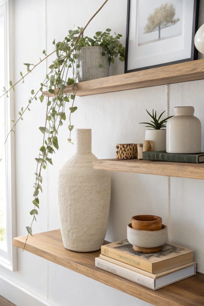
A regular editing habit — removing items that have drifted onto the shelf without being part of the original intentional arrangement — keeps this styled display from gradually reverting to visible clutter.
Applying These Principles to Your Specific Shelves
These styling principles work regardless of the shelf’s actual location — a kitchen shelf, a living room floating shelf, or a hallway display all benefit from the same underlying approach of grouping, height variation, and genuine restraint.
Start by applying just two or three of these principles to a single shelf before attempting a full multi-shelf display, since practicing the rule of three and height variation on one shelf builds the eye for composition needed to style additional shelves consistently afterward.
Most of these techniques require no new purchases beyond what’s already sitting around the home — rearranging existing books, plants, and objects using these principles often makes a bigger visible difference than buying new decor without any underlying styling structure to guide the arrangement.
Conclusion
Genuine negative space and height variation matter more than any individual decorative object, since both are what separate a curated shelf display from one that simply accumulated items over time. A regular editing habit is worth establishing early, since even a well-styled shelf gradually drifts toward clutter without some ongoing maintenance.