
North-facing rooms get consistent, cool, shadowless light throughout the day — no harsh direct sun, but also no natural warmth to offset a cool-toned paint color. The colors that work best here either lean warm to counteract that coolness, or are deep and saturated enough that the light’s evenness reads as richness rather than flatness.
Below are 10 colors that consistently perform well in north light, with specific paint names and the undertone reasoning behind each choice.
1. Soft Sage Green
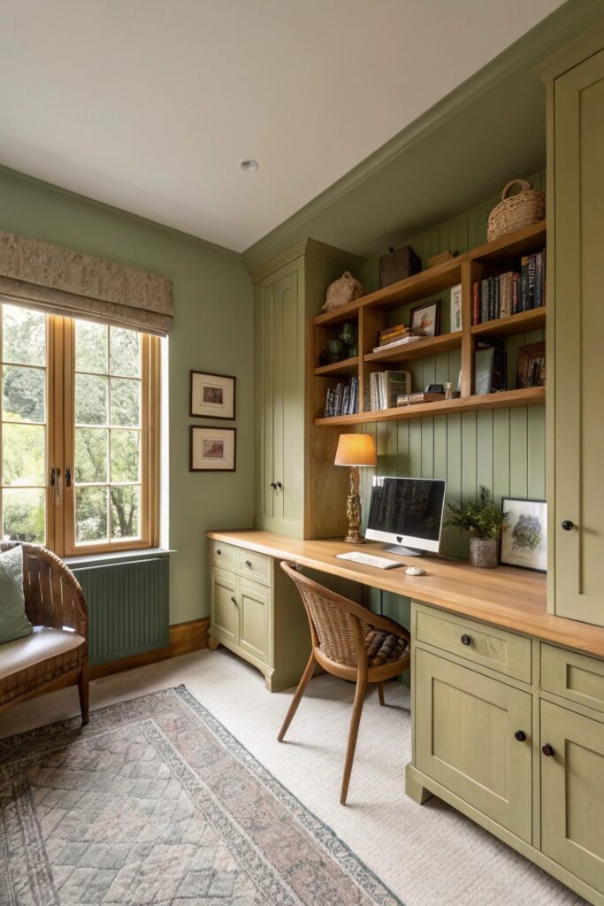
North light’s cool, consistent quality suits sage green particularly well — Sherwin-Williams ‘Evergreen Fog’ (SW 9130) or Farrow & Ball ‘French Gray’ both read balanced and sophisticated rather than washed-out, which is a common risk with green in cooler light specifically. Avoid sage shades with a strong yellow undertone in a north-facing room, since the cool light can pull that undertone toward a murkier, less flattering green.
Test on the actual wall at midday specifically, since north light stays relatively consistent through the day compared to south or west exposures — what you see at noon is close to what you’ll see most of the day.
2. Warm Greige
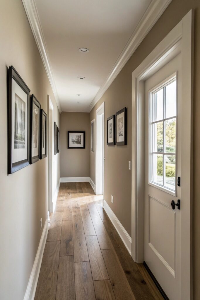
A greige (grey-beige) with a genuinely warm undertone — Benjamin Moore ‘Balboa Mist’ (OC-27) is a reliable reference point — counteracts north light’s cool cast better than a cooler-toned greige, which can read flat or slightly blue in this exposure. Greige is one of the more forgiving color families for north-facing rooms specifically because its dual warm-cool nature adapts reasonably well across different light qualities.
Check the paint’s LRV (light reflectance value) if available — north-facing rooms generally benefit from a slightly higher LRV (50+) than the same color might need in a south-facing room, since there’s less natural light bouncing around to begin with.
3. Deep Charcoal Gray
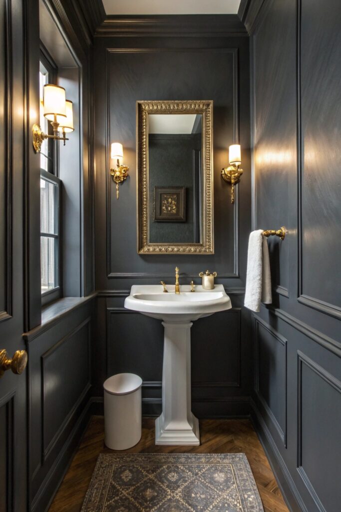
North light’s steady, shadowless quality is actually ideal for deep, saturated colors like charcoal, since there’s no harsh directional sunlight to create uneven patches across the wall throughout the day. Sherwin-Williams ‘Peppercorn’ (SW 7674) or Benjamin Moore ‘Kendall Charcoal’ (HC-166) both read rich and consistent in this light rather than patchy.
Pair deep charcoal with warm lighting fixtures (2700K bulbs specifically) in a north-facing room — the cool natural light plus a cool-toned charcoal plus cool artificial light compounds into a room that can feel genuinely cold without that warm lighting counterbalance.
4. Buttery Yellow
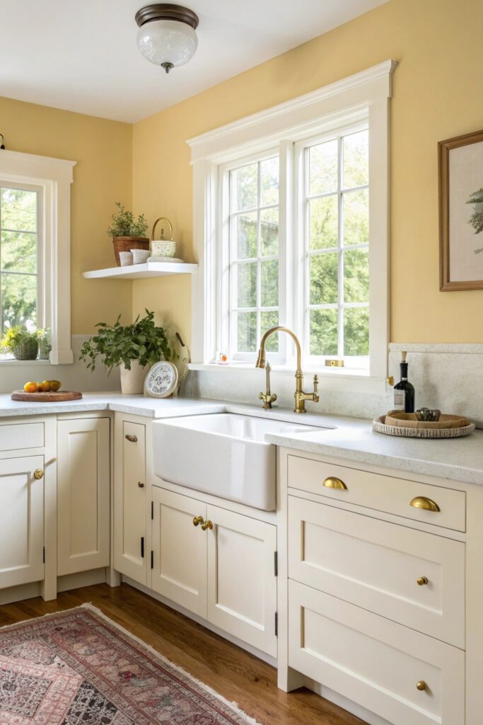
A soft, muted yellow (not a bright, saturated one) can work beautifully in north light specifically because the cool ambient light tempers yellow’s tendency to look overly saturated or garish — Benjamin Moore ‘Hawthorne Yellow’ (HC-4) is a commonly referenced example that reads warm and buttery rather than neon in this exposure.
Bright, highly saturated yellows are the exception here — they can look flat and one-dimensional in north light’s even, shadowless quality, which is better suited to more muted, complex colors than pure saturated hues.
5. Dusty Blue
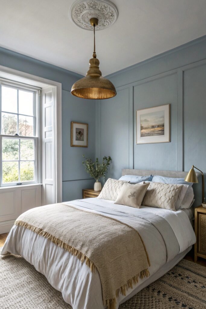
Blue is generally the riskiest color family for north-facing rooms, since the light’s inherent coolness can push blue toward looking cold or even slightly grey — but a dusty, muted blue with a grey undertone (rather than a clear, saturated blue) sidesteps this issue. Benjamin Moore ‘Wickham Gray’ (HC-171) is technically a blue-gray that holds its color well specifically in cooler light rather than shifting further blue.
If you love blue and have a north-facing room, lean toward the muted, grey-adjacent end of the blue spectrum rather than a clear sky blue or navy, both of which tend to read colder than intended in this light.
6. Warm Terracotta
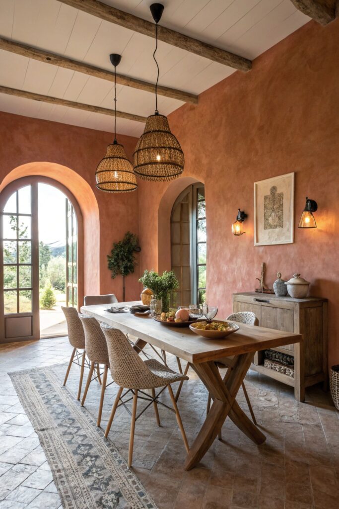
Terracotta and warm clay tones directly counteract north light’s cool cast, making this one of the most reliably successful color choices for this exposure specifically — Sherwin-Williams ‘Cavern Clay’ (SW 7701) reads warm and grounded rather than muddy in cooler light. This category works especially well in rooms that otherwise feel a bit flat or lifeless under consistent north light.
Terracotta pairs particularly well with warm wood tones and brass fixtures in a north-facing room, compounding the warmth the paint color alone introduces.
7. Off-White With Warm Undertones
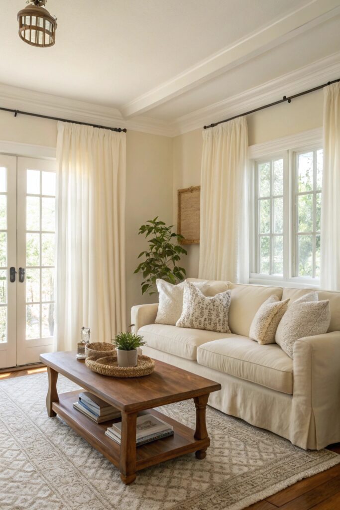
Not all whites perform equally in north light — a white with a cool or blue undertone can look stark or even slightly grey in this exposure, while a warm-undertone white like Benjamin Moore ‘Swiss Coffee’ (OC-45) or Farrow & Ball ‘String’ reads soft and inviting instead. This is one of the most common paint mistakes in north-facing rooms: choosing a popular white without accounting for how the room’s specific light will shift it.
Always test white paint samples on the actual wall rather than trusting a swatch alone — whites are more light-sensitive than almost any other color family, and the difference between a warm and cool white becomes much more obvious once applied at full scale.
8. Rich Forest Green
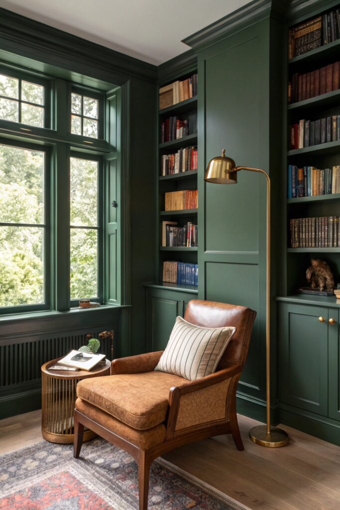
Like charcoal, a deep forest green benefits from north light’s even, non-directional quality — Farrow & Ball ‘Studio Green’ or Sherwin-Williams ‘Rosemary’ (SW 6187) both read as rich, saturated color rather than looking blotchy or uneven across the wall throughout the day. This depth of color works particularly well in a north-facing room that otherwise feels flat under consistently diffuse light.
As with charcoal, warm lighting fixtures matter here — a deep, cool-adjacent green under cool-toned bulbs can tip toward feeling heavy rather than rich and inviting.
9. Warm Taupe
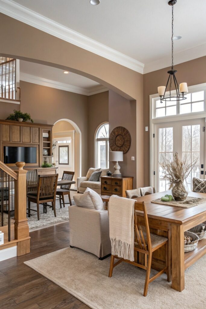
True taupe (an even balance of grey and brown, without leaning too far into pink or purple) is one of the more reliable neutral choices for north-facing rooms, since it holds its intended tone across the day’s relatively consistent light rather than shifting dramatically. Benjamin Moore ‘Balboa Mist’ or Sherwin-Williams ‘Perfect Greige’ (SW 6073) are common reference points that stay true rather than drifting toward an unintended purple or pink cast.
Avoid taupes marketed as ‘warm’ that actually carry a strong pink undertone — these can look genuinely rosy rather than neutral once applied in cooler north light, which is a common surprise for people who only checked the paint chip under warmer store lighting.
10. Muted Blush Pink
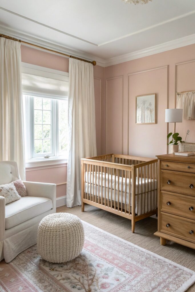
A dusty, muted blush (rather than a bright bubblegum pink) can work well in north light specifically because the cool ambient light softens pink’s intensity rather than amplifying it — Farrow & Ball ‘Setting Plaster’ is a commonly referenced example that reads sophisticated rather than overtly girly in this exposure.
As with yellow, brighter and more saturated pinks are the riskier choice here; north light’s evenness doesn’t flatter highly saturated colors the way it does more muted, complex ones.
How to Test Paint Colors in Northern Light
Buy sample pots (not just paint chips) and paint a 12×12 inch swatch directly on the actual wall, not on paper — paper doesn’t account for how a color interacts with your specific wall texture and adjacent trim. Check the swatch at three points in the day (morning, midday, and evening with lamps on) even though north light stays relatively consistent, since your artificial lighting still shifts the color meaningfully after dark. Compare the swatch against existing fixed elements in the room — flooring, trim color, any built-in cabinetry — under the same north light conditions, since a color that looks right in isolation can clash once you account for everything else already in the room.
Final Thoughts
The single biggest mistake in north-facing rooms is choosing a paint color based on how it looks in a south-facing showroom or under warm store lighting — always test in the actual room. Warm undertones and either muted or deeply saturated colors tend to outperform cool-toned or brightly saturated ones in this specific light quality.