
Two-tone cabinetry is a notably more technical color decision than a single-color kitchen, since you’re matching two separate undertones to each other rather than just choosing one color that works with the room. The details below cover the practical undertone and lighting considerations for each pairing.
Below are 11 two-tone combinations worth considering, with the specifics for each.
1. White Uppers and Navy Blue Lowers
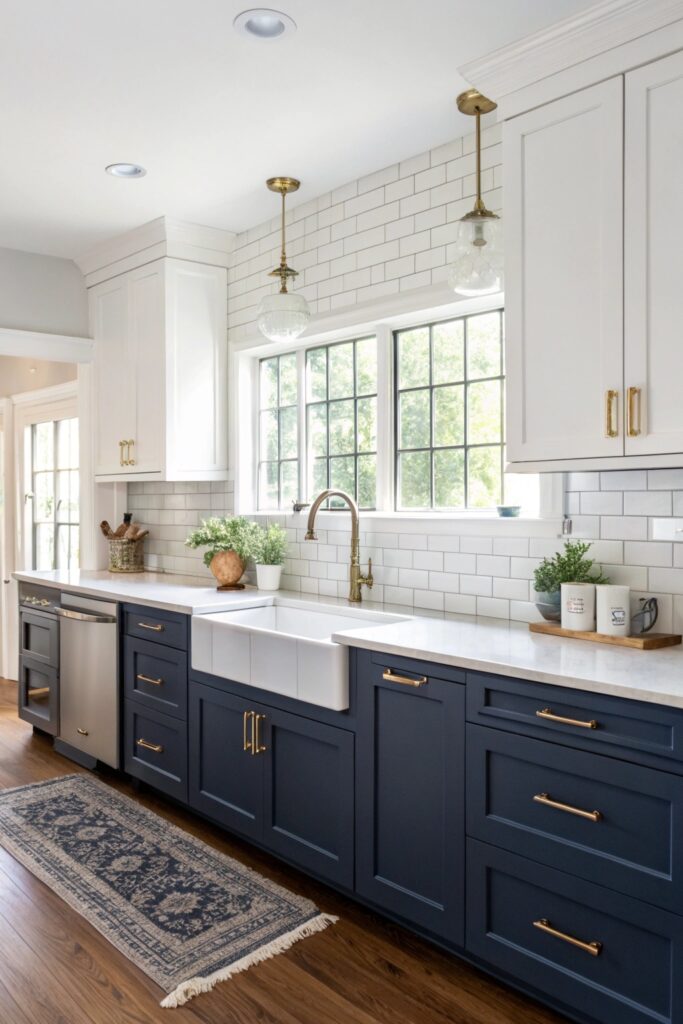
A warm white reads considerably better against navy than a stark, cool white, which can end up looking clinical next to navy’s own coolness rather than providing genuine contrast.
2. Cream Uppers and Forest Green Lowers
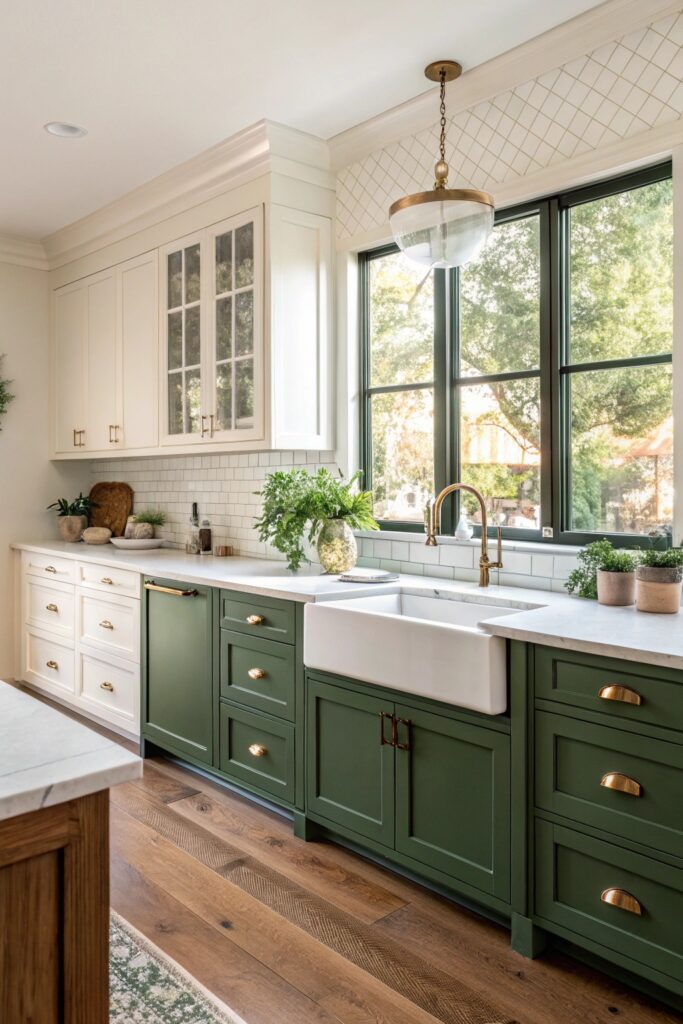
This pairing works especially well with brass hardware, since both cream and forest green carry enough warmth to complement brass rather than fighting against a cooler metal finish.
3. Light Gray Uppers and Charcoal Lower Cabinets
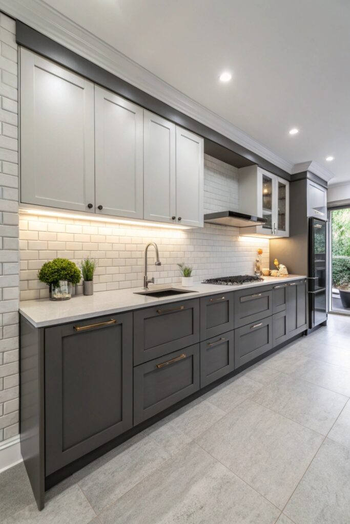
Staying within the same color family — different values of gray rather than two distinct colors — reads as more subtle and cohesive than a higher-contrast pairing, worth choosing specifically if you want a more understated two-tone look.
4. White Uppers and Sage Green Lowers
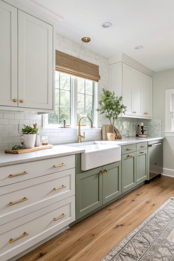
Sage shifts noticeably between warm and cool light sources, so testing the specific shade against your kitchen’s actual lighting matters more here than with a more color-stable choice.
5. Black Uppers and White Lowers
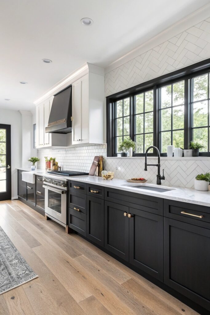
This reverses the more common convention of darker lower cabinets, and dark upper cabinets can visually lower a ceiling — this pairing tends to work best in kitchens with meaningfully higher ceilings that can absorb that added visual weight overhead.
6. Natural Wood Uppers and White Lowers
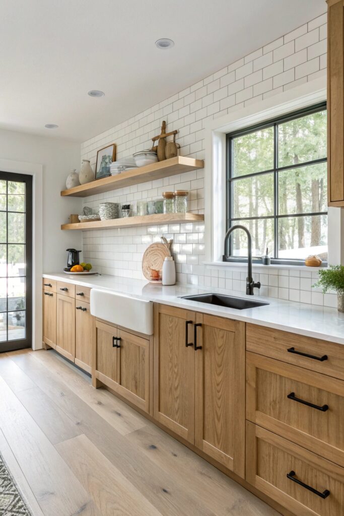
Matching the wood’s specific undertone to a complementary white matters here — a warm-toned wood can read orange or yellow next to a very cool white, so testing samples together avoids that clash.
7. Cream Uppers and Navy Island
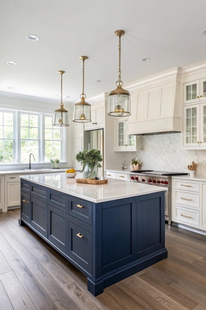
Treating the island as the accent rather than splitting upper and lower cabinets distributes the visual weight differently — the island reads as a distinct furniture piece within the room rather than a wall treatment running the length of the kitchen.
8. Dusty Blue Uppers and White Lowers
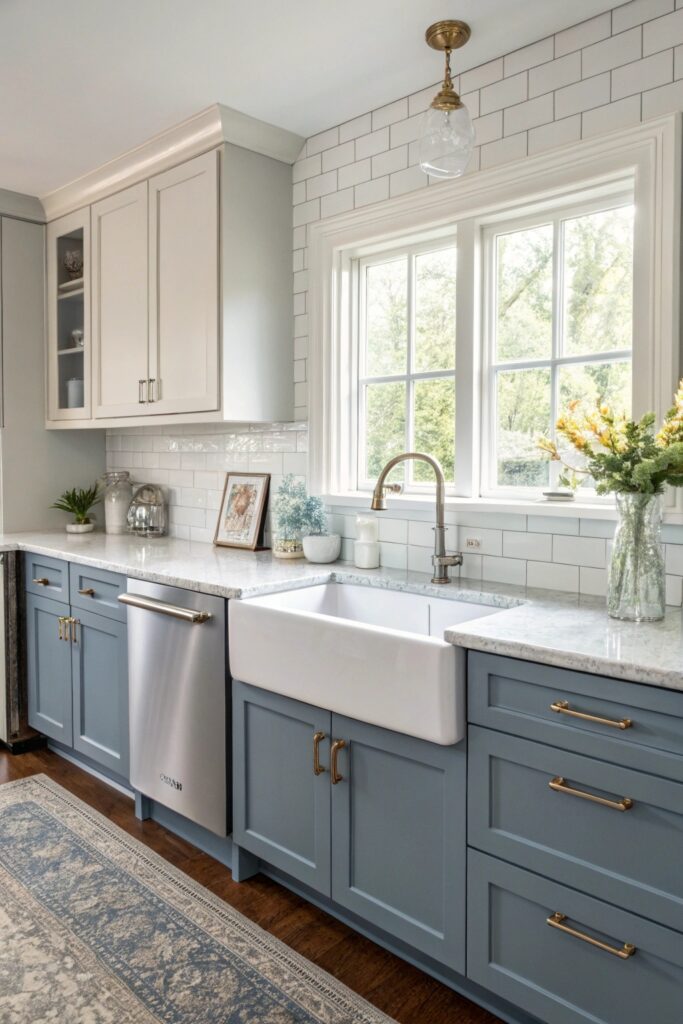
A muted, dusty blue reads as more sophisticated against white than a brighter, more saturated blue would, keeping the overall look calm rather than bold.
9. Greige Uppers and Warm Walnut Lowers
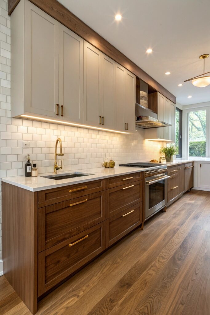
Since greige is already a blended gray-beige neutral, testing it against walnut’s actual undertone — which often leans warm or reddish — matters more here than with a more straightforward single-undertone color, since a mismatch can make the greige read too cool or too warm by comparison.
10. White Uppers and Terracotta Lowers
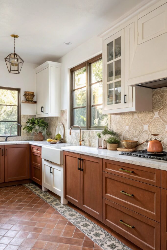
Terracotta shifts noticeably between warm and cool lighting, more than many other colors, so sampling it in the kitchen’s actual light before committing to a full run of lower cabinets is worth the extra step.
11. Olive Green Uppers and Cream Lowers
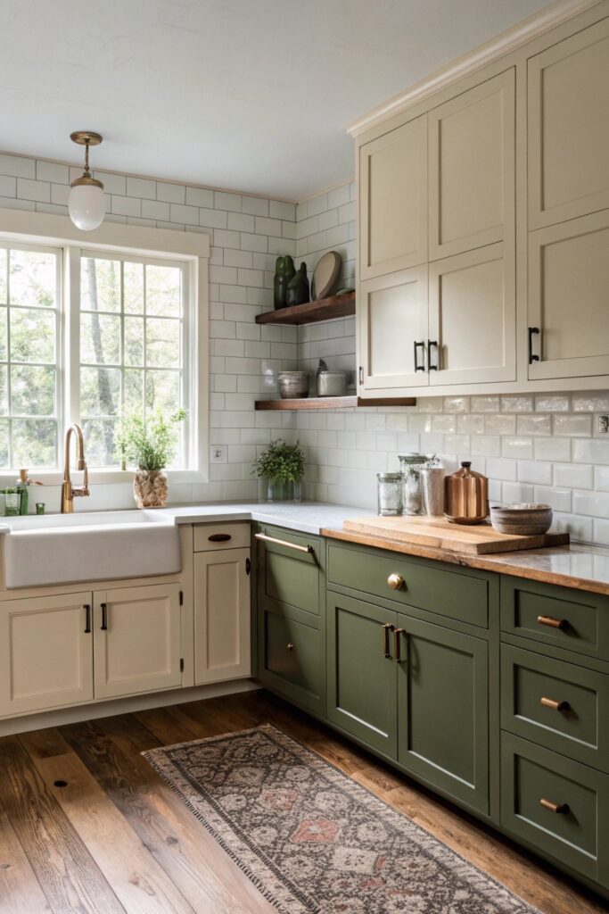
Similar to the black-and-white reversal, putting olive on top rather than the more conventional lighter-on-top arrangement is worth checking against your specific ceiling height, since a deeper color overhead reads heavier in a room with lower ceilings.
Sheen Consistency Between the Two Colors
Using the same sheen level — typically satin or semi-gloss for kitchen cabinetry — across both colors keeps the pairing looking intentional, while mismatched sheens can make one color read as an afterthought rather than an equal design partner to the other.
This matters especially with darker colors like navy or charcoal, which show sheen differences more visibly than lighter colors, where a slight sheen mismatch is easier to miss.
What Two-Tone Cabinetry Costs
Repainting existing cabinets in a two-tone scheme typically costs $1,500 to $4,000 depending on kitchen size and whether the work is done professionally.
New custom two-tone cabinetry runs considerably higher, often $15,000 to $40,000 or more depending on materials, kitchen size, and the specific manufacturer or cabinetmaker.
Deciding Where the Color Break Happens
Most two-tone kitchens split at the line between upper and lower cabinets, but some designs break at the island instead, or use the darker color only on a single wall of cabinetry — each choice changes how much visual weight each color carries in the room.
A full upper-lower split reads as the boldest, most evenly balanced version of two-tone, while an island-only accent is a lower-commitment way to introduce a second color without repainting or replacing the majority of the kitchen’s cabinetry.
Hardware as the Connecting Element
Using the same hardware finish across both cabinet colors, rather than switching styles or metals between the two, helps tie a two-tone kitchen together visually even when the colors themselves are quite different from each other.
This is a simple, lower-cost way to add cohesion if the two colors you’ve chosen read as slightly more contrasting than expected once installed — consistent hardware does real work toward making the pairing feel like one considered design rather than two separate decisions.
If you’re repainting existing cabinets rather than replacing them, proper surface preparation — cleaning, sanding, and priming — matters even more than usual, since a two-tone finish makes any inconsistency in the paint application more noticeable than a single uniform color would.
A two-tone kitchen, done with attention to undertone matching and consistent finishing details, tends to feel more custom and considered than a single-color kitchen of similar cost, which is part of why this approach has remained popular across several different broader design eras rather than reading as a passing trend.
Working with a kitchen designer or an experienced painter familiar with two-tone work, rather than someone who’s only done single-color kitchens, can help you avoid some of the more common undertone and sheen mismatches this approach is prone to when handled without that specific experience.
Whichever combination and layout you choose, taking the time to get the undertone matching right pays off in a kitchen that reads as intentionally designed rather than assembled from two separate color decisions made in isolation.
A well-executed two-tone kitchen tends to hold real appeal for future buyers as well, given how consistently popular this general approach has remained across recent design cycles.
Final Thoughts
Undertone matching is the real skill behind every pairing on this list — testing both colors together, in your kitchen’s actual lighting, catches mismatches that are easy to miss when choosing each color separately from a paint chip or cabinet sample viewed in isolation.
Whichever combination you’re drawn to, ordering physical samples of both cabinet colors and living with them in the space for a few days, across different times of day, remains the most reliable way to confirm the pairing works before committing to a full kitchen’s worth of cabinetry.