
A neutral bedroom relies on texture and material variation to avoid looking flat, since color isn’t available to do the usual work of adding visual interest.
Below are 11 elements that build this look, with practical notes for each.
1. Layered White and Cream Bedding
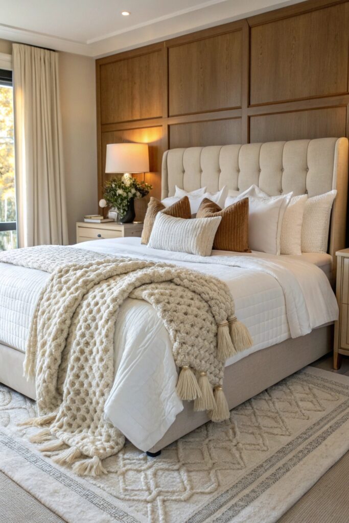
Mixing a few close shades of white and cream, rather than one flat tone, gives the bed genuine depth without introducing any actual color.
Look for at least three distinct fabric textures across the bedding — a waffle weave, a smooth sateen, a nubby linen — so the layers actually read as intentional rather than accidental.
2. Warm Greige Walls
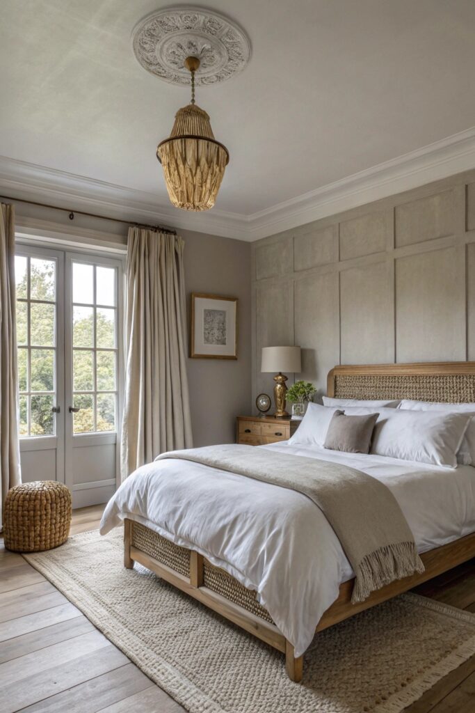
A greige with warm undertones avoids the cold, sterile look a true gray can sometimes bring to a bedroom, especially in rooms with less natural light.
Test the paint on your actual wall at different times of day before committing, since greige can shift noticeably warmer or cooler depending on the light.
3. Natural Wood Furniture and Accents
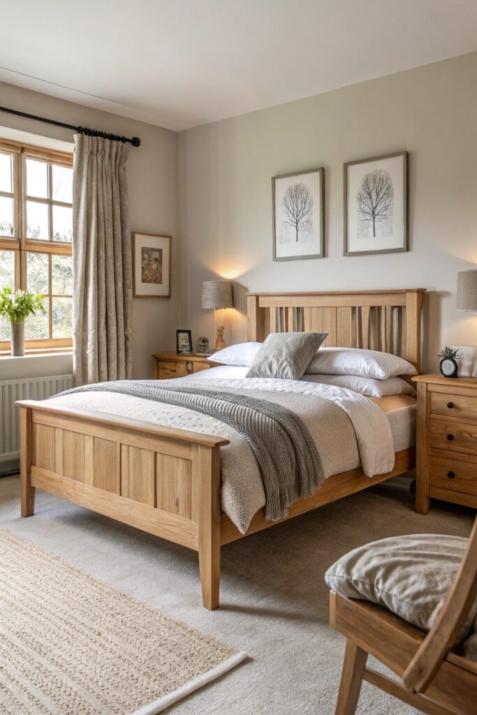
Unstained or lightly finished wood keeps the room’s material palette honest, letting the grain and texture stand in for color.
Mixing two wood tones is fine as long as they share a similar undertone, but combining a cool gray-toned wood with a warm honey tone tends to look unplanned.
4. Linen Curtains Floor to Ceiling
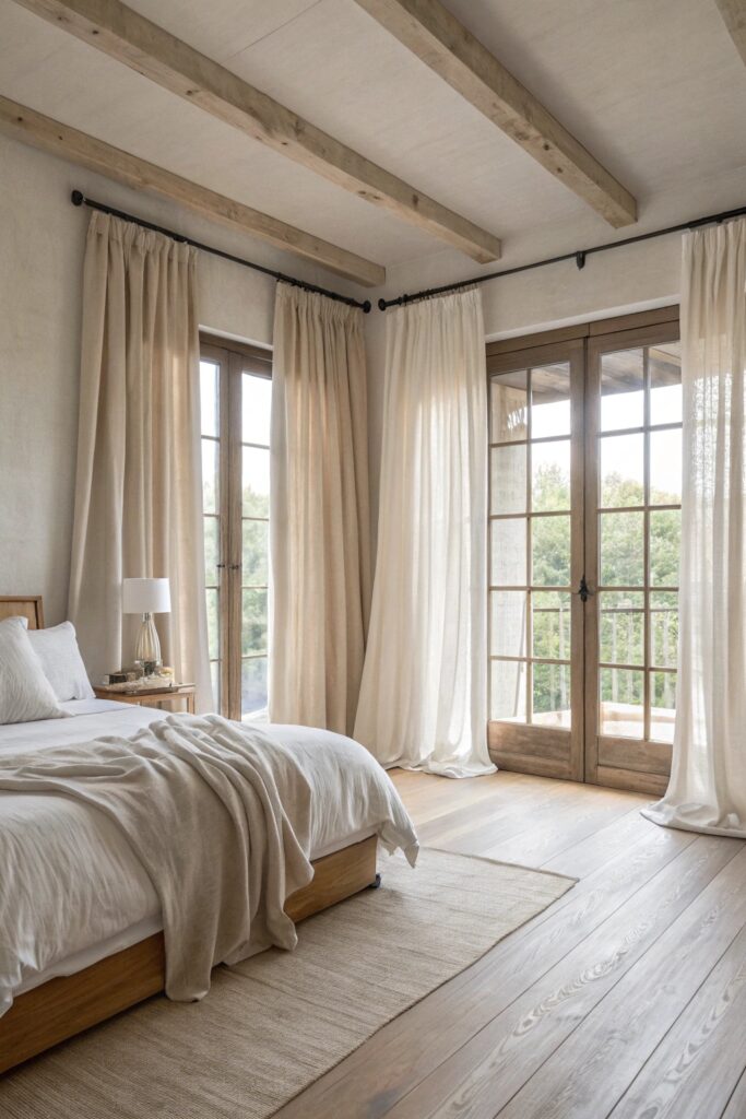
Hanging panels from ceiling to floor, rather than just covering the window, makes the room feel taller and more considered.
Choose a linen blend over pure linen if you want less wrinkling, though pure linen does drape and filter light in a way blends can’t quite match.
5. Rattan and Wicker Accent Pieces
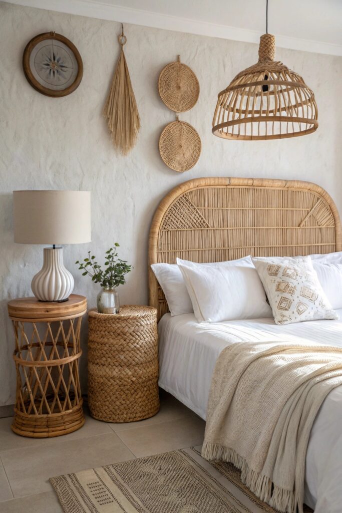
A woven headboard, mirror frame, or light fixture adds texture that flat painted surfaces alone can’t provide.
Pair rattan with at least one smoother material nearby, like a glass lamp or a metal frame, so the texture doesn’t feel one-note.
6. Chunky Knit Throws and Textured Pillows
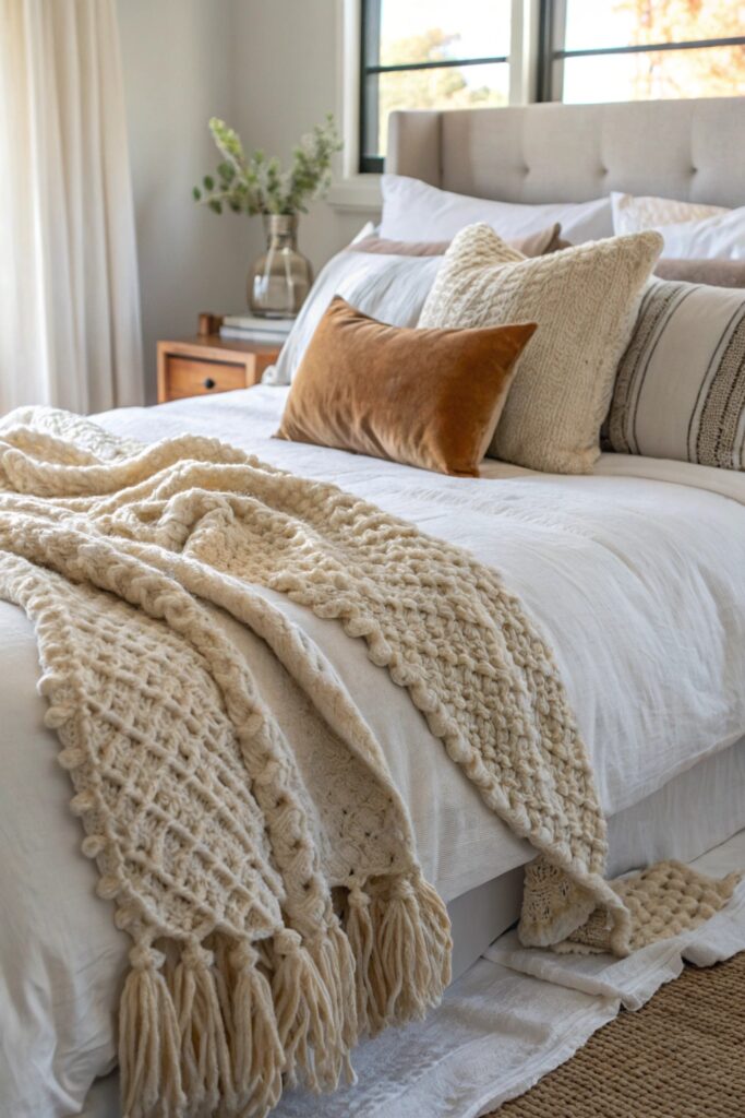
Heavier knits and varied pillow textures keep an all-neutral room from feeling flat, since texture is doing the visual work color usually would.
Stick to two or three textures in the pillow mix at most — more than that starts to look cluttered rather than deliberately layered.
7. Warm Ambient Lighting with Exposed Bulbs
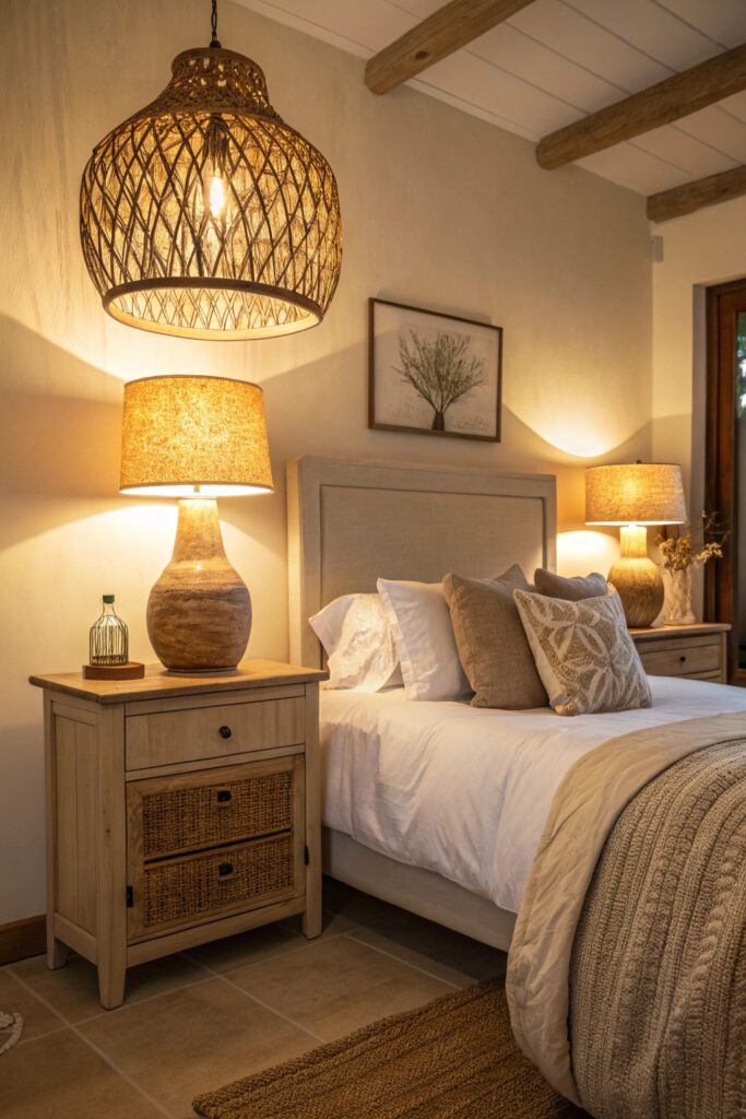
A warm bulb temperature matters more in a neutral room than almost anywhere else, since cool lighting can make the palette read as clinical rather than cozy.
Dimmable fixtures are worth the extra cost here, since a neutral room benefits from being able to shift from bright daytime light to a softer evening glow.
8. Neutral Gallery Wall with Natural Frames
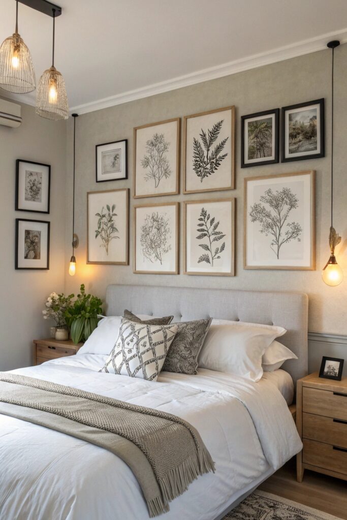
Frames in wood or matte black, paired with black-and-white or muted prints, keep a gallery wall from introducing color that clashes with the rest of the room.
Keep the print sizes and mat widths consistent across the gallery even if the frames themselves vary, which keeps the wall feeling organized.
9. Statement Neutral Rug with Natural Fiber
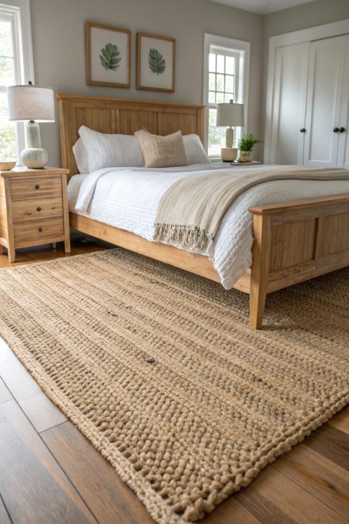
Jute or wool rugs bring pattern and texture without needing any color, working as a genuine focal point at floor level.
A jute rug pairs especially well with wood furniture, while a wool option feels a bit more refined if the room leans slightly more polished.
10. Minimalist Neutral Nightstand Styling
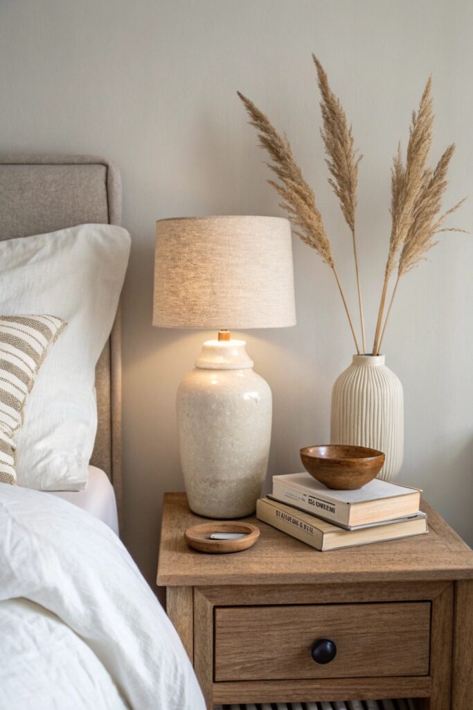
Keeping the nightstand to two or three objects in coordinated tones prevents even small clutter from disrupting the room’s overall calm.
11. Organic and Earthy Décor Accents
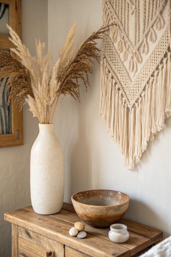
Dried branches, stone bowls, or ceramic vases in matte finishes round out the room’s natural-material theme without adding any color at all.
Avoiding the Flat, Boring Trap
The biggest risk with an all-neutral room is that it ends up looking unfinished rather than intentional. Texture, layering, and varied tones within the neutral family are what keep this from happening.
If a room feels flat after you’ve added the basics, it’s usually missing height variation or a genuine textural contrast — a smooth surface next to something nubby or woven tends to fix it.
What This Room Actually Costs
Bedding, a rug, and a few smaller accents can refresh a room for $200 to $400, while a full furniture swap including new pieces in wood or rattan runs closer to $1,000 to $2,000.
Paint is the cheapest single change that makes the biggest difference, so it’s worth starting there before investing in new furniture.
A Small Amount of Color Still Works
Going fully neutral doesn’t mean avoiding color forever. A single muted accent — sage green, dusty blue, terracotta — in one small spot can add warmth without breaking the overall calm.
Keep it to one accent color and one small application, like a single throw pillow or a small vase, rather than spreading it across multiple pieces where it starts to compete with the neutral base.
Live with the room for a few weeks before adding anything else. It’s easier to spot what’s genuinely missing once you’ve spent real time in the space than to guess at it all upfront.
Secondhand shops are worth checking specifically for wood and rattan furniture pieces, since older pieces often already have the warm, slightly worn patina that suits this look better than something brand new.
This palette also tends to age well compared to trend-driven color choices, since a well-executed neutral room rarely looks dated the way a bold, of-the-moment color scheme can a few years later.
Take a photo of the room once it’s finished so you have a clear reference point. Neutral palettes shift subtly over time as pieces are swapped, and it helps to have a record of what actually worked.
Start with just one or two changes if the whole list feels like a lot at once. Even a bedding swap and a warmer bulb can noticeably shift how the room feels before you touch anything else.
Conclusion
Warm undertones throughout — in the walls, the wood, the lighting — keep a neutral room from tipping into feeling cold or clinical. Texture is what separates a genuinely considered neutral room from one that simply lacks color, so prioritize it over adding more objects.