
Bookshelf styling is one of the few areas of home decor where the actual function (storing books) and the visual styling have to coexist, which is exactly why so many shelves end up either purely functional and cluttered, or so styled they barely hold any books at all. The best-looking shelves balance both.
Below are 12 techniques for that balance, with specific reasoning for why each one works.
1. Mix Vertical and Horizontal Stacking
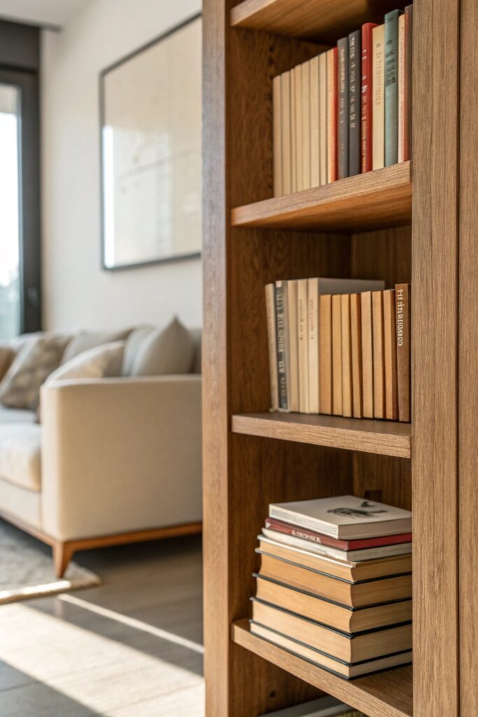
Standing every book upright is what makes a shelf read like a library rather than styled decor — stacking 3-5 books horizontally on their side, then topping the stack with a small object, breaks the rhythm and adds the height variation that makes shelving look intentional. Alternate vertical sections and horizontal stacks across a unit rather than picking one method throughout.
2. Use Bookends as Design Objects, Not Just Function
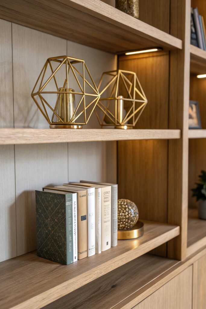
Sculptural bookends (marble, brass, or a simple geometric shape, $25-45 for a pair) hold books in place while functioning as a visible decor element rather than a hidden utility. Position them so they’re visible from the front rather than tucked flush against a shelf’s side wall, where their design gets lost entirely.
3. Layer in Objects That Aren’t Books
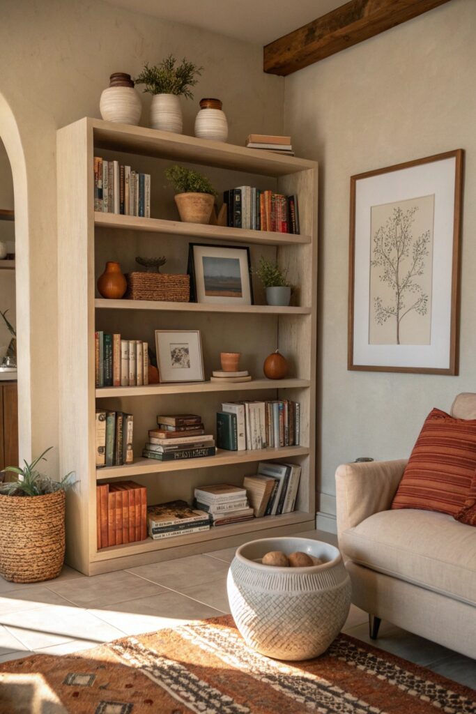
A small ceramic vase, a piece of stone or crystal, or a small framed photo interrupts a shelf that’s entirely spines and breaks up what would otherwise be a wall of uniform texture. Aim for roughly 60-70% books to 30-40% objects across a full unit — a shelf that’s mostly objects and few books starts to look like it’s avoiding actually being a bookshelf.
4. Group Books by Color, But Only Loosely
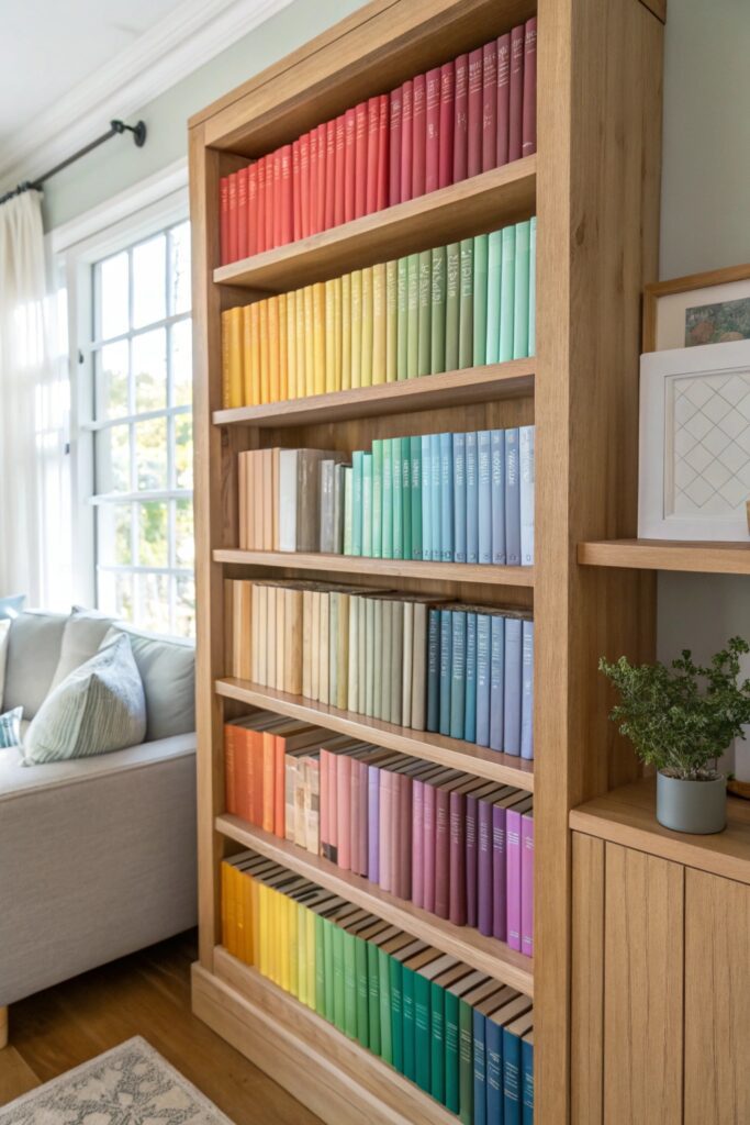
Full rainbow-order color-coding looks striking in photos but is famously hard to actually use day-to-day since you have to remember a book’s spine color rather than its title or author to find it again. A better middle ground: loosely group by color within a shelf or section (all the blues and greens together, for instance) rather than a rigid full-spectrum gradient.
5. Turn Some Spines Inward for a Neutral Base
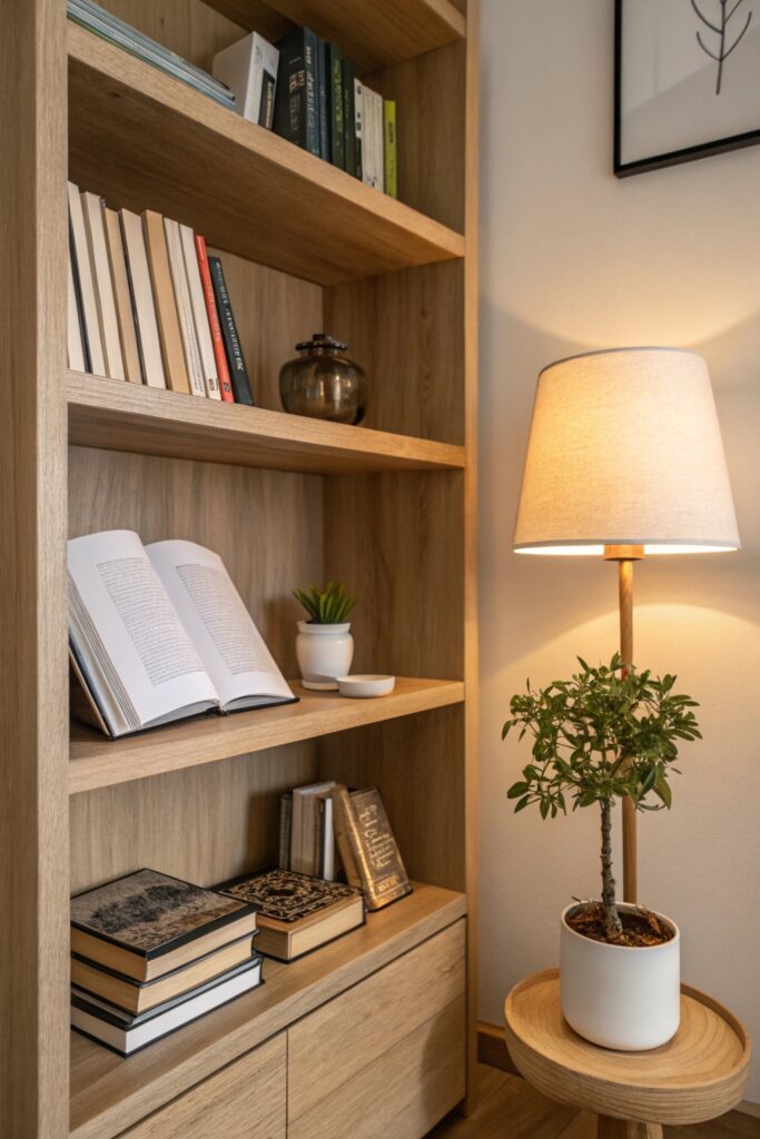
Turning a portion of books backward (pages facing out instead of spines) creates a neutral cream or white base that lets colorful accessories and cover art pop against it, rather than competing with dozens of different spine colors and fonts. This works especially well combined with the color-grouping idea above for shelves with a lot of visually loud spines.
6. Add a Reading Lamp Directly on the Shelf
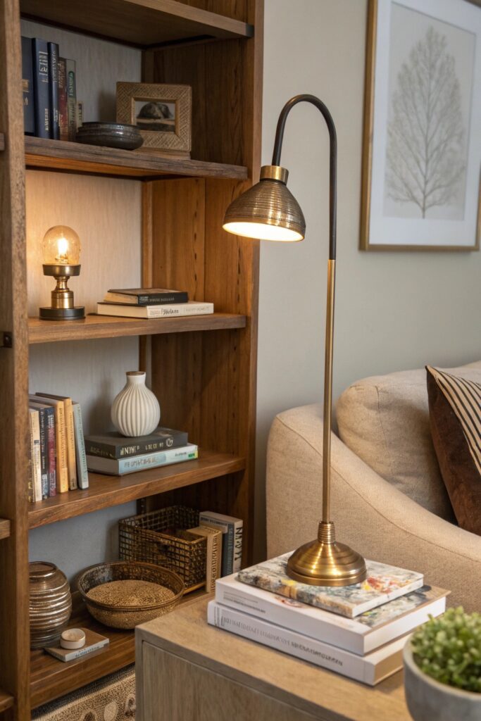
A small battery-operated or plug-in accent lamp ($20-35) placed on a mid-level shelf adds warm point lighting that makes the whole unit feel more intentional, especially in the evening when overhead lighting alone flattens a room. This also solves an actual functional need if the shelf doubles as a reading nook.
7. Use Trays or Boxes to Corral Small Items
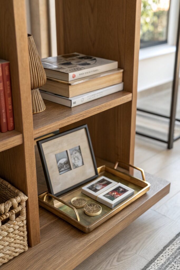
A small tray or lidded box groups loose items (coasters, small remotes, reading glasses) that would otherwise clutter a shelf’s visual line, converting a random collection of small objects into one contained, intentional-looking element. This is a functional-decor crossover — it solves an actual storage problem while looking styled.
8. Add Texture With Baskets on Lower Shelves
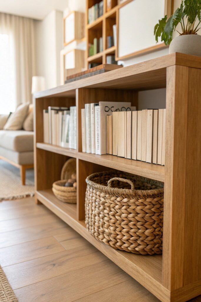
A woven basket on a lower shelf, sized to fit the shelf depth, adds natural texture at the base of a unit and can double as storage for magazines or extra items that don’t need to be visible. This grounds the top of the unit (where lighter, more decorative styling happens) with something more substantial at the base.
9. Lean a Framed Print Against the Back of the Shelf
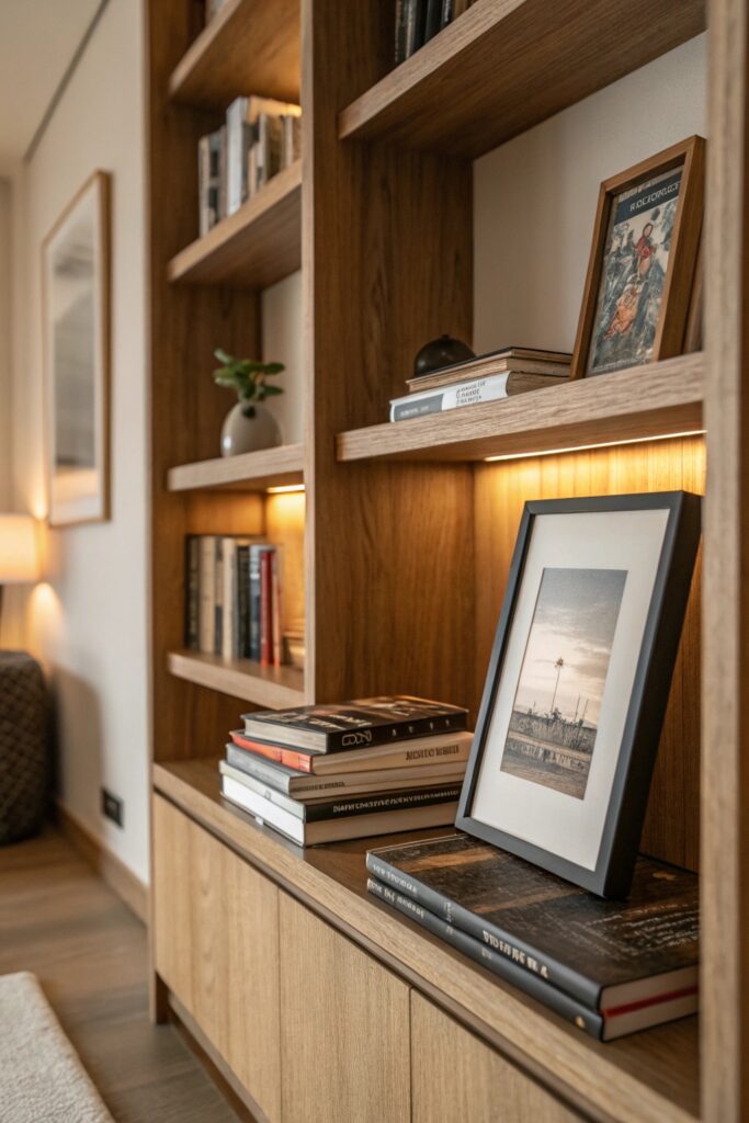
A small framed print or photo leaned against the back wall of a shelf (rather than hung separately) adds a layer of depth and color behind the books and objects in front of it. This is a low-commitment way to add art to a shelving unit without drilling additional holes or dedicating separate wall space.
10. Leave Visible Negative Space
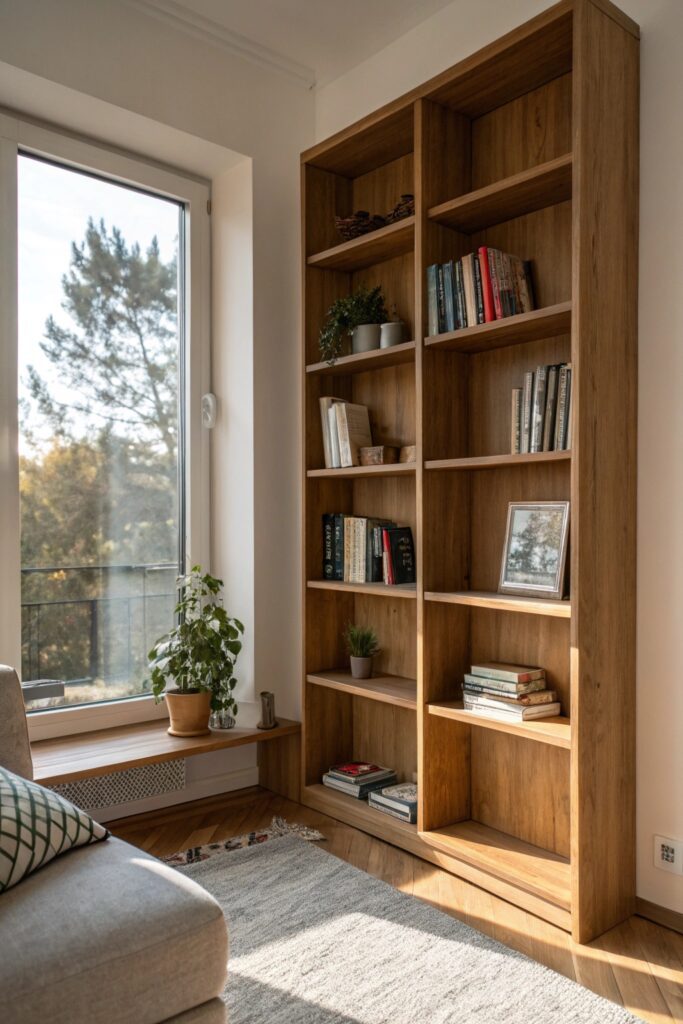
At least one shelf, or a portion of each shelf, left genuinely empty (not styled sparse — actually empty) gives the eye a place to rest and prevents the whole unit from reading as visually exhausting. This is the single most common mistake in shelf styling: filling every available inch rather than treating empty space as a deliberate design choice.
11. Add a Small Plant for Contrast
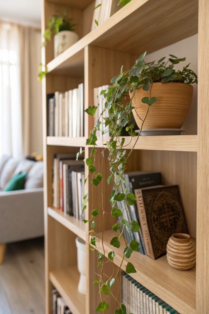
A small potted plant or a faux trailing vine (pothos or ivy specifically, since they tolerate lower light better than most houseplants) adds organic green that contrasts with the straight lines and hard textures of books and shelving. Let a trailing variety spill slightly over the shelf edge rather than sitting perfectly contained — the slight overflow reads more natural.
12. Repeat One Material Across the Whole Unit
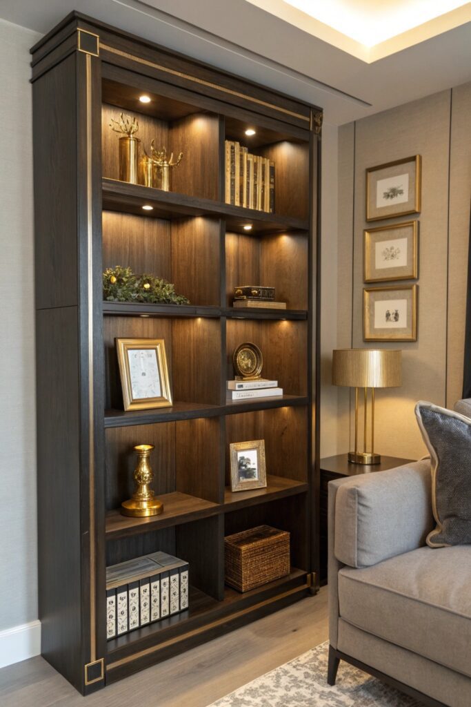
Choosing one consistent material or finish — all brass accents, or all matte black frames and bookends — across an entire shelving unit ties together what would otherwise be a collection of unrelated objects. This single choice does more to make a shelf look professionally curated than any individual object on it, since it signals the arrangement was considered as a whole rather than piece by piece.
Bringing It All Together
Negative space and the mixed vertical/horizontal stacking are the two techniques that make the biggest visual difference, and both are free — they’re about how you arrange what you already own rather than what you buy. Start there before adding new bookends, lamps, or decorative objects, since a poorly arranged shelf with expensive accessories still won’t read as styled.