
Grey is one of the most popular sofa colors precisely because it’s neutral and flexible, but that same neutrality means a grey couch can read as flat or cold if the rest of the room doesn’t actively work with it. The strategies below fall into two categories: warming grey up with color and material, or leaning into its coolness with complementary tones like navy and black.
Below are 10 approaches, with specific materials, colors, and reasoning for each, so you can pick a direction that matches your space rather than guessing.
1. Warm It Up With Rust, Terracotta, and Mustard Accents
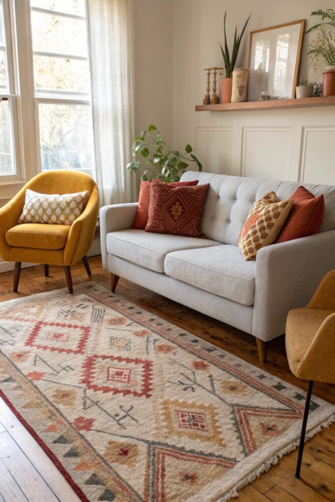
Grey reads cool on its own, so pairing it with warm-toned accents — rust or terracotta pillow covers, a mustard throw blanket — creates the contrast that keeps a grey sofa from feeling flat or cold. Keep warm accents to 2-3 touchpoints (pillows, one throw, maybe a vase) rather than a full warm-toned room, which would compete with the grey rather than balance it.
Test fabric swatches against your specific couch in natural daylight before buying — ‘warm grey’ and ‘cool grey’ upholstery reacts differently to rust and terracotta, and a swatch that looks right under store lighting can clash once home.
2. Add Warm Wood Tones for Balance
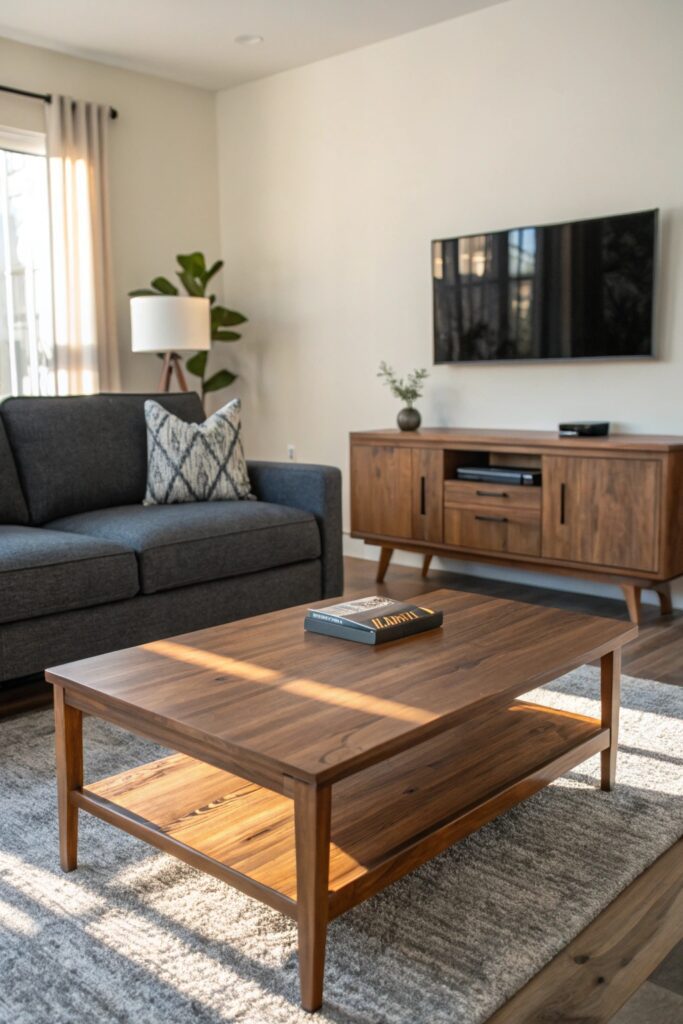
Medium-to-warm wood tones (oak, walnut, or a warm-stained pine) in a coffee table, side tables, or a media console counter grey’s coolness with material warmth rather than color alone. This matters especially if your flooring is also cool-toned (grey-washed hardwood or light tile) — warm wood furniture prevents the whole room from reading as one flat temperature.
Mixing two wood tones (say, a walnut coffee table and an oak console) is fine as long as both lean warm; the mismatch that actually looks off is combining a warm wood with a distinctly cool, grey-toned wood finish in the same room.
3. Layer in a Patterned or Textured Area Rug
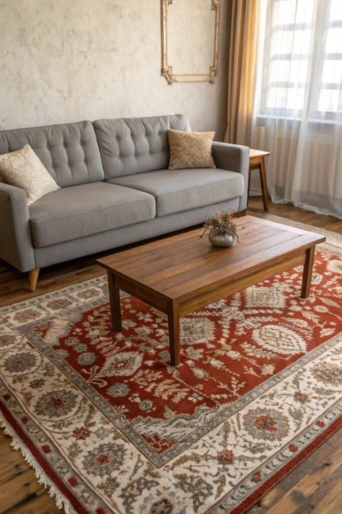
A rug with pattern or texture — a Persian-style rug in warm reds and blues, or a high-pile textured neutral — adds visual interest below a grey couch that a plain solid rug won’t provide, since grey furniture already reads as a fairly quiet, low-pattern anchor. Size the rug so all four sofa legs (or at minimum the front two) sit on it; a rug too small to reach the furniture makes the whole arrangement look disconnected.
If your walls or curtains already carry pattern, a more textured-but-solid rug (a chunky wool weave, for instance) balances better than adding a third competing pattern to the room.
4. Use Blush, Dusty Pink, or Mauve for Softness
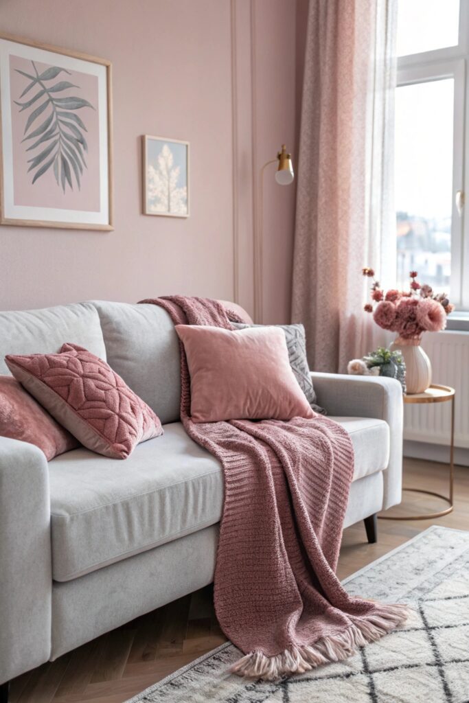
Blush and mauve tones pair with grey in a way that reads sophisticated rather than overtly feminine when kept to accents — a couple of pillow covers, a piece of art with a blush undertone — rather than large-scale elements like an accent chair or curtains. This combination works particularly well with cooler, blue-based greys specifically, since both colors share an underlying coolness that keeps them from clashing.
Dusty or muted pink reads more sophisticated against grey than bright bubblegum pink, which can tip the pairing toward looking like a nursery palette rather than an adult living space.
5. Introduce Black Accents for Definition
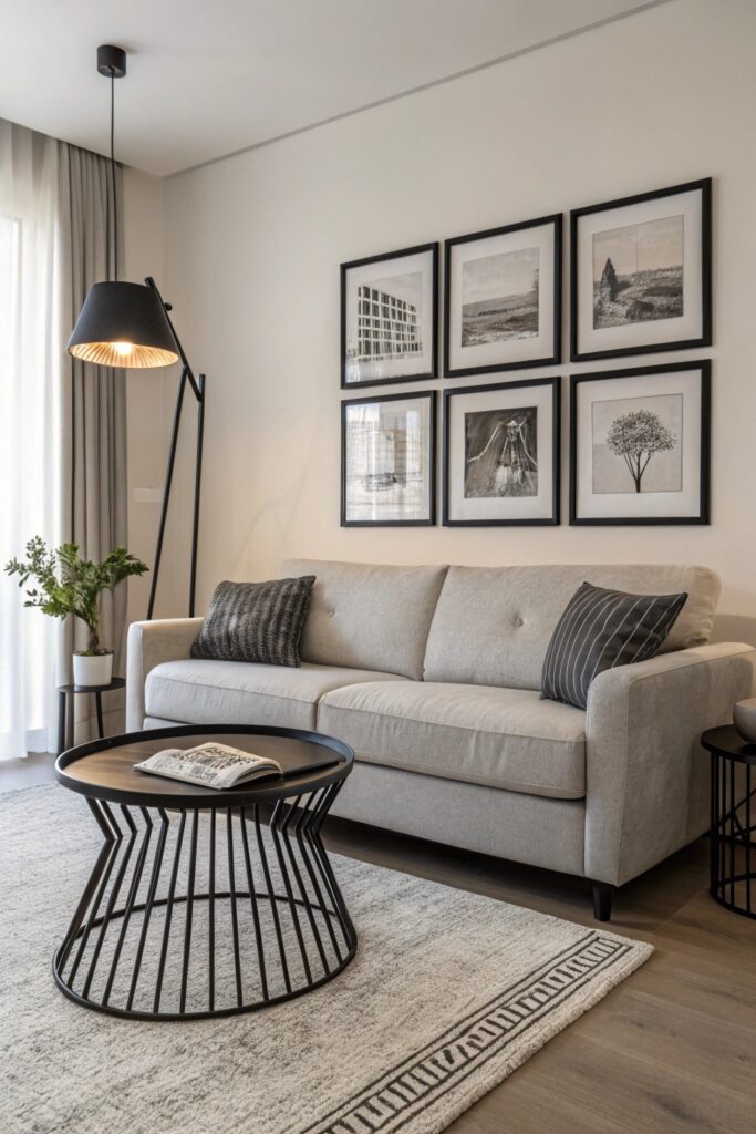
Small black accents — picture frames, a lamp base, thin-framed furniture legs — add visual definition and prevent an all-grey-and-neutral room from reading as flat or washed out. Black works as a ‘punctuation’ color here: a little goes a long way, and too much black against grey can tip the room from elegant to heavy.
Matte black finishes read more current than glossy black, which can look dated depending on the rest of the room’s finish choices.
6. Bring in Greenery for Life and Color
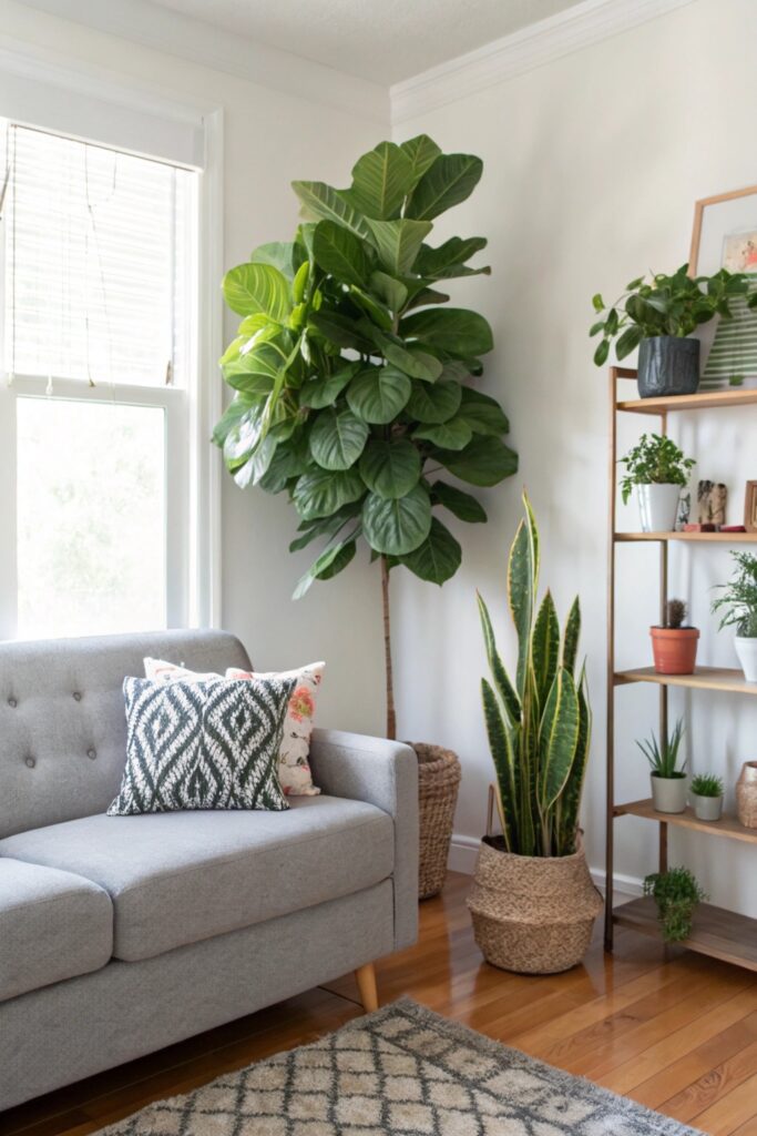
Live or high-quality faux plants introduce a color grey doesn’t have at all — genuine green — and the organic, irregular shapes of foliage contrast nicely with a sofa’s more geometric lines. A single larger floor plant (a fiddle leaf fig or snake plant, real or faux) makes more visual impact than several small potted plants scattered around.
If your space doesn’t get enough light for real plants, faux options have improved enough that a quality silk or latex-leaf plant ($40-80) reads convincingly real from normal viewing distance, unlike older generations of obviously plastic faux greenery.
7. Pair With a Navy or Deep Blue Color Scheme
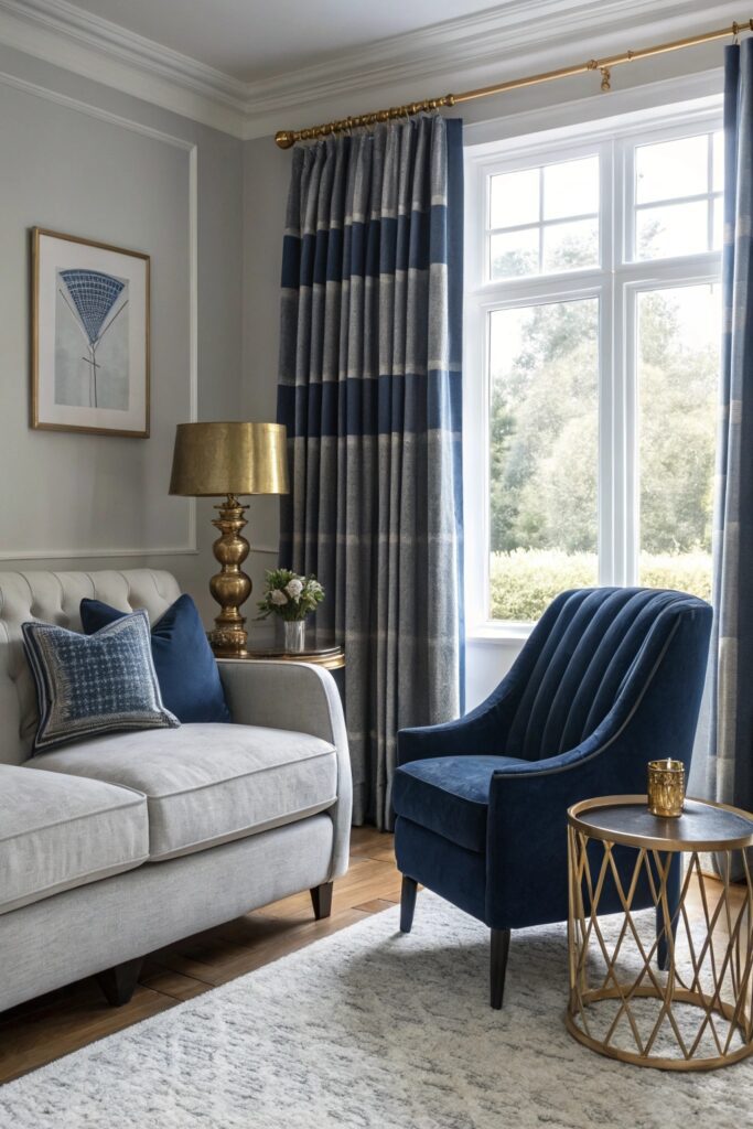
Navy shares grey’s cool undertone but adds depth and saturation, making this one of the more naturally harmonious pairings on this list rather than a true contrast — a navy accent chair or curtains alongside a grey sofa reads intentional and coordinated rather than mismatched. This combination works especially well in rooms with good natural light, since navy can read almost black in dim rooms.
Add one warm metal accent (brass or gold) to this pairing specifically, since navy and grey together without any warmth can start to feel cold as a combination.
8. Add Brass or Gold Metal Finishes
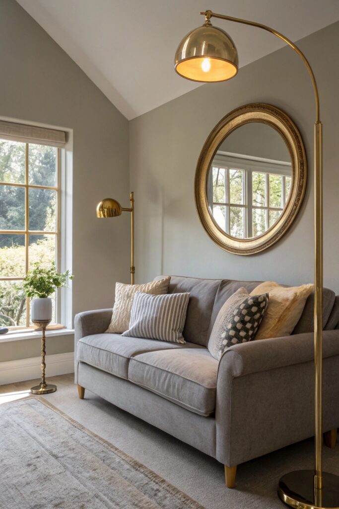
Warm metal finishes — brass lamp bases, gold picture frame edges, brass drawer pulls — cut through grey’s coolness the same way warm wood does, but with a more polished, slightly more formal effect. Apply one warm metal finish consistently across a room’s hardware and fixtures rather than mixing brass and chrome, which reads unplanned.
Vintage or antique brass (with a slightly dulled, less shiny finish) tends to look more intentional against grey upholstery than very bright, polished new brass, which can look almost too perfect against a more casual fabric like a grey linen or cotton-blend sofa.
9. Layer Textures With Boucle, Linen, and Knit Throws
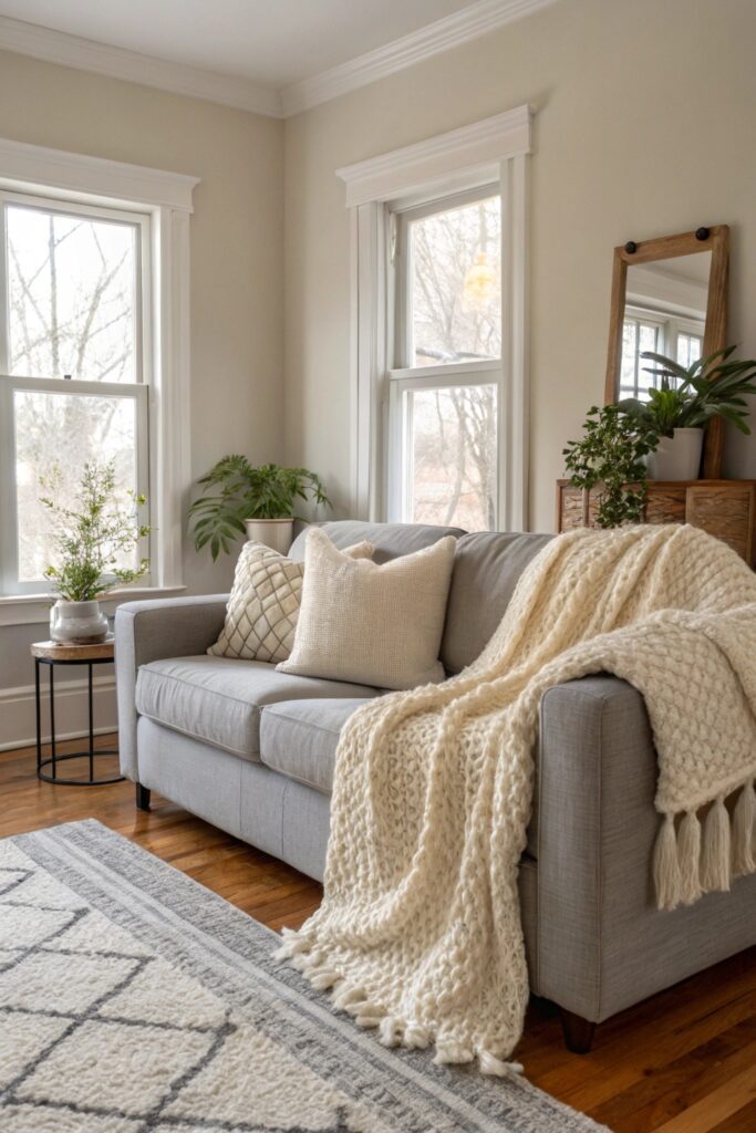
Since grey itself doesn’t provide much visual texture on a smooth upholstery fabric, layering boucle pillows, a linen throw, and a chunky knit blanket together adds the tactile richness a monochromatic grey room otherwise lacks. Vary texture more than color here — you can stay within a neutral palette entirely and still avoid a flat look purely through fabric variety.
Boucle specifically has become a popular counterpart to grey sofas because its looped, nubby texture reads as a texture rather than a pattern, so it doesn’t compete visually with other patterned elements in the room.
10. Anchor the Room With a Bold Piece of Art
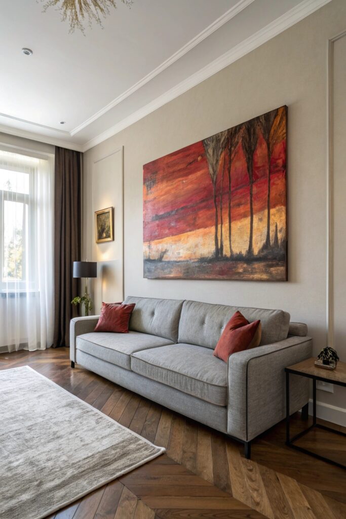
A larger-scale piece of art in a saturated color palette gives a grey-anchored room a clear focal point and a source of color that pillows and throws alone can’t achieve at the same scale. Abstract art with warm tones (rust, gold, terracotta) ties back to the warming strategies covered earlier in this list, creating a cohesive palette rather than a room with several unrelated color moments.
Scale the art to the wall, not just the sofa — a piece that’s too small above a large grey sectional will look like an afterthought regardless of how good the artwork itself is.
Bringing It All Together
Pick one primary direction — warming the room up, or leaning into grey’s coolness with navy and black — rather than mixing strategies from both camps at full strength, which can leave a room feeling like it can’t decide on a mood. Texture (boucle, knit, linen) works well as a supporting layer regardless of which color direction you choose, since it addresses grey’s flatness without adding competing color.